Category Archives: Coursework

Assignment 5 – Reflection

Fig. 03 The Common - 1/200 at f/16, ISO 200

Fig. 01 The Common – 1/200 at f/16, ISO 200

I have very consciously left a number of weeks between finishing this assignment and reflecting upon it. I felt it was important to give myself some space to consider what I had and had not achieved.

Demonstration of Technical and Visual Skills

Technique: There was nothing radically new in terms of my photographic technique, I did attempt to move away from the saturated colours that I prefer and used a more subdued palette. This was to avoid any sense of creating a travelogue, I was not trying to promote this village and wanted it to be seen for what it is, ordinary. I took most of the photos during a sustained period of good weather and this inevitably meant that a number of shots are a little more postcard than I had intended.

The techniques used to present the assignment are where I have broken new ground. Using a typology to bring together the cottages and houses that formed the shared landscape between the old Surrey labourer and me was a new approach and one that I felt appropriate and I was pleased with the result. If the project had started a few months later I would have used Joachim Brohm’s idea of photographing all the buildings under a neutral sky to create greater uniformity between the images but this proved impractical.

The steepest learning curve was in laying out a magazine article of this type. If I had chosen to use photos and dummy text or much less text it would have been easier and I realised that it is a two dimensional jig-saw puzzle to balance the images and edit the text and to do both within a restricted space. It also showed that photos had to be chosen for content, shape, size and visual variation so when constructing a narrative the best photos do not always lend themselves to being included. These factors meant that I had to re-shoot a number of the images and to collect more in some cases. If I started again now I would have a much clearer idea of what was going to fit into a layout.

Observational Skills: The project became an investigation and, at times, I had to become an architectural archaeologist to spot buildings of the right age and to find the buildings that Sturt described as being part of Grover’s life. I spent many hours walking round the village and I believe that my observation skills did develop as the weeks went by.

Visual Awareness: I hope that I saw and photographed the subjects in interesting ways. This is a very ordinary place but I wanted to express how important it is to my history and how it fitted into the broader social history of Surrey. To achieve this I had to treat the subject matter as important and photograph it with as much skill as I could muster, my intent is classic “banal” photography – making an ordinary subject important by treating it as such.

Design and Composition: I am disappointed by the overall layout, the design is unexciting and when I tried different approaches – pictures at angles, more white space and unusual balances – it looked forced and I return to a conservative layout. The process shows that page design is a difficult skill in its own right. Having said that I believe I achieved a balance page by page and used the old black and white images effectively to maintain the two, sometimes three, timelines of the story.

Quality of Outcome

Content, Application of Knowledge: The intent was to use as much of the knowledge acquired during TAoP and bring it into this assignment. This might not be particularly evident with the photographs but I set out to incorporate influences from a wide group of photographers –  appropriation (Burgin and Fox) , typology (Brohm and the Blechers) , the use of multiple timelines (Germain), how to contextulise photographs with text and captions (Jones Griffiths, Lam, Koudelka) and depth of research and understanding of the subject (Freeman, Jones Griffiths, Tod Papageorge).

Presentation: The presentation might be unexciting but I believe that the story is coherent both in terms of the text and the photographs.

Discernment: The links between the characters are quite obscure so the challenge was to bring these people together into a single story against the background of a village’s history. I believe that my thought process was insightful and that I did connect the pieces together into a narrative that had not previously existed.

Conceptualisation: The original idea was lurking long before I started but it took a lot of thought to pull the idea into a coherent narrative. The challenge always lay in the length of the story, a hundred years between the labourer arriving in the village and my starting at Grammar School and then another fifty years to the present day. I had to find a way to pull this into a single narrative with different but concurrently presented timelines. It may not be a brilliant idea but it was incredibly difficult to plan and present so I was pleased with the conceptualisation process.

My tutor was immensely helpful in suggesting, on a phone call, that I looked for the sprit of the labourer and this idea led to finding, what I think are, some of the best links like the schoolboy walking past his cottage – just as I had done every day 50 years ago- and the cattle on the common – a sight that he would have related to.

Communication of Ideas: I recognise that some might say that it is meant to be a photo essay and that the extensive use of text is inappropriate. I considered this at some length and was ultimately swayed by something that Jones Griffiths said along the lines that we are living in a literate society so why attempt to tell a story without using the most easily understood form of communication. The text became very important and I wanted to test how words could be used to expand upon the pictures, not to explain them, not to describe them but to build upon the visual ideas. I felt I achieved this to some degree.

Demonstration of Creativity

Imagination: I wanted to avoid looking at a single event, or a day-in-the-life, or to mimic an old school Life Magazine article so it felt as if the extended history of a place across many decades using old and new photos was a little different and therefore reasonably imaginative. In some ways it would have been more creative to discard the idea of a magazine all together and to design a photo book which is probably the natural home of narrative in contemporary photography but, in the end, I decided to stay within the sprit of the assignment and target my article at a specialist magazine such as British Archeology which would use this type of approach, albeit it in a more sophisticated manner.

Experimentation: As previously mentioned I tried out a number of new techniques and approaches (typology, appropriation, combining text and images) plus the whole idea of a magazine article was in itself experimental for me.

Personal Voice: If there is any progress in this area it probably lies in the use of text and images. I was very comfortable with this approach and, to some degree, it built on assignment 3. I see myself taking this further over time so it might qualify as beginning to find my voice.

Context

This whole assignment was totally reliant upon research, collecting appropriate influences and moulding those influences with my own ideas into a single project. I set out to produce something that was supported by careful historical and photographic research and felt that I achieved that goal.

The work is strongly contextulised in terms of the practitioners that I researched and found relevant but it was equally important to look at a number of other forms of narrative that were unlikely to influence this particular piece. I believe that I am building my skills in terms of considering the work of established and not so established artists, finding inspiration and influence where appropriate and leaning how to look beyond the images on the page.

Researching and Completing Assignment 5

Fig. 01 Cattle on The Common - 1/60 at f/16, ISO 100

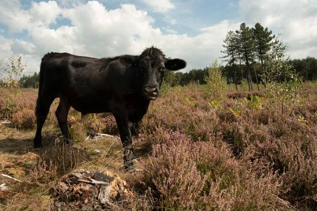
Fig. 01 Cattle on The Common – 1/60 at f/16, ISO 100

Introduction

Assignment 5 has a straight forward brief, the essence of which is to create a magazine story in the form of a picture essay and to design the cover of the magazine that will run the story. The final result should ideally incorporate both illustrative and narrative techniques.

As this assignment comes at the end of TAoP it is an opportunity to bring together elements of the whole course and it was always my intent to allocate a disproportionate amount of time to researching, planing and undertaking this assignment. TAoP naturally led me to researching a wide selection of established photographs, many of whom have very directly influenced my thinking even when their style or chosen field is not directly relevant to my own work but more than this influence they have collectively taught me a set of basic principles that I wanted to take forward into assignment 5 and beyond.

Working in a Series

The first principle, which is especially relevant to narrative, is that work is more effective when presented as part of a series. Nearly every photo book that I have studied and reviewed is greater, more powerful, than the sum of the individual photos within in. Sometimes this is because of the story line but often it is simply the effect of developing and building a conversation with the audience,  exponentially drawing the viewer deeper into a subject as each image is revealed.

See – Planning Assignment 3 with Tony Ray-Jones and Martin Parr

Quality of Research and Understanding

The second principle relates to the ethics of documentary photography. Respected photo journalists such as Stuart Freeman (1), and Phillip Jones Griffiths (2) both point out the importance of the photographer immersing themselves in their subject so that their work respects and honestly represents it. Freeman states that “storytelling in photography must be as vigorous in thought and research as it is beautiful in construction and execution” and this aide has directed my whole approach to assignment 5.

This ideal is best summarised by a quote from Tod Papageorge (13).

“If your pictures aren’t good enough, you aren’t reading enough.”

See – Philip Jones Griffiths – An Engaged Observer

Contextualisation

The third principle flows from the second. Jones Griffiths points out that documentary images must be properly contextualised. His example is that a picture of a starving child is just that, it doesn’t mean anything. The photographer must provide the context, why is this child starving? what events led to this point? who is depriving him of food? Jones Griffiths believes that this can only be done by combining photographs with text, he argues that we live in a literal society so words are an essential element of photographic story telling.

See – Captions and Other Words in Photo Narrative and Phillip Jones Griffiths and the Use of Captions, Cutlines and Other text in Vietnam Inc.

Respecting the Subject Through the Quality of the Image

For the final principle I will refer back to the second part of the Freedman quotation. Understanding the subject is not enough, we must use whatever skills we possess to bring beauty to the construction and execution of the photographs. Exhibit one to support the case for this principle can be found in the work of Josef Koudelka (4) who has championed isolated and suppressed communities for much of his career and who makes these marginalised people important, human and valuable by the art and technical excellence that he brings to every one of his pictures.

See – Josef Koudelka – Wall and The Role of Olive Trees in Koudelka’s Wall

The Concept

Choice of Subject

It was always going to be important to select a subject that I already, at least in part understood, I felt that my classmate, Adam Newsome, had been so successful with his assignment 4 on IEDs (Adam’s Assignment) (5) because he had based it on a subject with which he was already intimate. This intimacy allowed him to explore and document the subject in real depth and to offer the audience an unique viewpoint.

I chose to look at my own childhood and the village in which I grew up.

Parallel Timelines

Having looked at a wide range of narratives and photo stories I wanted to develop a story line that had multiple strands. I had connected with Julian Germain’s For Every Minute You Are Angry You lose Sixty Seconds of Happiness (3) for many reasons but I especially responded to the idea of combining his “current” photographs with the subject’s own photographic memories, this gave the audience two timelines to follow and the opportunity for juxtaposing past and present. This worked well because Germain gave both sets of pictures equal prominence and therefore equal value, there was no suggestion that because the subject’s photos were amateur ‘snaps” that they should be treated with any less respect.

To enable me to introduce multiple timelines to my narrative I decided to base part of the story on the writings of George Sturt who lived in “my” village between 1891 and his death in 1927. Sturt was not a typical man of his times, a self confessed socialist who was also a business owner and employer and who saw his employees as people and friends. A number of his books are heralded as classics but his most moving works are a trilogy of books (6), (7), (8), based on conversations with his gardener whom he calls Bettesworth. Bettesworth, or Fred Grover, was an old man when Sturt first employed him and the stories of his life in a tiny Surrey hamlet tell the story of that village from the 1840s until his death in 1905. Sturt’s other book, Change in the Village (10) and his Journals continue to map the evolution of the area until Sturt’s own death.

The concept was to trace the spirit of Fred Grover and to document his path through this landscape and to overlay that with own childhood in the same place. I hoped to find places where Fred and I could meet and ideas upon which we might have agreed or even argued. I aslo wanted to draw on any similarities that I could find between my family history as it related the the village and Grover’s.

From the outset I wanted to use a small number of photographs from Grover’s time and from my family album. This would enable me to not only juxtapose past and present but to also provide visual variety.

Text and Captions

Whilst recognising and accepting that this assignment was about photography it was also clearly set as a magazine article and for that reason alone it needed text to complement the images. My study of the early photo stories had been informative but it was also obvious that this approach is now historic, Life and its competitors have long gone and the Sunday magazines, National Geographic and specialist magazines that are image heavy such as travel magazines have a high proportion of text to image. I am sure that there are examples of pure photo stories in magazines but I would more see this to be the province of the photo book or internet slide show.

More importantly I considered whose work had influenced me the most when researching narrative and quickly concluded it was Kodelka’s WallJones Griffiths’ Vientnam Inc and Lam’s Abandoned Futures. Each of these books are heavily reliant on the written word to contextualise the photographs.

It also seemed relevant that as I would be researching the subject matter in some depth part of the story would only be told effectively by combining words with the photographs. I made the decision to format the story as if it was to be published in a magazine but to adopt a text / picture mix similar to Jones Griffiths.

Appropriation

The use of old photographs would already introduce an element of appropriation to the project but I was also keen to try and link the modern photographs with the past by using quotes from George Sturt’s books as captions. This approach also linked this assignment back to assignment 3 and my research into Anna Fox and Victor Burgin.

Other Influences

Different photographers and writers influenced different parts of the assignment.

Joachim Brohm and the Bechers influenced the way I approached a double page spread typology of cottages and other buildings that I knew as a child and that Grover would have known.

I researched a number of different views on how a photo story should be created and took forward ideas from Harold Evans’ Pictures on Page (11) regarding layouts and the relationship between pots and text although there was, of course the need, to translate the ideas from broadsheet to a smaller format. His ideas on how to build a story are invaluable an, being a newspaper man, he likes words so further justified my essay writing. Equally useful was Derek Birdsall’s Notes on Book Design (12), his ideas on how to layout a page were inspiration even though I know that I fell way short of his high standards.

My general background research is summarised in my post Narrative andI endeavoured to carry forward that research into this assignment.

Overall my strongest influences were the photo journalists such as Jones Griffiths, who I have already mentioned, Stuart Freedman, Chris Steele-Perkins, and Eugene W. Smith (for Minamata rather than his work for Life Magazine). In each case these men talk about and follow the principles I have discussed above. Quite clearly they are usually documenting subjects of world importance and I had no such subject in leafy Surrey and their technical excellence is way beyond my limited skills but their real influence on me was to set a pace for the assignment that allowed me to become absorbed in my subject and think through the photographs I wanted and how I wanted to use them.

The Process

Developing the Concept

The concept was developed in parallel with the research described in Narrative but, even before I started with OCA, I was planning a project to look at the journeys of William Cobbett or the writings of George Sturt. Partly because they were both local men and partly because they wrote about the countryside  I love and rural issues which are important to me and that always take a back seat in our urban dominated political landscape. However, I realised that the scale of the research required to deal with Cobbett was inappropriate for a single assignment and I also wanted to bring a personal element to the work and that would have been harder to achieve with Cobbett.

I felt that I already had a number of personal connections with George Sturt. My father had collected his books and as another passionate socialist shared many of Sturt’s views about the treatment of the rural poor. I had walked past his house everyday on my way to school and knew all of the places he wrote about but, more to the point, I knew these places not as a visiting student but as someone who had grown up in the lanes, fields and commons that he describes. His countryside was my countryside and it was this shared landscape that I mots wanted to explore.

Research

The first step was to re-read Sturt’s books and as I did this I formed a strong affinity with Fred Grover who had lived in a tiny cottage a few hundred yards from where I grew up, moving there around a hundred years before I was born. Sturt’s conversations with his old gardener revealed a complex life hidden behind the simple and stereotypical facade of the Surrey labourer and my copious notes centred around the important moments in Gover’s and, his wife, Lucy’s lives. His war service in the Crimea,  the enclosure of the common, the birth and death of their children, Lucy’s decline as her epilepsy worsened, the shadow of the workhouse and destitution that was the end of the road for so many of the rural poor.

Each strand opened up new avenues of research including:

  • Roger Fenton and his Crimean War photography, specifically searching on-line libraries for a photograph of the men of Grover’s regiment. I had looked at Fenton’s still life work during assignment 4 so it was interesting to look at a different aspect of his career.
  • Farnham Museum, who were most helpful with searching their photographic archives for pictures of the 19th century village, Sturt’s house, Grover’s cottage and, after much searching, a single photo of Fred Grover himself talked by George Sturt.
  • Simon Fairlie’s “A Short History of Enclosure in Britain” (15) was invaluable and provided much needed historic context and that helped explain Sturt’s thoughts on the matter.
  • I met and talked to Wendy Maddox, who co-incedentially had been taught by my Father at The Bourne School in the late 1940’s, and who is an amateur but dedicated historical researcher who has carried out extensive work on the history of the village and specifically on the old graveyard. She was part of the team who identified Fred and Lucy Grover’s unmarked graves. The results of some of this research can be found on The Bourne Conservation Society website (16)

Photography

It is not really appropriate to describe my photography trips as shoots. Over a period of nearly three months I kept visiting the village, walking through different areas, talking to the people I met and taking photographs that seemed to capture the village I remembered. My aim was to find Grover’s spirit or part of my own history so other than starting my walks from obvious landmarks such as his cottage, Sturt’s house, the houses where I had lived, the school or the pub I did not plan shoots.

Over time I began to find themes and that invested my work with a little more purpose. I began to form an idea of wanting an element of typology in the final piece and a lot of my walks were in search of cottages that had been the homes of the original squatters who inhabited the village.

A number of my walks were on, what had been the common land, and is now either part of Frensham Common which is managed by the National Trust or The Bourne Woods which are owned by the RSPB and has become quite well know for its staring role in films such as Gladiator and Robin Hood.

My photographic technique changed significantly during this time as a heavy DSLR and camera bag became too restrictive and, given I was often photographing people’s home from the lane in front of their house, it also felt too invasive. Instead I started carrying a mirror-less Fuji XT-1 and this liberated my approach and led to, what seemed, simpler and more appropriate compositions.

Sources

 Books

(3) Germain, Julian (2005) For Every Minute You Are Angry You lose Sixty Seconds of Happiness. Gottingen: Steidl MACK (Reviewed o line via a combination of Julian Germain’s web site – http://www.juliangermain.com/projects/foreveryminute.php and the MACK web site – http://www.mackbooks.co.uk/books/16-For-every-minute-you-are-angry-you-lose-sixty-seconds-of-happiness.html

(4) Koudelka, Josef. (2013) Wall: Israeli and Palestinian Landscapes 2008 – 2012. New York: Aperture

(6) Sturt, George. (1902) The Bettesworth Book: 1978 Edition, a facsimile of the second edition published in 1902. Firle: Caliban Books.

(7) Sturt, George. (1907) Memoirs of a Surrey Labourer: 1978 Edition, a facsimile of the second edition published in 1907. Firle: Caliban Books.

(8) Sturt,George (1913) Lucy Bettesworth. London: Duckworth & Co. Sturt, George (1907) Memoirs of a Surrey Labourer. 1978 facsimile of the 1st Edition. Firle, Sussex: Caliban Books

(9) Sturt, George (1912) Change in the Village. 1955 edition. London: Gerald Duckworth & Co.

(10) Sturt, George (1923) The Wheelwright’s Shop. First paperback edition 1963. Cambridge: Cambridge University Press.

(11) Evans, Harold. (1979) Pictures on a Page: Photo-journalism, Graphics and Picture Editing. London: Book Club Associates.

(12) Birdsall, Derek. (2004) Notes on Book Design. New Haven and London: Yale University Press.

Internet

(1) Freedman, Stuart. (2010) Ethics and Photojournalism – http://www.epuk.org/The-Curve/952/ethics-and-photojournalism

(2)  Photo Histories (August 2014) – Philip Jones Griffiths – http://www.photohistories.com/interviews/23/philip-jones-griffiths

(5) Newsome, Adam. (2014) IEDs – https://adamnewsome.wordpress.com/2014/08/31/level-1-art-of-photography-assignment-4/

(13) Foto8. Mark Durden Interview with Tod Papageorge – http://www.foto8.com/live/tod-papageorge-interview/

(14) Smith, W. Eugene and Smith, Aileen M (1971) Minamata vs. Chisso Corporation – Magnum Photography site – http://www.magnumphotos.com/C.aspx?VP3=SearchResult&ALID=2TYRYDDWZXTR

(15) Fairlie, Simon (2009) A Short History of Enclosure in Britain. First Published in The Land Magazine – http://www.thelandmagazine.org.uk/articles/short-history-enclosure-britain

(16) The Bourne Conservation Society – http://www.bourneconservation.org.uk/index.htm

Jaochim Brohm – Typology 1979

Fig. 1 Typology for Assignment 5 – Double Page Spread

I was drawn to Joachim Brohm’s Typology 1979 *(1) for two reasons.

Typologies

Firstly, as part of assignment 5 I wanted to have at least one page that showed cottages in a village that existed in my time and at the time of the old Surrey labourer that was part of the story. I therefore wanted to look at some different photographic typologies to see whether there were approaches that worked better than others. My first thought was to look at Bernd and Hilla Becher *(2) who started creating grids of black and white photographs of industrial structures in the 1960s. These are methodical and highly detailed records of 19th century constructions taken head on from similar distances against flat grey skies and have become much sought after art prints. Their original intent was to capture these structures as reference material for Bernd’s paintings but, in doing so, they created a photographic archive of buildings that were destined for demolition as industrial processes advanced and changed and a photographic style that has been much copied. For reasons best known to the art critics of the time they were initially considered to be conceptual sculptures rather than photographs but Gerry Badger neatly links their work to the boards used by lepidopterists to pin collections of butterflies to allow comparison *(3). The Becher’s philosophy has been to find a subject and pursue it obsessively for your whole career.

Slightly aside from the purpose of this review I was intrigued that the Becher’s work had two connections with Richard Billingham’s Ray’s a Laugh. The first link, as mentioned above is that the Bechers like Billingham were taking photos as “models” for their paintings, the second link comes from the comments made by Gerry Badger on page 217 of The Genius of Photography. Badger records that the way that the Bechers displayed their work as wall-sized prints had art critics “drooling about seriality, presentational rigour, minimalism, comparative typologies and other art-speak words.” He believes that this diverted attention from the real intent of these photographs which was more about seeing the beauty in these structures and creating architectural photographs with, what he calls, “head on austerity”. The link being that the art world saw something in these photographs that the artist had not necessarily intended to include.

Other than being German there are no specific connections between Joachim Brohm and the Bechers although the timing of Typology 1979 suggest some level of influence. The Bechers were running the Dusseldorf School of Art while Brohm was studying at the Wolkwang University of Art in Essen. Looking at the broad spectrum of his work one might assume that he has been more influenced by Stephen Shore, especially, Lee Friedlander and William Eggeleston more than by the Bechers. In an interview with ASX *(4) he explains that, in the 70s there were few outlets for artistic photography in Germany and he became orientated towards American practitioners and finished his formal education at the City of Columbus, Ohio.

Typologies 1979 is a recent publication of his student work. When asked why he has waited so long to publish his early work he suggests that the world, or perhaps just Germany, wasn’t ready to look at it and that German photography was dominated by the Dusseldorf, and by inference the Becher, School. It is therefore interesting that one of the pieces of his early work that he has chosen to publish thirty years after it was completed, is a typology. It is in colour rather than black and white and the other obvious difference from the Becher’s work is the variety of compositions, angles and viewpoints that he uses, it is less rigourous. However, one clear similarity is the choice of working under pale grey skies.

Allotments

The second attraction to Brohm’s Typology 1979 is the subject matter. There is an element of the banal in systematically documenting the structures that people build on German allotments but I was more interested in the culture that they represent. I have worked extensively in Frankfurt and a number of other German cities and was always drawn to the fringes of the cities where the allotments are found. Very unlike British allotments, that always have a “Dig for Victory” feel about them with their compost heaps and rows of vegetables, a German allotment is like a detached garden, a place that the family can visit for the evening or weekend to escape their apartment in the city centre. They are more personal and varied that our remote vegetable plots and most include structures intended for socialising and relaxing rather than for just storing a fork and spade.

Brohm set out to document the allotment structures of one city, Essen, and, like the Bechers he approached the assignment in architectural terms. There are traces of people but no people appear in the photographs. The buildings are small but are strong personal statements, some are austere, some colourful, some brick, some wood and all nondescript in the context of the city’s architectural heritage. I cannot pretend to know what people travel to Essen to see but it’s not the allotment buildings.

Frankfurt, an otherwise pleasant city, lacked places to eat or drink outdoors and when the weather was hot and humid I was always envious of the German families enjoying a cool drink on the verandas of their little houses overlooking a tiny lawn and neat flower beds. It always struck me that there is something very specifically German about both the allotments and the structures in them and how the close proximity of one summer house to the next appeared un-noticed, the skill of city dwellers to edit out the presence of others.

The Photographs

Having looked at Brohm’s more recent work on line I see a very direct relationship with the work of Stephen Shore. There is a same era feel to both the subject matter and the prints. A certain pale, desaturated look reminiscent of slightly faded prints. If anything, Shore’s work is a little more saturated than Brohm’s but the similarities are there. There is a more subtle relationship with the American colourists, Brohm is interested in marginal places “with all their seeming lack of significance” *(5) an idea that is at the heart of Shore’s Uncommon Places. Typology was obviously completed at an early stage of his career but it is unquestionably about marginal places. In the traditions of the banal movement and the American colourists this study brings importance and significance to a marginal or unnoticed subject.

The book is collection of square prints, each little building is placed in the context of its allotment so we do not have the austere representation of the Bechers. For this project it is a valid decision as we are being shown significant variations on a theme so an identical approach to composition would have told us less that the varied angles arising from placing the buildings in context. As mentioned previously the whole set were taken under grey skies which provides a diffused lighting lacking in contrast, they are also taken in late autumn or early winter so the trees provide a dark, often black, natural frame to many of the buildings. In some of the photos the path across the allotment is used as a compositional device to lead us to the structure.

There is no sense of trespass, no physical invasion of private spaces, the little houses were probably all photographed from outside their gardens and fences are often included as if to make this point. These are private and personal spaces and the photographer has not become intimate with the detail of their structure, we see them as a passerby, a stranger looking over the garden fence. It is interesting that the photographer chose to carryout this study at a time of year when the houses are generally deserted, this choice allows us to see the buildings with no distractions, no colourful flowers or lush foliage but it also makes the allotments look sad and neglected, lonely, drab places on the margins of the city. Only the occasional toy left on the frosted grass hints at these buildings being enjoyed by families. My own experience in Frankfurt is that these are vibrant, joyous places in mid-summer, children playing on the lawns, adults drinking beer in the shade, barbecue smoke drifting on the sultry evening air so the dilapidated feel of so many of these photographs is a slightly misleading picture, an example of the truth not being the truth.

Part of the value of this type of documentary, in the true sense of the word, is that it imparts, records and stores information that we would not otherwise have. One might argue that it shouldn’t matter whether that information is interesting and, interest, like beauty is in the eye of the beholder, but ignoring my prior knowledge of these structures or my desire to learn something from Brohm’s style I found these photographs compelling. Once again it underlines the importance of working in series because the interest lies in the variety of these structures, the comparisons, the typology. Bohmn shows that the residents of Essen have taken their inspiration from a glorious range of architectural styles, we have ginger bread house, minimalist white box, romantic plantation house, pure garden shed, blue and white Greek Café, suburban bungalow, log cabin, Scandinavian chalet,  ramshackle stable and many more. The colours are uninhibited and bold, Farrow and Ball would have had little success in 1970’s Essen.

This might be a love it or hate it book. It asks the viewer to take time to understand the subject and his approach. Compared with his more recent work it is understandably raw and a little less sophisticated and, I suspect, less generally appealing but it is a book firmly within the banal tradition addressing a ordinary subject that is, in itself, unique and that provides an insight into an aspect of German culture. The simple design, one square print per spread, works well with the subject matter and the introduction by Ulf Erdmann Ziegler provides helpful background to the project and the history of “Schrebergartens”.

Inspiration and Assignment 5

Typology 1979 has been less directly useful in bringing assignment 5 together than I had hoped but the process of looking at typology and the work of the Bechers and Brohm was useful. The way that the Bechers presented their work has helped with deciding on my typology page layout and Bohm has shown me that it is possible to move away from black and white, austerity and rigour and still compile a typology.

Looking at Bohm, going back to Shore, and recently visiting Russell Squires’ D-Day Landings exhibition has left me with a unresolved question on how to deal with colour. I have touched on the subject before and no doubt will again. I cannot decide whether my colour work is generally, or always, too saturated and contrasted or whether it a simple matter of style but there is no doubt that many contemporary photographers present, what to me, is low contrast and desaturated work, many appear to only work in flat light on cloudy days. This in itself is certainly not an issue and a difference in stylistic approach is understandable but my predicament is that I respond positively to this approach in the work of others but never feel comfortable when I process my own work in that manner.

For the sake of completeness I have included the draft versions of my cottage typologies for assignment 5. My main concern is a lack of consistency in terms of light which is somewhat inevitable when the photographs are collected over an extended period of time. Initially I considered using the Becher front-on and consistent compositional approach by having discovered Brohm and liked his work I decided that this was an unnecessary and potentially counter productive approach given my subject. I am also looking for one more image as the photo that I have placed bottom right on typology 2 seems out of scale and therefore not a good fit. The building, now a scout hut and once a temperance hall has some relevance to the narrative so I would prefer to photograph it again from a different angle.

Fig. 2 Typology 1 (left) for Assignment 5

Fig. 2 Typology 1 (left) for Assignment 5

Fig. 3 Typology 2 (right) for Assignment 5

Fig. 3 Typology 2 (right) for Assignment 5

Sources

Books

(1) Brohm, Joachim. (2014) Typology 1979. First Edition Published by MACK. Mack Books (a small selection of the plates can be seen at http://www.mackbooks.co.uk/books/1028-Typology-1979.html)

(3) Badger, Gerry. (2007) The Genius of Photography: How Photography Has Changed Our Lives. London: Quadrille Publishing Limited.

Internet

The Telegraph. (2013) Joachim Brohm Q & A. The Telegraph – http://www.telegraph.co.uk/culture/photography/9949287/Joachim-Brohm-QandA.html

(2) Museum of Modern Art. (2008) Bernd and Hilla Becher: Landscape Typology. The Museum of Modern Art Exhibition Review – http://www.moma.org/visit/calendar/exhibitions/95

(4) American Suburb X (2013) Interview with Joachim Brohm – http://www.americansuburbx.com/2013/03/interview-joachim-brohm-asx-interviews-joachim-brohm-2013.html

(5) CPH Mag (2013) A Conversation with Joachim Brohm – http://cphmag.com/a-conversation-with-joachim-brohm/

(6) Squires, Russell (2014) D-Day Landings Exhibition – http://russellsquires.co.uk/d-day-landings/

Photography as Archeology

Fig. 01 The Old Dairy Weydon - 1/100 at F/18, ISO 1,000

Fig. 01 The Old Dairy Weydon – 1/100 at F/18, ISO 1,000

For 6,000 years we have built structures, places to live, to keep us safe, to work, to store the product of our labours, to preserve our ideas or to give structure to our beliefs, to remember our ancestors and commemorate our successes. For much of that time we have made durable things, weapons for hunting, attack or defence, tools to ease our labours, vehicles to transport goods and people, and for a myriad of other purposes. Since the first farmers stopped following the game herds and selected a place to settle in the landscape humans have changed that landscape by collecting raw materials, by farming, by building and by scattering the things we made.

The things we build start with clear structures and purposes but as civilisations evolve our creations lose their purpose and their structure. Nature is always waiting to reclaim every element of every thing we make. We might stave her off for a few years, a few generations or a millennium but eventually she degrades and degenerates everything. Some objects settle into the landscape over time and we come to terms with their demise to such an extent that, as ruins, they define or are thought to beautify the greater place in which they stand but others sit defiantly ugly, never able to gracefully decay, remaining as eyesores, a blot on the landscape. Some temporarily find new life but time will tell and the greatest of our achievements eventually become dust.

Archeologists seek out these abandoned structures and objects to document their existence and to study their context before nature removes their trace. We mostly associated this science with the distant past, the discovery of something that is lost, the process of putting flesh onto the bones of history but all around us there are structures and things in the early stages of their demise, the abandoned buildings and discarded objects of the recent past that might become the archeology of the future but more often are cleared to make way for the next great idea. The documentation of these recent relics can be as compelling as an episode of Time Team, in each building or discarded object there is the history of people, of failed dreams and social change, of seismic shifts in our politics, habits and desires.

Assignment 5 has taken me back to the houses, villages, heaths and woodlands of my childhood and in searching for the past I have found shadows of my generation and the generations that preceded me. I have captured some of these with my camera.

This slideshow requires JavaScript.

Photographically these objects offer interesting subjects but I find myself torn between using the saturated colours that I love, black and white graphic representations that remove the distraction of colour or desaturated and muted colours that might offer the best of both worlds. I was mildly critical of Tong Lam’s Abandoned Futures because I felt there were too many inconsistencies in his style and that this made his narratives slightly disjointed and I envy the certainty of style that can been seen in the work of Stephen Shore or Josef Koudelka who, I assume, never question whether to change their colour palette or, in Koudelka’s case, lack of colour.

There are examples of colour and monochrome being used together in a single presentation, David Bailey worked in both mediums and his Stardust exhibition showed his colour and black and white work, if not side by side, at least in close proximity. Irving Penn’s Still life includes examples of both and there is the sense that he moved freely between them. Most recently I visited Russell Squires’ Landings Exhibition where panoramic landscape photos in colour alternate with square format, black and white, intimate landscapes. These examples don’t necessarily set any precedents and the reasons that each artist mixed media in this way might need to be more carefully considered at some later date. At this stage and for these photos from around Farnham, I am switching between desaturated colour and black and white based on the approach that best suited each specific subject. A few months ago I conducted a similar study in Turks and Caicos and selected saturated colour as the approach that best suited the subjects and the warm Caribbean light. I may subsequently review this work and criticise myself for the lack of a consistent style.

Exercise 43 Illustration by Juxtaposition

Fig. 1 the Wheelwright's Shop Front Cover

Fig. 1 the Wheelwright’s Shop Front Cover

This exercise offer two options, either to design a book cover using a still life or to juxtapose a person with the result of their labour. As can be seen in fig. 1 my choice is the book cover.

The Book

The Wheelwright’s Shop (1) is linked, although not central, to my research for assignment 5 which is partly based on the writings of George Sturt. Sturt lived in the village where I grew up and was writing in the late 19th and early 20th century about life in rural Surrey at a time of great and rapid change. He had inherited The Wheelwright’s Shop from his father but his real love was writing and he handed over the business in 1891 to his foreman, whom he made a partner, and retired to his cottage in Lower Bourne to write a series of books and journals and to contribute to magazines such as Country Life.

The Wheelwright’s Shop, which he wrote in the period between 1884 and 1891 is widely regarded as his finest and most important work describing, in great detail, the complex processes involved in building wheels, carts, wagons and carriages. Sturt’s importance as a historical documentarian lies in his respect and admiration for the tradesmen employed in his business whom he describes as his friends. This elevates this book beyond being a technical journal through his descriptions of attitudes and life styles that bring the reader into close contact with the working man of the late 19th century.

The Cover

For my subject I chose two exhibits from Farnham Museum, the first is one of Sturt’s wheels and the other is from the collection of his tools that are currently on display. I wanted to design a cover that created an impression of a wheel being manufactured, creating a sense of past-times and suggestive of a craftsman’s bench. The juxtaposition is the completed wheel on one hand and the tools that might have made it on the other with the wood shavings acting as a link between the two.

The Process

Fig. 2 The Wheel - Original Photograph - 1/60 at f/20 with flash

Fig. 2 The Wheel – Original Photograph – 1/60 at f/20 with flash

Fig. 3 The Tools - Original Photograph - 1/60 at f/20 with flash

Fig. 3 The Tools – Original Photograph – 1/60 at f/20 with flash

  1. I started with two images, the wheel (fig. 2) and the tools (fig.3)
  2. They were both taken with the same exposure settings and a small on-camera flash gun, I used the same 24 to 70mm lens using my distance from the subject to achieve the difference in scale.
  3. I introduced the two photographs into photoshop as separate layers.
  4. My initial idea was to have the tools on top at about 80% opacity so that the wheel shoed through the tools but the result lacked any real punch.
  5. I then removed all the background from the wheel photo to give me a clean cut out and laid that over the tools.
  6. I adjusted the size of the wheel and moved the layer to create a compositional relationship between the tool handles and the wheel rim.
  7. Because it was a book cover the whole canvas had to be orientated vertically.
  8. For the text I wanted to use a font that reflected the time of the original book’s publication in 1923 and although Times New Roman, my final choice, wasn’t invented until 1932 it felt right.
  9. I added the text and created a mild 3D effect by copying the text layers, expanding the copies by 5% and changing the text colour to black. This gives a fine black line around the original white text which helps the text stand out without using any too modern techniques.

Sources

Books

(1) Sturt, George (1923) The Wheelwright’s Shop, 1963 edition. Cambridge: Cambridge University Press.

Exercise 42 Illustration by Symbols

White Vanitas - Colour - 1/60 at f/14 , ISO 100

White Vanitas – Colour – 1/60 at f/14 , ISO 100

Symbolism has been used throughout the history of both commercial and art photography. In art many symbols have been carried forward from religious painting, especially from the vanitas movement which flourished in the Netherlands in the early 17th century. During my research for assignment 4 I looked at the types of symbolism used by these Dutch painters and how photographers such as William Henry Fox Talbot and Roger Fenton brought that tradition into photography with it later becoming the basis for a lot of Irving Penn’s work and how vanitas symbols are regularly found in the work of contemporary still life photographers including conceptual artists such as Mat Collishaw. Many of the symbols used by contemporary artists have their roots in traditional religious, and especially Christian, art for the simple reason that they are readily understood by both religious and non religious audiences or because they have become so universal they have transcended their original religious meaning and become a common secular symbol so, for example, the Archangel Michael who was historically depicted holding scales as the warrior-guardian of righteousness and justice becomes Lady Justice on the top of the Old Bailey.

Advertising, and therefore commercial photography, is hugely dependent upon symbolism either by using commonly recognised symbols such as the sun to suggest health, vigour or goodness when advertising orange juice or breakfast cereals, shields, gates and castles for insurance and for security services or roses for valentine day products. All these uses of visual symbols rely on the concept of semiotics, which in simple terms is a sign that stands for something else *(1). The idea of semiotics was first described by Ferdinand de Saussure, a Swiss linguist, who explained that it involves a sign, word or object, the signifier and a concept, idea or thought that is to be communicated, the signified. Semiotics is a broad and complex subject that will no doubt be a subject for in-depth study at a later date but at its heart our ability to communicate an idea through the use of a symbol relies upon either, an obvious association between that thought and the symbol, or a common acceptance of the meaning of the signifier. There are many symbols that have instantly recognised meanings in Western society, a dove or an olive branch for peace, a red cross for medical care or a dollar sign for money or wealth (even in countries that use the pound or the euro). However, these symbols can be interpreted differently by different societies and cultures so a red cross might evoke a negative response in the Middle East where it is associated with the crusades.

In effect we all carry a mental register of codes that allow us to interpret these signs to understand their intended meaning, and although these codes might vary between cultures, we are often sophisticated enough to combine the code with its context to identify alternate meanings. These codes are constantly evolving, partly because the advertising industry sets out to design and introduce new signifier / signified relationships through the use of symbols in the shape of logos or by the repeated use of specific images in close association with a product.

Through this process we not only decode MacDonalds and everything it stands for from a large yellow “M” we come to associate meerkats with a consumer choice portal or, for those of a certain age, tigers with petrol. Once such strong brand identities are established the most sophisticated advertising can move beyond advertising a dull and unexciting product such as home insurance and provide short entertaining mini-dramas that become an end in themselves but subtly  promote the product by making the audience feel connected or just good about the family story in a series of gravy adverts, the students obsessed with the speed of their internet connection or the lives of Russian meerkats.

At a more sophisticated level charities are especially prone to leverage preconceptions and, arguably, prejudices, to attract our donations. A black child with a fly on their face is code for suffering, illness and deprivation even though many healthy children all over the world will have a fly land on their face in the course of a day, try visiting the Australian bush in summer, and using dogs and cats in an advert for an animal charity at Christmas is more effective that the same advert used in mid-summer because it is coded as “a dog is not just for Christmas”, “people are acting badly during the season of goodwill”.

Photographers can draw on all these sources and code their images to communicate a message by appropriating established signifiers or inventing new ones that leverage established ideas. In some of my test pieces for assignment 4 I tried to use contemporary items as modern day vanitas symbols. This led me to use lipstick and stiletto heals to signify the vanity of the fashion industry but I mixed in traditional vanitas symbols such as plentiful fruit and watches in an attempt to suggest to the audience that all of the items in a still life needed to be interpreted in the context of vanitas.

This exercise suggests that we avoid clichés but the de-coding system we carry in our heads is reliant on our ability to instantly recognise and interpret symbolism in art or advertising. As a result there is a very thin line between a symbol being able to communicate the idea intended and it becoming a cliché. In practise a cliché is just a matter of timing, so the 1914 Lord Kitchener “Wants You” recruitment poster or “Keep Calm and Carry On” only became clichéd when they became over copied.

Growth

Avoiding plants, charts, upward pointing arrows and other common ideas:

  • I might try to photograph the wall in a house where parents have marked off their children’s height over time. The more dilapidated the wall the better, indicating that it has been left undecorated as a family treasure. This could provide a underlying message of love and nurture and sense of time passing.
  • On a similar theme a heap of, obviously discarded shoes of varying sizes might work.

Excess

  • Without wishing to appear obsessed with the subject all the traditional vanitas symbols work here, over-laden tables and so forth but, if I was planning to work on this subject again I would build on Mat Collishaw‘s ideas with his studies of American junk food. The concept of over sized portions and what we throw away offers powerful imagery.
  • Skips behind supermarkets and, a subject dear to my heart, all the food we dump in land fills that used to be fed to pigs because we have allowed government to over legislate to stop pork products being fed to pigs and cow products being fed to cows. As ever, we introduce new, sweeping, ill thought through laws instead of policing existing and sensible regulations.

Crime

  • I would look to go beyond symbols of crime and look for images of social situations that inevitably nurture crime. Disproportionate unemployment in areas with large populations of  ethnic minorities could provide interesting subjects.
  • The other angle might be crime waiting to happen such as open windows, keys in locks or visible purses in handbags.

Silence

  • A wealth of religious symbolism comes to mind and although this might verge on being clichéd it would rely on the image being strong enough to lift itself above the cliché. A lone monk walking towards an abbey or a simple altar in an empty church, someone praying alone in a church. Something with an Eleanor Rigby feel from Yellow Submarine might work so that loneliness was linked to silence. Note the use of a Beatles’ film as a source of symbolism.
  • Nearly any rural landscape with a pond if it is photographed with a long exposure so the surface is misty and perfectly smooth. Even a fisherman by a river might work.

Poverty

  • Probably a cliché but my first instinct would be to look for a juxtaposition of unnecessary wealth and extreme poverty. I spent many years in Asia and the images that still leap into my mind are slums next to Chinese graveyards where the dead were “living” in marble mausoleums and the living languished in huts made from flattened oil cans and packing cases.
  • If, it was to be a project, I would probably focus on rural poverty which is over-shadowed by the more obvious urban equivalent. The regular car boot sale in Aldershot would provide plenty of opportunities.

Sources

Internet

(1) Moriarty, Sandra. An Interpretive Study of Visual Cues in Advertising. http://spot.colorado.edu/~moriarts/viscueing.html

Chandler, David. Semiotics for Beginners. http://visual-memory.co.uk/daniel/Documents/S4B/sem01.html

Captions and Other Words in Photo Narratives

Smokey Mountain, Manila1989, Metro Manila's largest garbage dump was home to 30,000 people who made their living searching for saleable items in the rubbish. 50% of Manila's 11 million population live in slums.

Smokey Mountain, Manila1989, Metro Manila’s largest garbage dump was home to 30,000 people who made their living searching for saleable items in the rubbish. Ineffectual government policies leading to the repeated failure of re-housing schemes means that even now 50% of Manila’s  population of 11 million still live in slums.

Introduction

Researching narrative has revised my interest in how words and pictures work together and it is obvious that there are a number of different ways to incorporate words within a photo essay ranging from their complete absence, through captions, cutlines, appropriations, to written essays.

The history of the photo story and photo essay is closely linked to photo journalism, magazines and newsprint so it is no surprise that many such narratives are published with text but it is also common for photo books to use captions, cutlines or editorial text to support the photographers’ work. So, whilst some photographers’ work is inevitably destined to be published with associated text because they are working for news or magazine publishers it is clear that many photographers with editorial control are still making the decision to incorporate text with or within their work and it interesting to look a little more closely at why and how this is done.

When first researching  narrative photography it became clear that there is the photo journalist’s and news editor’s view on one hand and the photography critic’s and writer’s view on the other and an attempt to simultaneously consider both views is often trying to square the circle. It also leads to a semantic debates on the meaning of story versus essay and documentary versus journalism and so forth. It could be that this difference of opinion has its roots in what Graham Clarke *(2) describes as the “extent to which photographic practice has been haunted in its development by what has been termed the ‘ghost of painting'”. In simple terms “great art” before the invention of photography rarely, if ever, resorted to using captions beyond assigning a title so, perhaps, great photography is expected not to need or use them.

Absence of Words

It can be argued that the perfect photographic narrative needs no words and many such narratives exist. Richard Billingham’s Rays a Laugh *(6) tells the story of life with his alcoholic father and was published with only a short photographer’s statement on the inside cover to introduce the characters in the photographs, after which there are no captions of any kind, not even the place and date form of captions found in Henri Cartier-Bresson, William Eggleston or Stephen Shore’s work. These works are not lessoned by a lack of captions, the photographers felt no need to offer Cartier-Bresson’s “verbal context” and this approach is clearly highly effective in a photo book or exhibition context where the story can be completely communicated through the images.

A further argument would be that the “norm”, the standard starting point is for there to be no words. The pictures speak for themselves and the photograph only controls the content of the image and the context in which they are made available to the audience. The audience is left to interpret the pictures. If we accept that is the status quo it would appear that we are only looking for arguments for why we would use words.

Appropriations

After assignment 3 I looked at the work of Victor Burgin (Victor Burgin and Appropriations) who has produced a number of series where his photographs appropriate types of words, such as marketing-like slogans, or pieces of text from other sources. In Burgin’s case he is placing an image into a context where we would not normally expect to see it and thereby unsettles the audiences expectations and interpretation of that image.

Anna Fox used the same idea in Work Stations by selecting extracts from corporate “literature” as ironic texts to accompany her images of office life in the 1980s. I had adopted Fox’s approach to my own assignment 3 and attempted to highlight issues with the fashion industry by using their own marketing material as ironic captions.

Fox and Burgin both use appropriation by juxtaposing text and image that are in conflict with one another. For example a piece of fashion speak that celebrates the virtues of a pale skin with a photograph of a black women in a bus queue. (Burgin “Life Demands a Little Give and Take”) *(1).

Appropriation could be a valid technique to use in a photo story or essay and I am considering using it in assignment 5 but, this time, in a less ironic manner by combining the written words of a late 19th / early 20th Century writer who published several books about the village in which I grew up, combined with current images of the same village.

Other Examples of Combining Words and Pictures

Research into narrative has led me to several other photographers who use text as part of their work, or who have produced work that is nearly always seen with the original magazine text in place; I have previously made notes on:

Photo Journalism

Although I can’t find the origin of the quote Harold Evans *(3) quotes Cartier-Bresson as saying “The who or what and the why are incorporated in the subject – or should be – and the how is unimportant.” However, in The Mind’s Eye *(4), Cartier-Bresson also says “in A Picture Story, the captions should invest the pictures with a verbal context, and should illuminate whatever relevant thing it may have been beyond the power of the camera to reach.” It appears that even Cartier-Bresson had more than one view on the role of the caption.

Evans is less ambivalent believing that the idea that words “pollute photographs” is “a piece of intellectual debris from the early idea that photography was art or it was nothing” and, in his world of newsprint, we would expect no other view. The typical process of understanding a news photo is to first look at the picture, then read the caption and any short descriptive extension to the caption (what the American press calls the “cutline”) and then to return to the photograph for a second look. This process builds an understanding by ‘reading” and absorbing the information in the picture, reading the caption and its associated text to gain any helpful explanation or additional data and then revisiting the image to use the context provided by he caption to reveal any nuances missed on the first visit. Newspapers and magazines are expert in the field of caption writing because they know that only headlines have a higher readership that photo captions *(5) and readers are drawn deeper into the editorial or news text through the process of reading photographs and their captions.

Photo journalism, photo stories and photo essays as published in magazines and newspapers are rarely offered as stand alone pictures, in fact, it is so rare that it is only a slight exaggeration to say that this type of photography always includes a caption and is often linked to a more detailed descriptive context or, is providing a visual context to the text.

Not surprisingly, as a newspaper man, Evans, is an advocate for words; he believes that, by adding text, the editor can enhance both the emotional and cognitive experience of viewing a photograph or a series of photographs. In the world of newsprint the aim of this text is to add to and explain the story by providing descriptive detail although Evans recognises that too often it repeats the facts we can see on the photograph because it has been badly executed or is unnecessary but this doesn’t detract from the fact that many news photos are enhanced by their relationship with text. When this is done well the photograph and the text each contribute to the story and the relationship is inevitable, it is a known result that both photographer and writer are working to.

Summary and Next Steps

The two ends of the spectrum are the pure visual story and the story embedded within and closely related to text. In the middle there are a significant number of photo books that extensively use text to provide context, additional information and explanation and, whilst assignment 5, is set as a “magazine cover and article” and therefore inextricably  linked to text if it is to be authentic, it is this middle ground that interests me most. Why does a photographer choose, in Evans’ words, “to pollute” their images with text?

The relationship between words and pictures in a photo book is complex and not inevitable. Anna Fox explains that, whilst she knew that she wanted to use text from the corporate world in a association with her photographs in Work Stations, she collected the pictures and text quite separately, only selecting combinations when she was collating the final presentation. I followed this approach in assignment 3 by collecting phrases during the same few weeks that I was taking the photographs but selected the pictures and decided on my final sequence before starting to look for, what I saw as, natural matches from my collection of quotes.

To explore how text is used by different photographers I have looked at three books.

Koudelka’s Wall –  that I have looked at twice already once as a general review (here) and once in the context of how he used olive trees as a metaphor (here).

Josef Koudelka and the Use of Captions in Wall

Philip Griffith Jones’ Vietnam Inc. that I have looked at in the context of The Engaged Photographer

Philip Jones Griffith and the use of Captions, Cutlines and Other Text in Vietnam Inc.

Tong Lam’s Abandoned Futures that I have not previously reviewed previously in this blog.

Tong Lam and the Use of Text and Appropriations in Abandoned Futures

Conclusion

In each case the photographer has decided that his photographs only tell part of the story. Koudelka provides short captions that explain and educate to ensure that we see past the beauty of his images. Jones Griffiths is constantly explaining “why” so that we understand the history, the back story the broader context of he Vietnam war and its impact on the people and their culture. Lam is offering us two ways to see and understand post industrial landscapes, the words and essays are blended but neither fundamentally relies on the other, they are two parallel data sources.

These different approaches show that words and pictures can be successfully integrated in media other than news or magazines. In the case of Jones Griffiths his book is a direct reaction to the what he sees as the way that the news editors take photo journalist’s work out of contact to illustrate the story they want to publish.

My final conclusion is to agree with Jones Griffiths when he says that we live in a literate society so, if we believe we have a story to tell why would we limit ourselves to using pictures as a complete narrative form? It is essential that the words compliment the photographs, they must add to the story and not be simple and redundant descriptions of the image. The ideal is for the photograph to be strong enough to provide the majority of the information and for the caption or essay to provide the context that explains why the event is happening, or how others events have unfolded to lead to this moment. The two forms of communication need to work together to gain an emotional reaction.

Sources

Books

(2) Clarke, Graham (1997) The Photograph. Oxford: Oxford University Press.

(3) Evans, Harold (1979) Pictures on a Page: Photo-Journalism, Graphics and Picture Editing. London: Book Club Associates.

(4) Cartier-Bresson, Henri (1999) The Mind’s Eye: Writings on Photography and Photographers. New York: Aperture Foundation

(6) Billingham, Richard (1995) Ray’s a Laugh. Books on Books Edition (2014). New York: Valerie Sonnenthal

Internet

(1) Zero Focus – Victor Burgin – Life Demands a Little Give and Take – http://shihlun.tumblr.com/post/84456144504/victor-burgin-poster-life-demands-a-little-bit

(5) University of Kansas web resources – A picture is worth a thousand words (but only of it’s got a really good cutline!) – http://web.ku.edu/~edit/captions.html


Philip Jones Griffiths and the use of Captions, Cutlines and Other Text in Vietnam Inc.

Illegal Logging Luzon Philippines c.1989

Illegal Logging Luzon Philippines c.1989. When the Philippines Government began to carryout aerial surveys of, what they had previously thought were islands covered with virgin rain forest, they discovered than many had no trees left apart from a fringe near roads or the sea and they realised that the loggers had, over many years, denuded whole areas or islands in secret.

In an earlier post I looked at Philip Jones Griffiths as an Engaged Observer. In this post I want to focus on how he uses text to strengthen the message of his photographs and to understand better why he chose to use such extensive text.

Vietnam Inc. is a anti-war narrative recoding the relationship between the American military machine and the Vietnamese people as the war moved through a series of phases until it became a remotely controlled and conducted conflict where American servicemen neither saw their enemy nor the people they thought of as their allies. To understand why the book was published as a combination of essays, captions, cutlines and pictures it is essential to look at the context of its publication.

In an interview with Bob Dannin in 2002 Philip Jones Griffiths talks extensively about Vitenam Inc. *(2). He reveals that he went to Vietnam with the idea of creating a book, he had a publishing contract already secured, although, in the end, the publisher in question “went bust” and he had to find a new outlet. The answer to why he wanted to publish a book rather than work as a news photographer lay in his deep mistrust of the news system. He believed that to work for remote editors and organisations meant that he could not tell the story he wanted to tell, by definition his photos would be published out of context, or worse be used in the context of someone else’s story.

It is interesting that he made two visits to Vietnam as part of developing Vietnam Inc. During his first visit he travelled extensively capturing every aspect he could of the Vietnam people. He then left Vietnam and returned to base to select and edit his photographs and to start creating a layout for his book. He did this to identify the gaps in his story and he then returned to Vietnam for a year to complete the narrative.

There are three levels of text in Vietnam Inc..

Firstly there are captions. These captions are longer than the headlines we normally associate with news photos. They usually run to approximately 40 words. Jones Griffiths says that, when he first became a journalist, he was taught that captions needed to contain the 5 W’s. These are:

Who? What? Why? Where? When?

Of these the middle one, “why”, is the most important. He saw little value in capturing a photo of “yet another starving child”, other than the message that there are too many starving children this offers very little because it is de-contextualised. The important question is why is this child starving? Who is depriving him of food? What is the history of this event? Jones Griffiths argues that this vital information cannot be communicated by pictures alone. The caption is a vital component of the story, the pictures and the words must be blended together, with the words supplementing the photographs. He makes the point that the role of this text is not to explain or describe the photograph, that would be redundant, but to provide the audience with context.

The second level of text is an extension of the first, Jones Griffiths’ includes what the American’s call cutlines, extended captions, in several places in the book. These are used in exactly the same way as his captions, they provide essential context but as well as being longer the context is usually broader providing more in-depth background on larger issues.

The third level of text is his eleven essays that each cover two or more pages and act as chapter introductions to his narrative. They are his own accounts and act as explanations of the background, occurrences and consequences of specific events or groups of events. They are subjective, opinionated and forceful.

Taken as a whole Vietnam Inc. is much more than a photo book and it is the partly the text that makes it so different. Jones Griffiths was an eloquent man, strongly opinionated, a thinker and a communicator who could not work within the constraints of news driven photo journalism. He recognised that many photographers, film makers and journalists in Vitenam were frustrated by the system that edited, selected and used their output out of its original context to meet the objectives of the news organisations. The difference between him and most of the other journalists was that he found a way of controlling the context in which his work was used.

Philip Jones Griffiths uses extensive text in Vietnam Inc. because the pictures were insufficient. He knew that his audience could only understand his photographs when they were contextualised. Collectively his three types of text provide the 5 W’s but the emphasis is unquestionably upon the “why”. It doesn’t pretend to be objective or unemotional and couldn’t be anything else because he is ultimately focusing on how a whole way of life was systematically dismantled by a foreign power who didn’t and never could understand the place or its people.

Sources

Books

(1) Jones Griffiths, Phillip. (1971) Vietnam Inc. : First Published by Collier Books 1971, this edition published in 2001 and reprinted in 2011. London: Phaidon.

Internet

(2) Musarium – Interview with Philip Jones Griffiths by Bob Dannin in New York City, January 2002 – http://www.musarium.com/stories/vietnaminc/interview.html

Josef Koudelka and the Use of Captions in Wall

River Jordan & Red Sea from the Wilderness of Judea. Photograph by Norman Middlehurst 1944

River Jordan & Red Sea from the Wilderness of Judea. Photograph by Norman Middlehurst 1944

I cannot say at what point Koudelka decided on incorporating text into Wall. His other work has not used captions in the same way but in Wall they play a major role. Koudelka didn’t write the captions or the other blocks of text that are included within Wall, they were written by Ray Dolphin, a researcher and writer who has prepared several reports about the, so called, Separation Barrier, for the UN and who wrote Unmaking Palestine. Give his status as a leading and internationally recognised photographer we must assume that Koudelka sanctioned the book being designed in this way.

The captions are often factual. Where, how, when, and at times are quite neutral, for example the caption “Structures from the British Mandate (1922-48) and Jordanian era (1948-67) remain in the West Bank” accompanies a photograph of a derelict building. We are left to decide whether the building is from the British or Jordanian era so the caption is not acting as if it is part of a news story, it is not filling in detail or completing a story, it is not even explaining the original purpose of the structure. It is contextualising the photograph; we see a bleak landscape including a long security fence through the glassless window and damaged wall of a deserted building that we now know was built before the Israeli’s occupied this land. If we consider the gross amount of information on the page most of it is being communicated by the photograph and a small proportion comes from the caption but even when combined we are not presented with completeness. There are plenty of questions left unanswered, there is opportunity for interpretation and the audience can be drawn into the picture to consider small details and wonder how they impact the story and, neither the photograph nor the caption express a strong opinion.

However, the factual captions are frequently loaded with a political agenda. For example a photograph of another abandoned building, but this time the interior of a house, is captioned with “More than two hundred Syrian villages, including the old town of Queitra, were abandoned by their inhabitants in the 1967 Arab-Israeli War; many were later demolished by the Israeli authorities.”

Some captions express the opinions of third parties. “Most Israeli citizens attribute the lack of suicide bombings in Israel in recent years to the success of the wall in preventing infiltration from the West Bank.” We are not told in words whether Koudelka or Dolphin subscribe to this view, nor whether they believe it is justified. The accompanying photograph shows two lines of “defences”, the Wall at this point is large, dominant, ugly, medieval in texture and scale so we are left to make up our own mind as to whether this was the only or appropriate way to address, what was, a serious threat to the safety and well being of Israelis. The writer and photographer’s agenda is made reasonably clear by the choice of photograph. In other places we see the Wall as a fence or even as road blocks and this caption with those pictures would have suggested a more mild response to the threat. So, here we see the words and the pictures having a more equal relationship in terms of the amount of information or message being communicated.

And, some captions just express Dolphin’s opinion, even though it might be expressed in factual terms. “Thousands of olive tress in the West Bank have been cut down, uprooted or otherwise vandalised”. Take out the last two words and this is a factual statement, put them back and the text becomes subjective and opinionated.

To return to the question of why did the photographer want so many words in this presentation? Are his photographs not enough, would they not stand alone as a narrative of the Wall? Why deviate from the approach he used in his other work? Without the opportunity to question Koudelka or his editors there is no absolute answer to these questions but I sense that the answer lies in his history. Koudelka comes from a country that was held in thrall to the Russian empire, the USSR, he understands the sense of helplessness felt by Poles, Czechs, Hungarians, Tibetans, and many others that have been in recent times been or still are under the yoke of a militaristic and ruthless neighbour. It is likely that he saw many similarities in the relationship between the Israelis and the Palestinians and recognised in the Wall was a symbol of that domination much as the Berlin wall was a symbol of the East West divide. In the spirit of the engaged observer or concerned documentary photographer he wanted to communicate the strongest possible message and felt that his photographs alone were not enough. He adopted the fundamental principles described by Evans and added enough text to contextualise the pictures and to develop, in his audience, a depth of understanding that would emotionally and intellectually engage them.

If, as Karin Becker Ohm says, the role of the documentary photographer is “to bring the attention of the audience to the subject of his or her work and, in many cases, to pave the way for social change” then Koudelka appears to believe that we must not only see the Wall, often disturbingly beautiful in his dark tonal compositions, but fully understand its context so there is limited opportunity for his audience to miss his point. Wall is unambiguous statement and much enhanced by the text.

Sources

Books

Koudelka, Josef. (2014) Wall: Israeli and Palestinian Lanscape 2008 – 2012. New York: Aperture.