Category Archives: Inspirational Photographers

Nicky Bird, Tracing Echoes, Assignment 5 Follow-up

My tutor suggested that I looked at Nicky Bird’s Tracing Echoes (1) as a follow up to my TAOP assignment 5 submission, Change in the Village. This proved to be an interesting line of research that not only plays a part in closing down TAOP but has real relevance to various lines of research that I have subsequently been pursuing as part of Context and Narrative. With this in mind I am posting this essay on both learning logs.

Julia Margaret Cameron 1815 – 1879

I declare my prior ignorance regarding this obviously eminent Victorian photographer. Tracing Echoes includes, as way of an introduction, an essay by Pamela Gerrish Nunn which explains some of Cameron’s history and her place in the history of British photography. She is an artist worthy of study as her work, in many ways, is more closely related to the styles of the late 20th and early 21st century than to her own time. Gerry Badger (2) presents her as an unconventional photographer who “broke all the rules of 1860’s photography” and Pamela Gerrish Nunn explains that her disregard for conventions was not limited to her work behind the camera, she was a strong character who apparently often intimidated her sitters. Dr. Nicky Bird’s book mostly concentrates on her portraits of women, often in tableaux or as allegorical figures, so we have to look elsewhere (3) to find examples of her portrait style and how she often filled the frame with her subjects, sometimes working so close that the camera could not be focussed. This approach gives the viewer no escape, the frame is dominated by the subject and because we instinctively and subconsciously read body positions and faces we are joining Cameron in confronting her sitter and through this process are exposed to some element of their personality. Do they stare firmly back? Do they appear relaxed? Are they being made uncomfortable by the experience? Badger uses a photograph of Thomas Carlyle taken in 1867 to make the point that she was “totally at odds” with the usual formality of the Victorian portrait.

Diane Arbus (4) was a modern photographer who regularly used the same techniques to ensure that her audience did not miss the message when she photographed studies such as A Women in a Bird Mask or Women with a Fur Collar and many other of her street portraits, one might also look to some of Martin Parr’s work to see a similar approach. ( i )

I would like to return to Cameron in the future but, for now, my interest in is Nicky Bird.

Photography’s Relationship with History

Tracing Echoes is a refreshingly affordable book and one that I am pleased to have added to my collection and, from my perspective, a book that is highly relevant to my work on Change in the Village and to my current research into Late Photography. Nicky Bird’s approach to photography speaks to my own interest in finding ways, by combining past and present photography, to understand how history has shaped us and our contemporary landscape. Photography records the present at the moment it becomes the past and since the 1860’s our understanding of history has become increasingly informed by the still or moving image. Today, television, on-line news and social media is consciously or subconsciously prioritised by the availability of images to such an extent that an un-photographed or un-filmed event is, at best, a footnote and, at worst ignored.

As a way of recording a place or an event photographs form part of the archaeological record but, beyond this, the photograph, in itself, is a physical or electronic artefact, a piece of archaeology. Most of us born in the 20th century have a record of our life in photographs forming a visual record of the places we have been, the physical and social changes we have experienced. This “family album” is a tiny current in the ocean of history but becomes more interesting when we attempt to link it with other contemporary or historic currents so it becomes part of a wider stream that tells a more comprehensive story of who we are and where we came from. In Change in Village I was trying to relate two lives that were separated by over a hundred years but played out on the same stage, a small Surrey village, and through this process I was exploring the way ideas and social interactions changed in a single place over time. I was also seeking traces of my life in that place and of the earlier life that had been lived there so the project was archaeological in nature with found images being the most commonly discovered artefacts.

Nicky Bird

Dr. Nicky Bird is a PhD Coordinator at the Glasgow School of Art (6) and a practicing artist whose work usually involves a combination of new and found photographs (7) to support explorations of social and hidden history. Tracing Echoes is one of her older published or exhibited projects dating back to 2001 when she was the artist in residence at Dimbola Lodge, the home of Julia Margaret Cameron.

In 2006/07 she created Question for Seller where she purchased unwanted family photos on ebay and exhibited them with the sellers comments and their original purchase price. At the end of the exhibition the photos were resold. This project raised a series of questions about the value placed on a family’s history and how a family album moves from being a cherished possession to a commodity that sells for a few pounds on eBay. In an interview with Sharon Boothroyd (8) the artist touches on how this process might be connected with class and the way in which working class history only exists at the margins. This is insightful and reminded me that the only reason I could trace photographs of Fred Grover, the real hero of Change in the Village, was because his middle-class employer had photographed him and that this family had placed sufficient value on their family album for it to survive and to be eventually donated to the local museum. I did not attend the exhibition but can only assume that the most asked question was “who are these people?”, a question that we ask ourselves when we pick up an photograph in a market. My mother left a biscuit tin of ancient family photographs and many are unnamed, undated and mysterious, I presume there is a connection with the family, that connection must have been important for my mother or her mother to have kept the photo but there the story ends.

Archaeology of the Ordinary was a series created in 2011 centred around a group of derelict cottages in East Lothian where archaeologists had found the signatures of, what proved to be, Irish migrant workers from the 1950s. Abandoned buildings hold a particular fascination as a place of ghosts and faint traces of history and perhaps because they have been abandoned as opposed to evolved and changed with the times adds a sense that the ghosts and traces are present but on the verge of disappearing forever. These migrants may have moved on and made their mark on the world in many other ways but it is also possible that some of these signatures are the only permanent record of their passing and it is this sense of seeing a moment in time in a photograph or a piece of graffiti and not knowing the back story or what followed that makes these marks, and Bird’s photos of them, so poignant. The idea and the approach of this and other examples of Bird’s work reminded me of an article in the British Archaeology Magazine about tree carvings or arboglyphs left by soldiers who trained on Salisbury plain showing, perhaps, that archaeology and photography sometimes follow the same as opposed to parallel paths. (10) ( ii )

Tracing Echoes

Tracing Echoes is divided into four main sections followed by a detailed conversation between the artist and two individuals from the National Museum of Photography. The first section sets out to map  Dimbola Lodge, which as previously mentioned was the home of Julia Margaret Cameron in Freshwater Bay on the Isle of White. The presentation is of a single found photograph of the house in Cameron’s time and a series of new images taken by Bird. This acts as an introduction and gives a sense of place. I am interested that these images are quite flat, low contrast and without any artificial lighting for the interiors. This made me think of Jaochim Brohm’s Typology 1979 (11) which was part of my inspiration for Change in the Village, Typology 1979 is a study of the small structures Germans build on their allotments and was consciously photographed in flat autumn light. ( iii )

The second section, Timelines, is more interesting as each found photograph is accompanied by one of Bird’s images. The linkages between each pair are not always obvious and Bird makes no attempt to copy the composition and her images are all in colour. She explains that whilst some are of the same location there is a certain amount of guesswork involved and in one case we see Cameron’s daughter in 1867 and her bedroom as it is in 2000 which, as bedrooms have a special relationship with their occupants, this is a link that any parent or grandparent can relate to; the room is now stripped bare but showing it alongside a portrait of the daughter took me to the room in the 1860s asking me to imagine its Victorian decor. I found the subtle and unclear linkages drew me into the archaeological investigations asking me to linger over the photographs to find the clues and traces that Bird had seen or sensed.

There is then a section that records Bird’s genealogical research which I found needed to be read in conjunction with the conversation section at the end of the book that explains who these people are. However, that is a minor comment as any photo book worth owning must draw us back on multiple occasions and when the artist provides the level of context that we have here it will always be necessary to turn back and forth to understand the story. The genealogy searches tell us what happened to Cameron’s sitters which takes found photography to a different and interesting place partly, or perhaps mainly, because the sitters are mostly Cameron’s domestic servants or other working class people who visited the house. ( iv ) This research enabled Bird to make contact with some of the descendants of the sitters and thereby leading to the Echoes and Dialogues section.

It is worth noting that this research and, in some ways, the whole book is fuelled by Cameron’s tendency to note the names of her sitters on the back of the photographs. This is all the more surprising both because the pictures are often allegorical and because the sitters were working class, servants who would have been transparent to many upper middle class Victorians. Most other Victorian photographers and plenty of more modern ones did not take the trouble to find out or record who their subjects were so, as Bird points out, this act held some significant for Cameron despite the fact that some of these acquaintances were quite transitory, a fleeting visitor to the house for example. Cameron is an artist who is much studied and researched so the names of her sitters are well known and well published, the simple act of noting down their names has given these ordinary people an unusual status, a remarkable level of importance 150 years after they sat in front of Cameron’s camera so, for once, we are not asking “who were these people?”, a name gives them a more real existence, a history and, by tracing some of their decedents, a future.

The pairs of photographs presented in the Echoes and Dialogues section are not simply ancestor to the left and descendant to the right. Some are direct decedents, some are unrelated in the genealogical sense and Bird has linked the timeline through other means such as composition in Venessa at the Gate. Vanessa is Nicky Bird’s sister and quite unrelated to the original sitter, Mary Pinnock, the link is that they look similar, the pose is the same but it is not the same gate. Without going through each link suffice to say that they are varied and somewhat complex and I found myself drawn into the narrative to such an extent that I was turning back and forth between the photographs, the genealogical research and the closing conversation to understand the links.

Bird takes a place and shows it to us in the 1860s, she fills the place with the women who sat for a notable artist in that house and then draws us across 130 years to find that same place and another group of local women who are sometimes related to the original cast and sometimes not. This work is part historical research, part genealogy, part photographic and partly the study of a women who has an important place in the history of British photography and of women photographers and a exploration of Victorian values and the history of working class women. It appeals because it blends these disciplines in a practical and unforced manner, using research and photography as equal partners to tell an interesting story.

Notes on Text

( i ) When I made this statement I had in mind many of the close-up portraits that are included in Think of England (5). Plates 17, 19, 20, 24, 25, 58, 73, 82, 83, 104, 106, 107 and 108 are all examples where it might be argued that Parr has invaded the private space of his subject in a potentially confrontational manner.

( ii ) As soon as I saw Nicky Bird’s photos of these signatures I was reminded of an article in British Archaeology Magazine (10) in January 2013 about arborglyphs, the carving of soldiers names and often regimental badges into the trunks of the beech trees on Salisbury plain. All archaeology is about people but the stories become more moving the nearer they are to our own time, in the article the author, Chantel Summerfield, describes how she has traced some of these soldiers from their time training on Salisbury Plain to their service in WWI and sadly to their war graves in France or Belgium. One example combines a photograph of the arborglyph left by one solider with a found photo of his wedding day after the war, another shows a WWII arborglyph recording a soldier’s love for his wife Helen and found photos of the same lady in 1955. This latter story was quite poignant as although the American soldier in question had survived the war he had predeceased his wife but shortly before her death the author of the article had been able to send her a photograph of her husband’s carving of her name in a heart in a small wood on the other side of the world. Looking at this article again I realise that the dividing line between an archaeologist’s article and Nicky Bird’s work is very slight. The archaeologist offers us a higher ratio of words to pictures and her photographs are taken from the perspective of being a functional record but Nicky Bird’s Tracing Echoes also has a high percentage of text and the main difference is in the presentational style.

( iii ) One of the aspects I have struggled with when approaching landscape work during the course is that so many contemporary photographers appear rot actively seek out flat, low contrast lighting. I ask myself whether this approach is mandatory if one wishes to be taken seriously. If so, it is disappointing as I happen to like strong contrasts and saturated colours in landscape.

( iv ) Contemporary historians and archaeologists and the writers of fiction are increasingly interested in the stories of ordinary people following a long period where the world appeared to made up solely of the aristocracy and their servants without anyone in between. One of the great appeals of the work of Hilary Mantel, the two times Booker prize winner, is that her Henry VIII series is written from the perspective of the professional classes that served him. 

Sources

Books

(1) Bird, Nicky (2001) Tracing Echoes. Leeds: Wild Pansy Press, University of Leeds in association wit the University of Northumbria at Newcastle

(2) Badger, Gerry (2007) The Genius of Photography: How Photography has Changed our Lives. London: Quadrille.

(4) Arbus, Diane (1972) Diane Arbus: An Aperture Monograph. Fortieth anniversary edition 2011-2012. New York: Aperture.

(5) Parr, Martin (2000) Think of England. Paperback Edition 2004. London: Phaidon Press.

(10) Summerfield, Chantel (2013) Landscape of Rememberance. British Archaeology Magazine January February 2013. York: The Council for British Archaeology

(11) Brohm, Joachim. (2014) Typology 1979. First Edition Published by MACK. Mack Books (a small selection of the plates can be seen at http://www.mackbooks.co.uk/books/1028-Typology-1979.html)

Internet

(3) J. Paul Getty Museum (accessed January 13th 2015), Jula Margaret Cameron Collection – http://www.getty.edu/art/gettyguide/displayObjectList?maker=2026&pg=1

(6) Glasgow School of Art (accessed January 15th 2015) – http://www.gsa.ac.uk/research/supervisors-plus-students/primary-supervisors/b/bird-nicky/

(7) Bird, Nicky – Artist’s website (accessed January 11th 2014) – http://nickybird.com/profile/

(8) Boothroyd, Sharon (accessed January 14th 2014) Nicky Bird – https://photoparley.wordpress.com/category/nicky-bird/

(9) Bird, Nicky – Artist’s website (accessed January 11th 2014) – http://nickybird.com/projects/archaeology-of-the-ordinary-2011/

Jaochim Brohm – Typology 1979

Fig. 1 Typology for Assignment 5 – Double Page Spread

I was drawn to Joachim Brohm’s Typology 1979 *(1) for two reasons.

Typologies

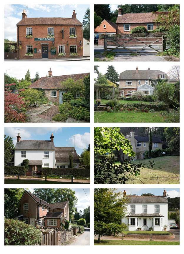
Firstly, as part of assignment 5 I wanted to have at least one page that showed cottages in a village that existed in my time and at the time of the old Surrey labourer that was part of the story. I therefore wanted to look at some different photographic typologies to see whether there were approaches that worked better than others. My first thought was to look at Bernd and Hilla Becher *(2) who started creating grids of black and white photographs of industrial structures in the 1960s. These are methodical and highly detailed records of 19th century constructions taken head on from similar distances against flat grey skies and have become much sought after art prints. Their original intent was to capture these structures as reference material for Bernd’s paintings but, in doing so, they created a photographic archive of buildings that were destined for demolition as industrial processes advanced and changed and a photographic style that has been much copied. For reasons best known to the art critics of the time they were initially considered to be conceptual sculptures rather than photographs but Gerry Badger neatly links their work to the boards used by lepidopterists to pin collections of butterflies to allow comparison *(3). The Becher’s philosophy has been to find a subject and pursue it obsessively for your whole career.

Slightly aside from the purpose of this review I was intrigued that the Becher’s work had two connections with Richard Billingham’s Ray’s a Laugh. The first link, as mentioned above is that the Bechers like Billingham were taking photos as “models” for their paintings, the second link comes from the comments made by Gerry Badger on page 217 of The Genius of Photography. Badger records that the way that the Bechers displayed their work as wall-sized prints had art critics “drooling about seriality, presentational rigour, minimalism, comparative typologies and other art-speak words.” He believes that this diverted attention from the real intent of these photographs which was more about seeing the beauty in these structures and creating architectural photographs with, what he calls, “head on austerity”. The link being that the art world saw something in these photographs that the artist had not necessarily intended to include.

Other than being German there are no specific connections between Joachim Brohm and the Bechers although the timing of Typology 1979 suggest some level of influence. The Bechers were running the Dusseldorf School of Art while Brohm was studying at the Wolkwang University of Art in Essen. Looking at the broad spectrum of his work one might assume that he has been more influenced by Stephen Shore, especially, Lee Friedlander and William Eggeleston more than by the Bechers. In an interview with ASX *(4) he explains that, in the 70s there were few outlets for artistic photography in Germany and he became orientated towards American practitioners and finished his formal education at the City of Columbus, Ohio.

Typologies 1979 is a recent publication of his student work. When asked why he has waited so long to publish his early work he suggests that the world, or perhaps just Germany, wasn’t ready to look at it and that German photography was dominated by the Dusseldorf, and by inference the Becher, School. It is therefore interesting that one of the pieces of his early work that he has chosen to publish thirty years after it was completed, is a typology. It is in colour rather than black and white and the other obvious difference from the Becher’s work is the variety of compositions, angles and viewpoints that he uses, it is less rigourous. However, one clear similarity is the choice of working under pale grey skies.

Allotments

The second attraction to Brohm’s Typology 1979 is the subject matter. There is an element of the banal in systematically documenting the structures that people build on German allotments but I was more interested in the culture that they represent. I have worked extensively in Frankfurt and a number of other German cities and was always drawn to the fringes of the cities where the allotments are found. Very unlike British allotments, that always have a “Dig for Victory” feel about them with their compost heaps and rows of vegetables, a German allotment is like a detached garden, a place that the family can visit for the evening or weekend to escape their apartment in the city centre. They are more personal and varied that our remote vegetable plots and most include structures intended for socialising and relaxing rather than for just storing a fork and spade.

Brohm set out to document the allotment structures of one city, Essen, and, like the Bechers he approached the assignment in architectural terms. There are traces of people but no people appear in the photographs. The buildings are small but are strong personal statements, some are austere, some colourful, some brick, some wood and all nondescript in the context of the city’s architectural heritage. I cannot pretend to know what people travel to Essen to see but it’s not the allotment buildings.

Frankfurt, an otherwise pleasant city, lacked places to eat or drink outdoors and when the weather was hot and humid I was always envious of the German families enjoying a cool drink on the verandas of their little houses overlooking a tiny lawn and neat flower beds. It always struck me that there is something very specifically German about both the allotments and the structures in them and how the close proximity of one summer house to the next appeared un-noticed, the skill of city dwellers to edit out the presence of others.

The Photographs

Having looked at Brohm’s more recent work on line I see a very direct relationship with the work of Stephen Shore. There is a same era feel to both the subject matter and the prints. A certain pale, desaturated look reminiscent of slightly faded prints. If anything, Shore’s work is a little more saturated than Brohm’s but the similarities are there. There is a more subtle relationship with the American colourists, Brohm is interested in marginal places “with all their seeming lack of significance” *(5) an idea that is at the heart of Shore’s Uncommon Places. Typology was obviously completed at an early stage of his career but it is unquestionably about marginal places. In the traditions of the banal movement and the American colourists this study brings importance and significance to a marginal or unnoticed subject.

The book is collection of square prints, each little building is placed in the context of its allotment so we do not have the austere representation of the Bechers. For this project it is a valid decision as we are being shown significant variations on a theme so an identical approach to composition would have told us less that the varied angles arising from placing the buildings in context. As mentioned previously the whole set were taken under grey skies which provides a diffused lighting lacking in contrast, they are also taken in late autumn or early winter so the trees provide a dark, often black, natural frame to many of the buildings. In some of the photos the path across the allotment is used as a compositional device to lead us to the structure.

There is no sense of trespass, no physical invasion of private spaces, the little houses were probably all photographed from outside their gardens and fences are often included as if to make this point. These are private and personal spaces and the photographer has not become intimate with the detail of their structure, we see them as a passerby, a stranger looking over the garden fence. It is interesting that the photographer chose to carryout this study at a time of year when the houses are generally deserted, this choice allows us to see the buildings with no distractions, no colourful flowers or lush foliage but it also makes the allotments look sad and neglected, lonely, drab places on the margins of the city. Only the occasional toy left on the frosted grass hints at these buildings being enjoyed by families. My own experience in Frankfurt is that these are vibrant, joyous places in mid-summer, children playing on the lawns, adults drinking beer in the shade, barbecue smoke drifting on the sultry evening air so the dilapidated feel of so many of these photographs is a slightly misleading picture, an example of the truth not being the truth.

Part of the value of this type of documentary, in the true sense of the word, is that it imparts, records and stores information that we would not otherwise have. One might argue that it shouldn’t matter whether that information is interesting and, interest, like beauty is in the eye of the beholder, but ignoring my prior knowledge of these structures or my desire to learn something from Brohm’s style I found these photographs compelling. Once again it underlines the importance of working in series because the interest lies in the variety of these structures, the comparisons, the typology. Bohmn shows that the residents of Essen have taken their inspiration from a glorious range of architectural styles, we have ginger bread house, minimalist white box, romantic plantation house, pure garden shed, blue and white Greek Café, suburban bungalow, log cabin, Scandinavian chalet,  ramshackle stable and many more. The colours are uninhibited and bold, Farrow and Ball would have had little success in 1970’s Essen.

This might be a love it or hate it book. It asks the viewer to take time to understand the subject and his approach. Compared with his more recent work it is understandably raw and a little less sophisticated and, I suspect, less generally appealing but it is a book firmly within the banal tradition addressing a ordinary subject that is, in itself, unique and that provides an insight into an aspect of German culture. The simple design, one square print per spread, works well with the subject matter and the introduction by Ulf Erdmann Ziegler provides helpful background to the project and the history of “Schrebergartens”.

Inspiration and Assignment 5

Typology 1979 has been less directly useful in bringing assignment 5 together than I had hoped but the process of looking at typology and the work of the Bechers and Brohm was useful. The way that the Bechers presented their work has helped with deciding on my typology page layout and Bohm has shown me that it is possible to move away from black and white, austerity and rigour and still compile a typology.

Looking at Bohm, going back to Shore, and recently visiting Russell Squires’ D-Day Landings exhibition has left me with a unresolved question on how to deal with colour. I have touched on the subject before and no doubt will again. I cannot decide whether my colour work is generally, or always, too saturated and contrasted or whether it a simple matter of style but there is no doubt that many contemporary photographers present, what to me, is low contrast and desaturated work, many appear to only work in flat light on cloudy days. This in itself is certainly not an issue and a difference in stylistic approach is understandable but my predicament is that I respond positively to this approach in the work of others but never feel comfortable when I process my own work in that manner.

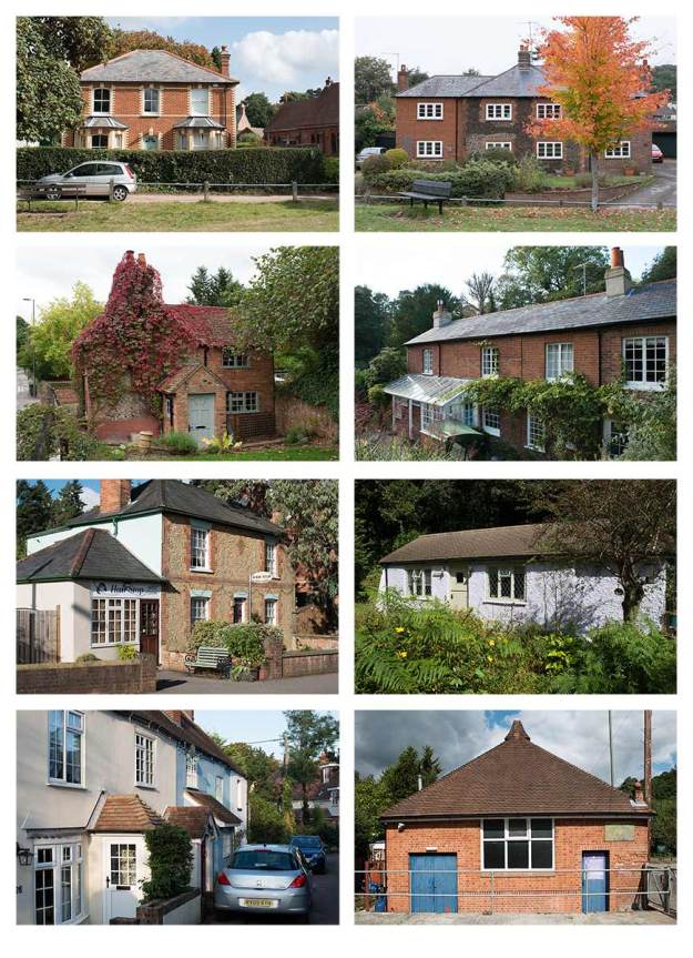
For the sake of completeness I have included the draft versions of my cottage typologies for assignment 5. My main concern is a lack of consistency in terms of light which is somewhat inevitable when the photographs are collected over an extended period of time. Initially I considered using the Becher front-on and consistent compositional approach by having discovered Brohm and liked his work I decided that this was an unnecessary and potentially counter productive approach given my subject. I am also looking for one more image as the photo that I have placed bottom right on typology 2 seems out of scale and therefore not a good fit. The building, now a scout hut and once a temperance hall has some relevance to the narrative so I would prefer to photograph it again from a different angle.

Fig. 2 Typology 1 (left) for Assignment 5

Fig. 2 Typology 1 (left) for Assignment 5

Fig. 3 Typology 2 (right) for Assignment 5

Fig. 3 Typology 2 (right) for Assignment 5

Sources

Books

(1) Brohm, Joachim. (2014) Typology 1979. First Edition Published by MACK. Mack Books (a small selection of the plates can be seen at http://www.mackbooks.co.uk/books/1028-Typology-1979.html)

(3) Badger, Gerry. (2007) The Genius of Photography: How Photography Has Changed Our Lives. London: Quadrille Publishing Limited.

Internet

The Telegraph. (2013) Joachim Brohm Q & A. The Telegraph – http://www.telegraph.co.uk/culture/photography/9949287/Joachim-Brohm-QandA.html

(2) Museum of Modern Art. (2008) Bernd and Hilla Becher: Landscape Typology. The Museum of Modern Art Exhibition Review – http://www.moma.org/visit/calendar/exhibitions/95

(4) American Suburb X (2013) Interview with Joachim Brohm – http://www.americansuburbx.com/2013/03/interview-joachim-brohm-asx-interviews-joachim-brohm-2013.html

(5) CPH Mag (2013) A Conversation with Joachim Brohm – http://cphmag.com/a-conversation-with-joachim-brohm/

(6) Squires, Russell (2014) D-Day Landings Exhibition – http://russellsquires.co.uk/d-day-landings/

Ray’s a Laugh – Richard Billingham

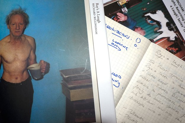
_FJ10318Rays a Laugh was published in 1996 and some critics including Charlotte Cotton believe that it redefined contemporary narrative. For reasons of price it was impractical to review the 1996 original or the 2000 paperback reprint but I was able to acquire the 2014 Errata Books on Books edition *(1) which is, in effect a high quality photocopy, but is bound as a book and includes an informative essay by Charlotte Cotton. *(2)

Rays a Laugh is fundamentally different from any other photo book that I have reviewed. It is an extended six year narrative about the artists’ chronically alcoholic father and the small dysfunctional family that surrounds him. It has a level of intimacy that could only be achieved by a family member, Julian Germain’s For Every Minute You Are Angry You lose Sixty Seconds of Happiness *(3) that I reviewed recently, is also an inmate study of one man but the photographer is a step back from the subject. in Ray’s a Laugh the father and son’s relationship is being intimately visualised. Interestingly the artist himself compares his approach to that of a wildlife photographer so he clearly believes that there is a level of objectivity and whist, after reading a number of interviews with the artist I better understand why he says that, my initial and emotional reaction is that he, the photographer, is in the picture with his family. This series might be a biography of his family but it is also an autobiography of six highly developmental years in his own life.

This work could be interpreted as being intentionally provocative but Richard Billington says that he didn’t set out to shock or offend anyone *(4), he is just endeavouring to make his work “spiritually meaningful”. I accept that this is his aim but to achieve it he had to produce emotionally charged images and it is inevitable that this level of emotional energy will generate strong reactions in its audience. Given the emotional reaction that this book is always going to generate it seems a valid approach to record my first reactions before I look more deeply. The words I first wrote down were family, personal, private, voyeuristic, revealing, ugly, sad, hopeless, violent, amateur.

The photographs are a vivid and detailed exposé of the inner workings of a poor family living in a tiny, high-rise flat in a depressed area. Ray is a tragic figure, Richard thinks that he was “some sort of mechanic” but he is long term unemployed, alcoholic and unwilling to leave the flat. He drinks, slumps lost in his thoughts, falls over, is sick, sleeps and starts the cycle again. He looks detached, absent, empty and broken. He clearly provokes strong responses from his obese wife Liz who is, more than once, shown with a balled fist threatening him. Liz likes cats, dogs, jigsaw puzzles and cigarettes. Apart from Richard there is another son who is lazy, and potentially addicted to drug taking in general (as opposed to an addiction to a specific drug) and playing video games. In hindsight Billingham says that the themes of addiction and boredom are those that interest him the most but they were not in his mind when taking the photographs.

The photographs, which were taken as studies to help Richard draw gestures for his paintings, are snapshots, often erratically framed, sometimes out of focus and mostly over saturated. This approach is part of the tension created by the series, the viewer expects snapshots to present a universally positive view of family life, with snapshots we record happy events, holidays, weddings, new babies, pets asleep on the sofa, children reaching milestones in their lives. Billingham has brought an amateur feel, a snapshot style, to the negative aspects of his family so the audience is offered documentary style subjects presented as a family album. It is an uncomfortable combination.

If we accept the premise that the buyers of art photography books, visitors to exhibitions, art critics, photography academics and students are rarely park-bench-alcoholics there is another element at play. The audience is taken into an alien world, ugly with poverty, over flowing with social tragedies such as alcoholism, unemployment, obesity and the abandonment of hope and, worse than that, it is inconveniently on our doorstep.  But, this was not created as an objective piece of social documentary, the photographer does not talk about how they set out to change public opinion by revealing democracy’s dark secret. This was created, published and promoted as art, not documentary, and this decision implies that we are being asked to judge its artistic values ahead of the social questions it raises. My point being that with Griffiths or Koudelka we look at their work in the context of social documentary so we know that we must use the photographer’s work as a way of accessing their subject, we know we are being asked to understand the argument that they are making, we also appreciate their skill and consider their work as art but it is presented as documentary first and art second.

In Rays a Laugh the artist sets out to “study the human figure in interior space” *(5), it so happened that his family, and all their baggage were the human figures and the interior space was their flat. He had no political motivation and did not approach or publish his work as social documentary, he offers us his work as art. In an interview with American Suburb X *(5) it is suggested that, if his work encourages us to consider our relationship to class and poverty, we are giving his work deeper meaning than Billingham intended. This insight to the artist’s mind makes the book harder to review, does he wish us to ignore the social implications of his work ? Does he want us to ignore the narrative of hopelessness, addiction and boredom and only see the shapes on the page?

In 1996 we were less exposed to reality TV than we are today but looking at this work in 2014 there is an obvious link to modern documentary-style reality TV that is primarily created as entertainment with documentary and art being someway down the producer’s list of objectives. In both cases art critics and politically motivated observers will ask us to see this type of work as a contribution to the debate on poverty or class or the failure of capitalism but can we see it in those terms if the artist was not politically or socially motivated? Society’s obsession with voyeurism has become a driving force behind social media where we intentionally open our lives to strangers and then complain if they look a little too closely and with our unhealthy interest in the lives of celebrity that has led to “celebrity” being a job as opposed to being the description of a select few. All these examples tend to suggest that we are voyeurs by nature, we like being peeping toms, we are dying to know what happens behind the closed doors of the poor, the unemployed, the benefit claimants, the royals, the rich and the famous.

Another reason that care has to be taken when we inject our own prejudices and agendas into this work is that, if we accept (and why wouldn’t we?) that Billingham started out looking at gesture and form and then became interested in addiction and boredom then, we are looking at themes that are not restricted within one social or economic class. We  should see the unemployed class backdrop as the stage that happened to be there and not an essential element of the themes. We are also warned by Cotton to take care in how we see the book as it is far from the dummy that was created by Julian Germain, Michael Collins (then Picture Editor of Telegraph magazine) and Richard Billingham. Collins believes that Scalo’s treatment was insensitive and, reading between the lines, exploitative. Cotton is effectively saying that many of the political and social agendas that mask Billingham’s true intent are there because the publisher reduced his work to “a prurient spectacle”.

This leads neatly to the question of exploitation. If the photographer had been from outside the family they might be perceived as being opportunistic, a voyeur, exploitive and merely creating drama from misery, and perhaps the publisher was guilty of these things. But, of all the challenging issues this work raises I find this the easiest to reconcile. There is a detached affection in these photos which are the work of a young man whose interest in nature and ambitions to be an artist appear at odds with his environment. I believe he uses his camera and sketch pad as his way of looking at and understanding a family that appear to be sliding down a slippery slope that he has stepped off or avoided ever being on. He may not be rejecting his family but his work has provided him with a screen through which to observe them, a way to translate them into something that he can understand and even use as part of the foundation of his work.

Billingham has said that very few people get beyond the subject matter and can identify the artist’s intention, which is not surprising, given, as we have seen, we are all voyeurs. We want to look at his dysfunctional, addicted and bored family. To understand this work we have to recognise that the most important piece of context is that Billingham was studying for his fine art degree throughout the time he was photographing his family. By placing a camera between himself and the family he could convert their antics into shapes, forms, colours, compositions and artistic structures so he is asking us to look beyond Ray, Liz and Jason to see the underlying patterns that he was photographing.

Sources

Books

(1) Billingham, Richard (1996) Ray’s a Laugh: Errata Edition Books on Books (2014) New York: Errata Editions

(2) Cotton, Charlotte (2014) RAL. Errata Edition Books on Books (2014) New York: Errata Editions

(3) Germain, Julian (2005) For Every Minute You Are Angry You lose Sixty Seconds of Happiness. Gottingen: Steidl MACK (Reviewed o line via a combination of Julian Germain’s web site – http://www.juliangermain.com/projects/foreveryminute.php and the MACK web site – http://www.mackbooks.co.uk/books/16-For-every-minute-you-are-angry-you-lose-sixty-seconds-of-happiness.html

Internet

(4) Billingham, Richard. Rays a Laugh. American Suburb X – http://www.americansuburbx.com/2010/07/richard-billingham-rays-laugh.html

(5) Billingham, Richard. (2007)  “Reinterpreting Unconventional Family Photographs: Returning to Richard Billingham’s ‘Ray’s a Laugh’; Series” – http://www.americansuburbx.com/2010/04/theory-reinterpreting-unconventional.html

Philip Jones Griffiths and the use of Captions, Cutlines and Other Text in Vietnam Inc.

Illegal Logging Luzon Philippines c.1989

Illegal Logging Luzon Philippines c.1989. When the Philippines Government began to carryout aerial surveys of, what they had previously thought were islands covered with virgin rain forest, they discovered than many had no trees left apart from a fringe near roads or the sea and they realised that the loggers had, over many years, denuded whole areas or islands in secret.

In an earlier post I looked at Philip Jones Griffiths as an Engaged Observer. In this post I want to focus on how he uses text to strengthen the message of his photographs and to understand better why he chose to use such extensive text.

Vietnam Inc. is a anti-war narrative recoding the relationship between the American military machine and the Vietnamese people as the war moved through a series of phases until it became a remotely controlled and conducted conflict where American servicemen neither saw their enemy nor the people they thought of as their allies. To understand why the book was published as a combination of essays, captions, cutlines and pictures it is essential to look at the context of its publication.

In an interview with Bob Dannin in 2002 Philip Jones Griffiths talks extensively about Vitenam Inc. *(2). He reveals that he went to Vietnam with the idea of creating a book, he had a publishing contract already secured, although, in the end, the publisher in question “went bust” and he had to find a new outlet. The answer to why he wanted to publish a book rather than work as a news photographer lay in his deep mistrust of the news system. He believed that to work for remote editors and organisations meant that he could not tell the story he wanted to tell, by definition his photos would be published out of context, or worse be used in the context of someone else’s story.

It is interesting that he made two visits to Vietnam as part of developing Vietnam Inc. During his first visit he travelled extensively capturing every aspect he could of the Vietnam people. He then left Vietnam and returned to base to select and edit his photographs and to start creating a layout for his book. He did this to identify the gaps in his story and he then returned to Vietnam for a year to complete the narrative.

There are three levels of text in Vietnam Inc..

Firstly there are captions. These captions are longer than the headlines we normally associate with news photos. They usually run to approximately 40 words. Jones Griffiths says that, when he first became a journalist, he was taught that captions needed to contain the 5 W’s. These are:

Who? What? Why? Where? When?

Of these the middle one, “why”, is the most important. He saw little value in capturing a photo of “yet another starving child”, other than the message that there are too many starving children this offers very little because it is de-contextualised. The important question is why is this child starving? Who is depriving him of food? What is the history of this event? Jones Griffiths argues that this vital information cannot be communicated by pictures alone. The caption is a vital component of the story, the pictures and the words must be blended together, with the words supplementing the photographs. He makes the point that the role of this text is not to explain or describe the photograph, that would be redundant, but to provide the audience with context.

The second level of text is an extension of the first, Jones Griffiths’ includes what the American’s call cutlines, extended captions, in several places in the book. These are used in exactly the same way as his captions, they provide essential context but as well as being longer the context is usually broader providing more in-depth background on larger issues.

The third level of text is his eleven essays that each cover two or more pages and act as chapter introductions to his narrative. They are his own accounts and act as explanations of the background, occurrences and consequences of specific events or groups of events. They are subjective, opinionated and forceful.

Taken as a whole Vietnam Inc. is much more than a photo book and it is the partly the text that makes it so different. Jones Griffiths was an eloquent man, strongly opinionated, a thinker and a communicator who could not work within the constraints of news driven photo journalism. He recognised that many photographers, film makers and journalists in Vitenam were frustrated by the system that edited, selected and used their output out of its original context to meet the objectives of the news organisations. The difference between him and most of the other journalists was that he found a way of controlling the context in which his work was used.

Philip Jones Griffiths uses extensive text in Vietnam Inc. because the pictures were insufficient. He knew that his audience could only understand his photographs when they were contextualised. Collectively his three types of text provide the 5 W’s but the emphasis is unquestionably upon the “why”. It doesn’t pretend to be objective or unemotional and couldn’t be anything else because he is ultimately focusing on how a whole way of life was systematically dismantled by a foreign power who didn’t and never could understand the place or its people.

Sources

Books

(1) Jones Griffiths, Phillip. (1971) Vietnam Inc. : First Published by Collier Books 1971, this edition published in 2001 and reprinted in 2011. London: Phaidon.

Internet

(2) Musarium – Interview with Philip Jones Griffiths by Bob Dannin in New York City, January 2002 – http://www.musarium.com/stories/vietnaminc/interview.html

Josef Koudelka and the Use of Captions in Wall

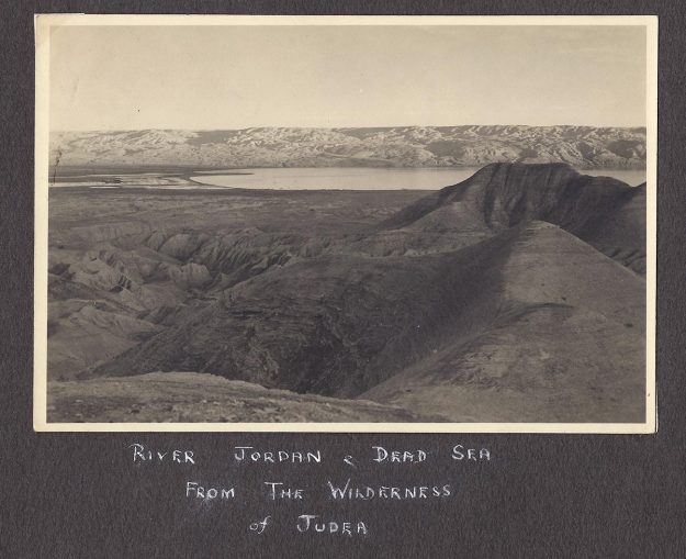
River Jordan & Red Sea from the Wilderness of Judea. Photograph by Norman Middlehurst 1944

River Jordan & Red Sea from the Wilderness of Judea. Photograph by Norman Middlehurst 1944

I cannot say at what point Koudelka decided on incorporating text into Wall. His other work has not used captions in the same way but in Wall they play a major role. Koudelka didn’t write the captions or the other blocks of text that are included within Wall, they were written by Ray Dolphin, a researcher and writer who has prepared several reports about the, so called, Separation Barrier, for the UN and who wrote Unmaking Palestine. Give his status as a leading and internationally recognised photographer we must assume that Koudelka sanctioned the book being designed in this way.

The captions are often factual. Where, how, when, and at times are quite neutral, for example the caption “Structures from the British Mandate (1922-48) and Jordanian era (1948-67) remain in the West Bank” accompanies a photograph of a derelict building. We are left to decide whether the building is from the British or Jordanian era so the caption is not acting as if it is part of a news story, it is not filling in detail or completing a story, it is not even explaining the original purpose of the structure. It is contextualising the photograph; we see a bleak landscape including a long security fence through the glassless window and damaged wall of a deserted building that we now know was built before the Israeli’s occupied this land. If we consider the gross amount of information on the page most of it is being communicated by the photograph and a small proportion comes from the caption but even when combined we are not presented with completeness. There are plenty of questions left unanswered, there is opportunity for interpretation and the audience can be drawn into the picture to consider small details and wonder how they impact the story and, neither the photograph nor the caption express a strong opinion.

However, the factual captions are frequently loaded with a political agenda. For example a photograph of another abandoned building, but this time the interior of a house, is captioned with “More than two hundred Syrian villages, including the old town of Queitra, were abandoned by their inhabitants in the 1967 Arab-Israeli War; many were later demolished by the Israeli authorities.”

Some captions express the opinions of third parties. “Most Israeli citizens attribute the lack of suicide bombings in Israel in recent years to the success of the wall in preventing infiltration from the West Bank.” We are not told in words whether Koudelka or Dolphin subscribe to this view, nor whether they believe it is justified. The accompanying photograph shows two lines of “defences”, the Wall at this point is large, dominant, ugly, medieval in texture and scale so we are left to make up our own mind as to whether this was the only or appropriate way to address, what was, a serious threat to the safety and well being of Israelis. The writer and photographer’s agenda is made reasonably clear by the choice of photograph. In other places we see the Wall as a fence or even as road blocks and this caption with those pictures would have suggested a more mild response to the threat. So, here we see the words and the pictures having a more equal relationship in terms of the amount of information or message being communicated.

And, some captions just express Dolphin’s opinion, even though it might be expressed in factual terms. “Thousands of olive tress in the West Bank have been cut down, uprooted or otherwise vandalised”. Take out the last two words and this is a factual statement, put them back and the text becomes subjective and opinionated.

To return to the question of why did the photographer want so many words in this presentation? Are his photographs not enough, would they not stand alone as a narrative of the Wall? Why deviate from the approach he used in his other work? Without the opportunity to question Koudelka or his editors there is no absolute answer to these questions but I sense that the answer lies in his history. Koudelka comes from a country that was held in thrall to the Russian empire, the USSR, he understands the sense of helplessness felt by Poles, Czechs, Hungarians, Tibetans, and many others that have been in recent times been or still are under the yoke of a militaristic and ruthless neighbour. It is likely that he saw many similarities in the relationship between the Israelis and the Palestinians and recognised in the Wall was a symbol of that domination much as the Berlin wall was a symbol of the East West divide. In the spirit of the engaged observer or concerned documentary photographer he wanted to communicate the strongest possible message and felt that his photographs alone were not enough. He adopted the fundamental principles described by Evans and added enough text to contextualise the pictures and to develop, in his audience, a depth of understanding that would emotionally and intellectually engage them.

If, as Karin Becker Ohm says, the role of the documentary photographer is “to bring the attention of the audience to the subject of his or her work and, in many cases, to pave the way for social change” then Koudelka appears to believe that we must not only see the Wall, often disturbingly beautiful in his dark tonal compositions, but fully understand its context so there is limited opportunity for his audience to miss his point. Wall is unambiguous statement and much enhanced by the text.

Sources

Books

Koudelka, Josef. (2014) Wall: Israeli and Palestinian Lanscape 2008 – 2012. New York: Aperture.

Narrative

Seeking A Simple Definition

A study of narrative in photography soon leads to a multitude of different interpretations of, what seems at first glance to be, a simple idea.

The Concise Oxford Dictionary defines narrative as an “account of connected events”, but goes on to say “in order of happening” so, whilst we might bank the idea of connectivity, the idea that narrative must be chronological is quesionable. Tate Modern Art Terms is equally clear.

“A narrative is simply a story. Narrative art is art that tells a story.”

Harold Evans, once the editor of the Sunday Times, and the author of Pictures on a Page *(1) suggests that story and narrative are interchangeable terms so, in that regard he might agree with the Tate but he quickly brings the concept of narrative being linked to an event and connectivity back into the mix. “The picture story is essentially a narrative, the record of a single event or aspect of it, or a simple chronology” He goes on to say, however, that the picture story is descriptive in nature not declarative whereas the photo essay is not restricted to a time or an event and can analyse rather than narrate.

Michael Freeman, in the Photographer’s Story, *(2) sees story telling as a “classic, essential and pure form” of photography and an integral part of creating a coherent body of work. He sees little distinction between the photo essay and the photo story but he believes that an essay implies one photographer with a single vision working in a consistent style whereas a picture story might be sourced from different photographers.

Kenneth Kobré, in Photo Journalism *(3) is certain that the photo story is chronologically sequential whereas the essay is not and is a more general study. This seems close to Evans’ definition so perhaps this is the traditional newspaper or magazine view but, as discussed later, it is just as likely that a photo story appears to be sequential through the way it is edited rather than having been photographed in the sequence in which it is presented.

Maria Short, in Context and Narrative *(4) takes a broad view arguing that narrative is a structure that enables an audience to follow the artist’s idea or to grasp a concept and it is this thought that helps us to move away from narrative being linked to an “event”. Greg Battye *(5) appears to agree and suggests that narrative is way of structuring the “construction, arrangement, organisation, transmission and understanding of information” and whilst this is a rather cumbersome definition it has the advantage of removing any restrictions based on a place or an event but still infers connectivity.

My summary is:

  • Narrative is story telling, fact or fiction.
  • It is a structure for communicating an idea.
  • Connectivity or an continuant subject is an essential ingredient.
  • Time will, in some way be involved, but the story might be linear, non linear, cyclical or only linked to time in the sense that there was something before and there is something after.

The Characteristics of Photographic Narrative

Having somewhat tentatively established what narrative is it logical to next try and understand what constitutes a successful narrative. Having looked at a number of different viewpoints and considered the commonalities and the exceptions my chosen starting point is a lovely thought expressed by Tod Papageogre *(6) who is quoted by David Campbell *(7):

“If your pictures aren’t good enough, you aren’t reading enough”

This adaptation of Robert Capa’s axiom “If your pictures aren’t good enough, you aren’t close enough” speaks to a theme that I have found prevalent amongst respected, more traditional and established photo journalists such as Stuart Freedman *(8) who believe that too much contemporary narrative is based on limited research and/or understanding of the subject. He argues that:

“Story telling in photography must be vigorous in thought and research”

The idea being that the photographer must understand the context of an issue or an event or a situation to be able to tell its story and this knowledge can only come as the result of research unless an appropriate level of knowledge has been acquired by more organic means as might be case for an essay about a close family member.

In some cases the event or the issue might, in fact, come first and be followed by research to gain an in-depth understanding or the subject may arise from researching a broader topic so my second characteristic is entwined with the first. David Campbell puts it quite simply:

“The most important thing to ask is what is the story I want to tell ?”

This is especially appropriate because it is expressed as a personal question; the story I want to tell, not the story someone else has asked for, the story that is expected, the story that people want to hear. This principle is at the heart of Phillip Jones Griffiths’ highly acclaimed book Vietnam Inc. *(9) which I discussed in An Engaged Observer. Jones Griffiths, who was president of Magnum for five years, believed that his role was to take the pictures that he thought were important, he went as far as to say that it is an “obscene concept” to give people what they want *(10). Vietnam Inc. is a series of anti-war photographs taken at a time when the American people generally supported the war and when the American media didn’t want to publish the dark side of what the US was doing in South East Asia. As a result Jones Griffiths’ images were unsaleable as news photos but when published as a book they played a significant role in changing public opinion in America.

Karin Becker Ohrn, as quoted by Maria Short *(4),  defines social documentary photography, which often uses narrative structures, as setting out to “bring the attention of an audience to his or her work and, in many cases to pave the way for social change.” In this context the concerned photography of Jones Griffiths not only meets the first criteria but can be credited by accelerating social change.

This debate is as current now as it was in 1970. Stuart Freeman believes that if the photo journalist is not intending to bring about change within what he calls the “humanist documentary tradition” they are merely voyeurs.  Like Jones Griffiths he argues that the photographer must be telling the story they want to tell and not illustrating someone else’s story. So, we can add personal engagement and:

A desire to tell a story, with an aim to draw attention or to pave the way for change.

Once we have a story, the desire, enough knowledge of the subject and a reason to tell it we need a way of constructing the story and narrative is that structure. There is plenty of advice available on structuring a narrative but most of it can be summarised as having a beginning, a middle and an end. A piece of string has all those things and very few pieces of string are interesting so it appears necessary to look a little deeper.

The first rule of structure is connectivity or a continuity of subject; without connectivity the audience only sees isolated and individual pictures. In a narrative the pictures are building blocks that the photographer is linking and combining into a story; so, as David Campbell says:

“The photographer is making the relationship between event – issue – story”

He refers to Alan Feldman who argues that we don’t find an event with its meaning fully formed, it only becomes understood as an event through narrative. Historical events from the industrial revolution to the swinging sixties weren’t  seen as events by the people involved, they became events through histories and stories, the narratives that told us about them. If we follow this thought to its logical conclusion the narrator is part of the process of defining an event and forming its meaning.

Regardless of how comprehensive the narrative sets out to be it can never been compete, it will always be based on the inclusion and exclusion of subject matter at the point of capture and again at the point of editing. This selectivity and editing is fundamental to the process of construction and the skill of the editor is to select a series of images that each contribute to the story line and that build upon one another as the story unfolds. David Campbell points out that:

“Everything within a narrative has a particular function [ ] nothing is superfluous”

The scale of the photo essay will always be limited. This limit might be self imposed or established as part of a brief, the size of an exhibition or the economic constraints of publishing but, in every case, each image within a narrative, a story or an essay must have a clear purpose and support the telling of the story. The penalty for ignoring this rule is likely to result in being unable to present the essay to its intended audience and thereby being unable to drawn attention to the issue or the event. As was the case when W. Eugene Smith refused to allow editors to select too small a set from his Pittsburg collection. A stance that delayed its publication for decades. Nearly sixty years after they were taken the Sam Stephenson curated exhibition Dream Street *(12) showed, depending on venue, between 85 and 190 prints from the the 11,000 negatives Smith collected. Smith saw Pittsburg as the most important work of his life yet its publication was delayed so far beyond the right moment it decayed from being a powerful and current narrative of an industrial city to being an aesthetically pleasing historical document.

Alan Feldman *(10) is quoted by David Campbell as saying:

“Narrative is the organisation of events into a system”

This builds on the idea of working within constraints by highlighting that the  narrative needs organisation because it is simply the presentation of information, it must systematic, planned and directed. I am increasingly appreciating the power of a series of photographs where the photographer leads the audience along the path that he or she thinks best communicates the underlying idea. This idea might be broad and loosely defined such as the sweeping portrait of Israel presented by Stephen Shore in From Galilee to the Negrev *(18) or the tighter, more focussed, narrowly constrained essay about the same place by Josef Koudelka in Wall *(17). There is little or no similarity in terms of style or theme but In both cases there is an identifiable structure to the presentation, the photos weren’t shuffled before being published, they were carefully arranged to catch our attention, hold our attention and to ask us to emotionally respond to the artists’ perspective. They are organised.

Koudelka is a story teller but not by using progressional images, we do not see the wall being mapped, then designed, then built before seeing its impact on the environment and population. It is there, in all its ugliness, in the very first plate and it is there on the last plate. In between, we see it snake across the landscape, we see it as a wire fence in the mist, we see it as a road block and we see it as a gate. He has documented its every aspect showing it in the broadest context of the rural and urban landscape. It is a model of how to present a large idea and is highly effective.

Stephen Shore takes a different approach, his narrative in Galilee to Negrev, is a broad, documentary sweep of the land. As I described in my review of the book there is a pattern in that he starts by putting Israel into the context of its ancient history before introducing the vast and untamed wilderness of the land, closing in to show man’s impact on the landscape, moving closer still to see the ugly urbanisation and then on to investigating ordinary people and the trivia of their ordinary lives. Because the book is ultimately a travelogue that spans the length and breath of this sliver of a country this sequence is generally repeated as Shore investigates each of the four main regions. I felt changed by Shore’s Galilee to Negrev, I was moved by Wall.

The form of construction is multi-various. It may be simple, linear, chronologically organised or, more likely, appear to be those things once the editor has finished. W. Eugene Smith’s Country Doctor is often held up as the definitive photo story. It has all the appearances of a linear “day in the life of” story but it is well documented that this is a highly edited series and there is little or no likelihood that the pictures were taken in the sequence in which they were published. Even if the emergency amputation had occurred five minutes after Smith arrived to start the project his editor would never have shown it as the opening shot because it would appear out of context despite being “correctly” positioned. This shows that photo stories not only have an external context they need to be constructed so that internal context is developed to enable the individual pictures to be understood.

The construction could be non-linear with flash-backs or links to parallel stories, which is part of the beauty of Julian Germain’s For Every Minute You Are Angry You lose Sixty Seconds of Happiness *(11) that uses the subject’s own photo albums to tell the  “back story” in parallel with Germain’s images telling the “present” story. The way that Germain weaves these two stories together, whilst giving equal weight to the importance of both timelines, might be viewed as a structural technique, which of course it is, but it is also the soul of the narrative. We understand the subject by simultaneously seeing his past and his present and through this learn why he is content and fulfilled. Every Minute represents another characteristic of a wide body of narrative, described by Maitland Edey, once an Editor at Life Magazine , as:

“Great stories have to do with people; with human dilemmas, with human challenges, with human suffering”

Every Minute is essentially about one man, although it could be argued that it is also an essay about the common human condition of a person surviving their life partner. When, as in that case, the structure of the narrative is based, not on an independent event or on specific timeline but on a person or a place or on the activities of a particular group of people or a social trend  we see more complex constructions and more challenging constructions as, without a timeline, the path through the story must use other linkages to hold the audience’s attention. There needs to be a flow, a continuity and internal connectivity so that one image leads from its predecessor and onto its successor.

Another example of this type of narrative would be Anna Fox’s Resort 1 *(13) which I looked at earlier in the course. Resort 1 tells the story of families holidaying at Butlin’s in Bognor Regis, so in that sense it is a story about a place and the people within it but through her photographic style and choice of subject it is also a social story about what people do, how they act, what they wear and how they relate to each other and to the theatrical setting of a holiday camp. In short it tells us much more about the times than just what Butlin’s looks like. Martin Parr’s Last Resort  *(14) would be another example that tells us simultaneously about place, people and society or social trends. In both cases there are multiple linkages being used, subject matter is often grouped together, colours carry over from one image to the next and the sub-plots are changed by punctuating the series with different colour sets or types of subject, the sequence is carefully planned but they are not progressional in terms of time or subject. Consistent style including, lighting, framing, composition, mood and repeating vantage points is the glue that holds the narrative together.

Each of the above examples are quite traditional and their style pre-dates the internet age. This does not lessen their effectiveness and it is interesting to note that W. Eugene Smith’s photographs are less dated in terms of subject and style than the words that accompany them. I have a collection of Life Magazine photographs and this is true of many of them. The photos are usually still engaging but the captions and accompanying text often seems naive, condescending and superficial, but this is a digression. To complete my look at narrative forms I want to include two pieces that embrace current technology.

Chris Steele Perkins’ study of the effect of the Tsunami that hit the coast of Japan in 2010 is published, on-line as Tsunami Streetwalk 1 and 2 *(15) and which I looked at in some detail in an earlier post. Amongst the same set of Magnum  “Inmotion” essays is a contribution by Bruce Gilden, Foreclosures *(16). In Foreclosures Gilden tells the story of the major social crisis caused by the sub-prime mortgage catastrophe that kicked off the Northern Hemisphere’s financial crisis that we are only now limping out of. This is a huge story with multiple beginnings and no clear ending as yet so it might still be impossible to tell. Gilden resolves this by focusing in on a single place and a finite group of people but by telling this tiny piece of the story he, in effect, tells the whole story. He is using Las Vegas as a metaphor for the near collapse of the global banking system. The fact that it was a “near” collapse is irrelevant to the people in his essay who live in the “foreclosure capital of America” with one in sixty homes being foreclosed in Las Vegas and Reno (or in English repossessed) .

The way Gilden tells the story is current and contemporary. He combines simple black and white photographs, contact sheets, animation, voice overs, music and appropriation to create an on-line slide show which, in just under five minutes, tells the story in a powerful and effective manner.

Tsunami Streetwalk by Chris Steele Perkins is equally contemporary but uses less techniques. His approach is to combine two rolling threads of photos that, together, form a vast panorama of a single street with straight after the Tsunami at the top and seven months later below so the audience can make a direct comparison of, what used to be, houses and businesses in two different cities. To support the rolling photos he uses scrolling captions and haunting music.

These two approaches show that the photo story or essay that, many say, started with Life Magazine in the 1950’s is still alive and well sixty years later having evolved from its magazine origins into photo books and, even more recently, on–line media. However, the fundamentals of narrative are still the same:

  • A story worth telling;
  • Research leading to knowledge and understanding;
  • An engaged photographer who has invested themselves in the narrative;
  • A construction that creates a story from an issue out of an event;
  • And, the organisation of information into a connected and coherent structure.

I have a closing thought.

All of the above fails if the quality of execution is poor. To complete the Stuart Freedman quote I used earlier:

“Story telling in photography must be as vigorous in thought and research as it is beautiful in construction and execution.”

We are bombarded with thousands of images every day on social media, news programmes, newspapers, film, TV drama, advertising hoardings. For the photographer’s story to be “heard” over all this background noise his or her images better be good.

So, therein lies the challenge for assignment 5.

Sources

Books

(1) Evans, Harold. (1979) Pictures on a Page: Photo-journalism, Graphics and Picture Editing. London: Book Club Associates.

(2) Freeman, (2012) The Photographer’s Story: The Art of Visual Narrative (Kindle Edition). Lewes: Ilex Press.

(3) Kobré, Kenneth (1996) Photo Journalism: The Professional Approach, 3rd Edition. Boston: Focal Press

(4) Short, Maria (2011) Context and Narrative. Lausanne: AVA Publishing.

(5) Battye, Greg (2014) Photography, Narrative, Time: Imaging our Forensic Imagination- Kindle Edition. Bristol: Intellect

(9) Jones Griffiths, Phillip. (1971) Vietnam Inc. : First Published by Collier Books 1971, this edition published in 2001 and reprinted in 2011. London: Phaidon.

(11) Germain, Julian (2005) For Every Minute You Are Angry You lose Sixty Seconds of Happiness. Gottingen: Steidl MACK (Reviewed o line via a combination of Julian Germain’s web site – http://www.juliangermain.com/projects/foreveryminute.php and the MACK web site – http://www.mackbooks.co.uk/books/16-For-every-minute-you-are-angry-you-lose-sixty-seconds-of-happiness.html

(13) Fox, Anna (2013) Resort 1″ Butlin’s Bognor Regis. London: Thames and Hudson

(14) Parr, Martin (2008) The Last Resort: Photographs of New Brighton. Stockport: Dewi Lewis

(17) Koudelka, Josef. (2013) Wall: Israeli and Palestinian Landscapes 2008 – 2012. New York: Aperture.

(18) Shore, Stephen. (2014) From Galilee to the Negev . New York: Phaidon Press.

Internet

(6) Foto8. Mark Duden  Interview with Tod Papageorge – http://www.foto8.com/live/tod-papageorge-interview/

(7) Campbell, David. (2010) Photography and narrative: What is involved in telling a story? – http://www.david-campbell.org/2010/11/18/photography-and-narrative/

(7) Campbell, David. Official Website – http://www.david-campbell.org

(7) Soundcloud, recorded by Matt Johnston. David Campbell – Narrative, Power and Responsibility – https://soundcloud.com/mattjohnston/david-campbell

(8) Freedman, Stuart. (2010) Ethics and Photojournalism – http://www.epuk.org/The-Curve/952/ethics-and-photojournalism

(8) Freedman, Stuart – Stuart Freedman Blog – Examples of Photo Narratives – http://www.stuartfreedman.com/blog/

(9) Photo Histories (August 2014) – Philip Jones Griffiths – http://www.photohistories.com/interviews/23/philip-jones-griffiths

(10) Feldman, Allen. (1991) Formations of Violence: the Narrative of the Body and Political Terror in Northern Ireland. Chicago: The University of Chicago Press. – http://books.google.co.uk/books?id=sVe1hmsR8J8C&printsec=frontcover&dq=Formations+of+Violence&source=bl&ots=ZNquSTkoCz&sig=pkZCSyUcUrZSG6eUkHpCBwPSljg&hl=en&ei=UTrlTPC8OoaXhQe6j7DADA&sa=X&oi=book_result&ct=result&resnum=3&ved=0CDgQ6AEwAg#v=onepage&q&f=false

(12) Carnegie Magazine – Carnegie Museums of Pittsburg – W. Eugene Smith and the Pittsburg project. An exhibition curated by Sam Stephenson

(15) Steel-Perkins, Chris. (2011) Tsunami Streetwalk 1 Kesennuma. Magnum Inmotion – http://inmotion.magnumphotos.com/essay/http://inmotion.magnumphotos.com/essay/tsunami-streetwalk-1-kesennuma 

(16) Gilden, Bruce. (2012) Foreclosures: Las vagas and Reno. Magnum In Motion – http://inmotion.magnumphotos.com/essay/foreclosures-las-vegas-reno


Philip Jones Griffiths – An Engaged Observer

Bringing Home the Spoils from a Manila Rubbish Dump 1990

Bringing Home the Spoils from a Manila Rubbish Dump 1990

My research on narrative has generated many disparate leads so I’ve decided to document my research on individual photographers and narrative series before trying to summarise my overall thoughts in a later post.

This post, to use Stuart Freedman’s *(1) phrase, is about “photo journalism as a mechanism for story telling” and about a photographer, Philip Jones Griffiths, who the Getty Museum included in a group of what they called Engaged Observers *(2) and who Magnum would call Concerned Photographers. The Getty grouping is a little arbitrary but the work of these practitioners is part of a common thread that runs through contemporary narrative photography that is initially captured or subsequently published in the context of photo journalism. These photographers have identified so closely with their subjects, become so totally absorbed in their projects and become so involved with the narrative that they have become part of the story they set out to tell. The Getty Museum also included W. Eugene Smith and Aileen M Smith in the same grouping but I have already discussed their work in WW2 to Minamato.

Harold Evans *(3) argues that a picture or photo essay is not confined to a single event or even by time, it addresses a broad subject and argues and analyses more than it narrates. It sets out to make a point. I have selected Jones Griffiths and the Smiths because each have produced at least one major work that sets out to fundamentally change the view about an important subject. Maria Short, in Context and Narrative *(4), quotes Karin Becker Ohrn as defining documentary photography in Dorothea Lange and the Documentary Tradition as:

“The Photographer’s goal was to bring the attention of the audience to the subject of his or her work and, in many cases, to pave the way for social change.”

This definition would have found favour with Philip Jones Griffiths who believed that his role as a concerned photographer and photo journalist was to “draw attention” *(5). Whilst holding the Presidency of Magnum in the 1980s he promoted the philosophy that, because of the institutional status the agency enjoyed, it had a responsibility not to give people what they wanted to see, but what the Magnum photographers wanted them to see. He believed that Magnum had survived because its photo journalists had something to say and who said it with independence and integrity *(5). But nearing the end of his life in 2008 he was deeply concerned that Magnum and the world of photo journalism in general was “dumbing down” partly because the audience was swamped with so many images from every imaginable source that the powerful and important images were losing their effect and partly because professional photographers had become “addicted to triviality”. This later quote might have been specifically directed at Martin Parr whose membership of Magnum he bitterly opposed.

This question of whether photo journalism and documentary photography has been dumbed down is a theme picked up by Stuart Freedman *(1). His concern is that too many photo journalists are “shooting visual clichés of suffering because it sells and advances their careers.” He finds common ground with the Jones Griffiths’ philosophy when he argues that the true photo journalist must look at the stories that they want to make not the stories that editors ask for otherwise they are merely providing pictures for someone else’s stories. So, we can establish one clear attribute of photo journalism, at least in the eyes of these two recognised practitioners, the photo journalist is telling the story not illustrating it.

Freedman discusses a second attribute that David Campbell quotes Tod Pappageorge summarising as:

“if your photographs aren’t good enough you aren”t reading enough” *(6).

This speaks of the photographer’s depth of understanding. The argument that superficial research leads to superficial photographs and that to tell a story the photographer must have acquired or developed an intimate understanding of their subject. Many established photo journalists express their concern that too many young photographers are chasing blockbuster, award winning, single images before quickly moving on to their next subject. Freedman calls for story telling to be “as rigourous in thought and research as it is beautiful in construction and execution” *(1) and, whilst he said this in the context of photo journalism, it is equally relevant to documentary photography and any other form of serious narrative.

As discussed elsewhere the power of Julian Germain’s For Every Minute you are Angry you lose Sixty Seconds of Happiness lies in his total engagement with the subject. In that instance his deep knowledge came from investing time over many years because he enjoyed his subject’s company and not because he saw him as a project. Josef Koudelka’s Wall is moving because, having been born in a place that ended up behind the Iron Curtain, he instinctively understands the emotional impact of arbitrarily imposing a divisive structure on a landscape. As I will come onto discussing, Jones Griffiths’ Vietnam Inc. is considered to be one of the most important books about that war or war in general because he went native and left many other war photographers in the bars of Saigon waiting for the next US Army briefing. He became engaged with the Vietnamese people whom he saw had much in common with the Welsh and through this engagement over an extended period of time he grew to understand them and felt empowered to tell their story. Robert Capa said “Like the people you shoot and let them know it”.

This can all be summarised by saying great documentary or journalistic narrative has three key attributes:

  • The photo journalist is telling a story that they believe is worth telling;
  • The story will be based on an in-depth understanding of the subject;
  • It will be beautiful in construction and execution.

These principles set a high standard to aspire to but Philip Jones Griffiths, whose work is discussed below, has been part of the history of the concerned photography movement that set the bar at this olympic height. However, by focussing on the greats of the industry there is a risk that we measure the importance of a story on a national or global scale and this would be a mistake. Julian Germain in Sixty Seconds and more recently in Classroom Portraits, Richard Billingham in Ray’s a Laugh, Martin Parr in The Last Resort and Think of England all show that powerful and important narrative can be created close to, or even in the, home.

Philip Jones Griffiths – Vietnam Inc.

In 1966 Philip Jones Griffiths decided to focus all his energy on a single grand project; in an interview for Photo Histories * (5) he said that he more or less decided that he needed to “get passionate” about something. The something was the Vietnam war and the end result was Vietnam Inc. The project took three years of in-country journalism in which time Jones Griffiths moved further and further away from reporting the war as the Americans with white hats defending democracy from the evil of communism. This meant that Magnum could not sell his photographs to the American media but, once published in Vietnam Inc., they became an important factor in changing opinions both at home in the USA and abroad. In its obituary for Jones Griffiths The Independent newspaper *(7) is one of many reviews to describe Vietnam Inc. as the single most important book about the Vietnam War, the most important photo book of the 1970s and goes on to argue that its publication changed photo journalism for ever.

The significant change was that it placed the photographer’s own experiences at the centre of the story, the photographs are highly subjective because of his choice of subject, he is expressing his own anguish by concentrating on the impact of the war on, not just on the Vietnamese but also on the young American soldiers who seem to be blundering around in an alien land fighting people and a political system they don’t understand and defending an American backed regime that is equally complex and baffling.

This book is a broad, sweeping narrative with many sub-themes within its overriding anti-war message. Jones Griffiths sent pithy and acerbic captions back to Magnum along with his photos and together they create a complex and detailed narrative of the war. Even now, nearly 40 years after the war ended, it is easy to understand why this book changed attitudes in America because it humanises the conflict. We are introduced to rural Vietnam, to pretty women farmers, children with the family buffalo (South East Asia’s tractor), families in their homes, fishermen on their boats, but these images of a rural idyll are punctuated with photos of shell holes and dead Vietcong. The American military is shown imposed on the landscape, heavily laden soldiers wading past farmers in their paddy fields, strangers in a strange land. We see  homesick, American soldiers holding Vietnamese children and talking to villagers but we are made aware that the context was not wholly philanthropical and often part of an attempt to Americanise the locals by introducing them to Disney films, toilet seats and filter tipped cigarettes.

I expected to see dark photos, similar perhaps to Josef Koudelka or Don McCullin, but Jones Griffiths has given us beautifully composed, bright prints to the extent that some could be taken out of context and used in a black and white Lonely Planet travel guide. He presumably didn’t feel that he had to hammer home the message with dark gritty images, he used all his artistic flair to present us with the beauty of the land and its people, the handsome young marines and the ugly scars and terrible effects of war. Jones Griffiths was a political being and this is a political book, he wants us to be shocked and to question what are we seeing and why is it happening ? How can an American marine point his automatic rifle at a mother holding her beautiful baby who is staring at the camera with solemn eyes like a miniature Chinese Emperor? What chain of events led the marine to this village and how had he reached the point where he could casually allow his gun to point at these people in front of a British journalist. Even though his stance is non aggressive I found this casual disregard for basic firearms safety as deeply concerning as the more horrific pictures because it talks of the man’s state of mind where things he could not image doing in Missouri or California or on the firing range are acceptable behaviour in Vietnam.

Phillip Jones Griffiths made no secret of his views and his captions are often highly loaded and critical. After its publication he talked extensively about his motives and the misguided policies of the American Government. He wanted the Americans to ask why their politicians thought it made sense to fight alongside people whose motives, culture and language they didn’t understand against an enemy who was equally enigmatic in an alien landscape on the other side of the world. This message is the overriding theme of the photographs, in simple terms, what are we doing here?

I chose Philip Jones Griffiths as an example of the engaged observer or concerned photographer for a number of reasons. Firstly because, as I said in my introduction, he became part of the story he was telling, secondly because Vietnam Inc. is the very definition of making photographs with the intent of achieving social or political change and lastly because although he is best remembered for his grand project he showed in his work on the Philippines *(9) and many other places that his empathy with distressed people came from his deeply held personal convictions and not because he could spot a global headline.

Sources

Books

(3) Evans, Harold. (1979) Pictures on a Page: Photo-journalism, Graphics and Picture Editing. London: Book Club Associates.

(4) Short, Maria. (2011) Context and Narrative. Lausanne: AVa Publishing.

(8) Jones Griffiths, Phillip. (1971) Vietnam Inc. : First Published by Collier Books 1971, this edition published in 2001 and reprinted in 2011. London: Phaidon.

Internet

(1) Freedman, Stuart. (2010) Ethics and Photojournalism – http://www.epuk.org/The-Curve/952/ethics-and-photojournalism

(2) Getty Museum – Engaged Observers: Documentary Photography Since the Sixties, Photographic Essays – http://www.getty.edu/news/press/engaged_observers/photographic_essays.pdf

(5) Photo Histories (August 2014) – Philip Jones Griffiths – http://www.photohistories.com/interviews/23/philip-jones-griffiths

(6) Campbell, David. (2010) Photography and narrative: What is involved in telling a story? – http://www.david-campbell.org/2010/11/18/photography-and-narrative/

(7) The Independent (March 2008 ) Philip Jones Griffiths: Photographer whose Vietnam images changed photojournalism – http://www.independent.co.uk/news/obituaries/philip-jones-griffiths-photographer-whose-vietnam-images-changed-photojournalism-799333.html

(9) Jones Griffiths, Philip – Garbage dump in the Philippines.1996 – http://www.magnumphotos.com/C.aspx?VP3=SearchResult&ALID=2S5RYDYUP9O7

(8) Jones. Griffiths, Philip – Magnum – https://www.magnumphotos.com/C.aspx?VP3=SearchResult&ALID=2K7O3RP3N9U


Chris Steele Perkins Tsunami Streetwalk 1 and 2

My research on narrative has generated many disparate leads so I’ve decided to document my research on individual photographers and narrative series before trying to summarise my overall thoughts in a later post.

Chris Steel Perkins is, perhaps, best know for The Teds (1979), a study of that very British group spawned by the early rock and roll years whom I remember well from my childhood and that is still an active movement. Since joining Magnum his work has tended to focus on the third world and I looked at some of his work when researching reflections for assignment 3.

Narrative in photography is a broad subject and can be achieved from a single image, a structured magazine style photo story such as W. Eugene Smith’s Country Doctor or through an extensive collection of photos of one place such as Josef Koudelka’s Wall. In his two tsunami series *(1) Chris Steele Perkins offers a quite different approach.

Tsunami Streetwalk 1, Kesennuma and Tsunami Streetwalk 2, Kamaishi * (1) can both be viewed in the essays section of the Magnum Inmotion site which showcases its members’ multi-media work.

These two essays are very simple in concept. Kesennuma and Kamaishi are two of the many Japanese coastal cities that were devasted by the 2011 Tsunami. There is some startling footage on the BBC website of the wave passing through Kesennuma. Initially there is a steady flow of water moving empty cars, then it swells to a strong flowing river carrying containers and lorries and finally houses. It reminds us of the unrelenting power of this destructive wave.

For Streetwalk 1 Steele Perkins visited Kesennuma 23 days after the disaster and took the approach of selecting a single. quite ordinary, road, Nainowaki Street, where he took a photograph of the remains of the properties every 20 paces.

He returned to the same road seven months later and took exactly the same photographs. For each visit he has joined the photos together into a rolling strip and placed the later set beneath the initial set so the properties perfectly align and we can see the direct comparisons.

The message is simple, there was unimaginable destruction in this city and seven months after the  event there has been no re-building, the place is still devastated, it is just a little neater with some of the worst of the debris having been removed. Any one of these continuum  is powerful enough to bring home the message that nothing was left standing. A long road has been flattened, every home and business has gone but by bringing time, an essential aspect of narrative, into the presentation he also shows that the scale of the damage was so great that, after seven months, minimal progress has been made.

The third layer of information is provided by rolling captions that detail basic statistics, 15,369 homes destroyed, 1,030 people dead, 3,380 people still missing in this city alone. 1,054,610 homes destroyed and 15,845 dead across the 250 miles of coastline that was affected. One of the factors that might be lost on many viewers is that Japan is a coastal country, the centres of these narrow islands are mostly mountainous and the vast majority of the population lives on the coast so whilst the distance along the Japanese coast is approximately the same as the distance from Plymouth to Dover the impact was more like Devon, Dorset, Hampshire, Sussex and Kent being flattened.

The sequence of photos is supported by hauntingly beautiful Japanese flute music.

Steele Perkins opens this presentation by asking “How can you convey the scale of destruction visited upon japan by the earthquake and tsunami that hit Japan on March 11th 2011?”

What follows has a sense of being a diary, the photographer very directly involves himself in the narrative by saying “I walked down Nainowaki Street ……..” he is intentionally connecting us to the event through his eyes. “a wasteland of shattered homes and businesses and damaged lives.”

After using text to ensure the viewer understands the context he remains silent for nearly half the rolling presentation to allow the visual messages to sink in before starting to provide the cold facts I referred to above. Around the middle of the sequence there is a single image which affected me more than any other. A man is standing next to his parked car, we only see his back but it is possible to guess that his arms are crossed, a defensive gesture, and he is staring at an empty plot. We are not told whether it was his home or his business or a property that belonged to someone close to him, perhaps someone lost in the disaster. Asking the viewer to invest their imagination into the work is another important facet of narrative. A sophisticated audience does not need or want all the answers, they are capable of asking their own questions and drawing their own conclusions. The man by his white mini is a sad figure, One hopes that he only lost a building and is not thinking of someone he loves and lost but he reminds us that this is not a story of damaged real estate, it is a story about badly damaged lives.

The story ends by telling us that it is estimated that it will take ten years for the city to return to normal.

The treatment of the other city, Kamaishi, is much the same.

This is a narrative approach that might seem to have very limited application but it is in fact a developed form of “then and now”, a format much loved by a certain type of local history book and the whole basis of the work of men such as Camilo José Vergara whose Tracking Time projects *(2)  document buildings, streets and neighbourhoods by taking photos from the same positions over more than 40 years.

Greg Battye, in his book Photography Narrative Time *(3), refers to Werner Wolf’s “multifactorial and gradable sliding scale of narrativity.” Wolf defines three cultural functions for narrativity:

  • “enables a conscious perception of time”
  • “provides a possibility of accounting for the flux of experience in a meaningful way”
  • “the basis for communicating, representing and storing memorable sequences of experience”

The “then and now” approach to narrative appears to deliver against each of these criteria. Steele Perkins uses time in three ways:

  • the presentation using the extended panorama of a long street creates a sense of the time it took the photographer to walk its length;
  • he shows the then and now separated by seven months;
  • and, he foresees the future, a much longer period of time that it will take to rebuild this city.

Sources

Books

(3) Battye, Greg. (2014) Photography Narrative Time: Imaging our Forensic Imagination. Kindle Edition Bristol: Intellect.

Internet

(1) Steel-Perkins, Chris. (2011) Tsunami Streetwalk 1 Kesennuma. Magnum Inmotion – http://inmotion.magnumphotos.com/essays

(2) Vergara, Camilo José. Tracking Time – http://www.camilojosevergara.com


W. Eugene Smith – WW2 to Minamata

Protest in Tokyo 1988

Protest in Tokyo 1988

My research on narrative has generated many disparate leads so I’ve decided to document my research on individual photographers and narrative series before trying to summarise my overall thoughts in a later post.

W. Eugene Smith’s approach to photography was, to a great extent,  a product of the Second World War. Staring out on a local newspaper in 1936 he had photographed the environmental devastation of the “Dust Bowl”, the series of droughts that severely impacted the American Midwest during The Great Depression *(1) but he rose to prominence as a war photographer covering the Pacific War including the invasions of Saipan, Guam and Okinawa. His photos of US Marines in the Pacific are reminiscent of Don McCullin’s *(3) and Philip Jones Griffiths’ *(4) much later Vietnam War photos having the same sense of the photographer being connected to the subject, not just being an impartial observer. Having read Don McCullin’s autobiography Unreasonable Behaviour *(5) it is easy to understand how close proximity to modern, close combat warfare in a harsh, unforgiving terrain would change a person’s whole outlook on life. McCullin says ” I don’t know if it taught me anything beyond a new appreciation of how terrible war can be. It certainly made me ashamed of what human begins are capable of doing to each other.”

Smith was severely injured at Okinawa and took two years to recover from his wounds. The first photograph he is said to have developed after recovering is of his two children walking hand in hand from a dark wood into sunshine The Walk to Paradise Gardens *(9). In other circumstances one might view this as a tired cliché but in the context of his wartime experiences and his recovery from wounds it is a powerful metaphor for his own state of mind, putting the darkness behind him and heading into a brighter future.

In The Genius of Photography *(6) Gerry Badger puts Smith’s post war work into the context of two opposing ideologies that prevailed in post war Europe, on one hand the reaction to the horror of a six year war was to withdraw into one’s self and soley take responsibility for one’s own actions; Badger labels this as the negative response. On the other hand the positive response was the humanist approach of heightened social concern, a response that Cartier-Bresson, Capa, W. Eugene Smith and their fellow Magnum photographers exemplify. This became known as the “concerned photographer” approach.

Smith epitomised this approach, an obsessive artist who was notoriously difficult to work with, who progressed from sentimental narratives with political undertones about “good people” such as Country Doctor (1948) *(7)  and Nurse Midwife (1951) to an in-depth study of Pittsburg (1955 to 1957) and eventually to Minamata (1975). This was a move from sentimental observer to involved crusader and the changes in his narrative style are informative.

Country Doctor is one of the best known examples of the classic Life Magazine photo story. It is considered in depth in several sources including by Michael Freeman in The Photographer’s Story *(8). Freeman says that Country Doctor is widely regraded as the first of what Life Magazine would call a “Photo Essay”, a presentation style made possible, perhaps desirable and essential by the large page, illustrated magazines that had evolved in the 1930s.

Smith and his, long suffering, photo editor, created an approach and a final layout that would become something of a template for the photo essay.

  • The opening page is a strong, scene setting shot of the doctor on his rural rounds – (1 x Photo)
  • The next four double page spreads are stories within the story, sub-plots, describing four different aspects of the doctor’s working life
    • “He must specialise in a dozen different fields” (9 x photos),
    • “An accident interrupts his leisure” (5 x photos),
    • “An old man dies at night” (3 x photos),
    • “He sets a badly dislocated elbow and amputates a gangrenous leg” (7 x photos)
  • The closing double page spread is spilt between,
    • left, a closing statement and three images, “Community absorbs most of his time” (3 x photos)
    • and, right, a strong closing shot of a tired doctor drinking a coffee and smoking a cigarette. (1 x photo)
  • 29 photos in total

Each double page spread is different and the photo sizes and aspects are varied within the pages and the overall story. Life Magazine found a photogenic subject and setting and Smith had no qualms about setting up individual shots. Smith said that “The majority of photographic stories require a certain amount of setting up, re-arranging and stage direction to bring pictorial and editorial coherency to pictures ….. it is done for the purpose of a better translation of the spirit of the actuality, it is completely ethical.”* (8). This statement and the fact that we know that there was a significant amount of stage direction in capturing Country Doctor seems to set the photo essay or photo story aside from what we consider to be photo journalism. Smith very much saw himself as an artist and admitted to being “constantly torn between the attitude of the conscientious journalist who is a recorder and interpreter of the facts and of the creative artist who often is necessarily at poetic odds with the literal facts.” *(6). These two statements help to reveal something about the photo story as a medium:

  • The images might be set-up and stage directed to communicate what the photograph sees as the essence of the narrative.
  • The photo story, presented in the style of Country Doctor, implies a linear continuum but, in reality the sequence of the overall story and what is included or excluded in the sub-plots may have occurred in an entirely different sequence.
  • It seems important to recognise that the photo essay or story in this form is an editorial not a news story. The stage direction, sequencing and editing are all interventions on the part of either the photographer or the picture editor.

To take this point a little further, Freeman tells us that the Denver bureau chief for Life magazine story boarded the narrative in the form of 45 images in a shooting script and many of the final shots did come from this storyboard

Following his departure from Life Magazine in 1955 Smith joined Magnum who found him an assignment to photograph Pittsburg for a book by Stefan Lorant. This was intended to be a three week job but Smith spent 2 years photographing the city, missing the deadline for Lorant’s book and turning down Magnum’s last ditch attempt to sell his series because the potential publisher would only use half the pictures Smith believed they needed to tell the story. Some of the Pittsburg photos can see on the Magnum site and they are in stark contrast to his work for Life. In Country Doctor the magazine wanted to entertain their readers with an interesting human interest story and to report on the modernisation of medicine at the local level  *(8). It was not social documentary photography in the sense that Life or Smith were campaigning for any change, nor were they drawing attention to the plight of the doctor or his patients but they did want to remind Americans that they had no need for state funded health care.

In the Pittsburg project we see Smith as the obsessive artist. According to the International Centre of Photography in New York *(11), who mounted an exhibition of 193 of the 1,200 prints Smith created from the 17,000 negatives he made in Pittsburg, Smith saw this project as the most important work of his life. It is now seen as a work of great importance documenting a large industrial American city in the middle of the twentieth century but for Smith it was an opportunity to expose the conflicts of 1950’s America. Sam Stephenson *(12), who curated the exhibition, says that Smith wanted to create a photo essay that presented images of hope and despair, poverty and affluence, and solitude and togetherness.

Given the scale of the Pittsburg project it is not surprising that only a small number of the photographs can be seen on line and there is no way, that I could find, of seeing the collection presented in a curated series. As a result, whilst it would possible to comment on the individual photographs, it is difficult to learn much from the work as a narrative. But, it might be a lesson in keeping the scope of a project contained, in my days as a project manager we used to talk of “project creep”, the way in which a project organically grows even whilst it is in progress and Pittsburg is probably the photographic equivalent. Smith had a story to tell but he included so many sub-plots that it became impossible to find a medium for the narrative to be made public. The complexity of the story and his insistence on completeness meant that the narrative ultimately fails because it resides in boxes in a storeroom. If the role of narrative within social documentary photography or the concerned photographer approach is to pave the way for social change, as it is defined by Maria Short in Context and Narrative *(10), then the photographer has failed if they cannot bring the narrative into the public’s view.

Protest in Tokyo 1988

Protest in Tokyo 1988

Near the end of Smith’s life he embarked on another major project and one that met the Maria Short definition in that it not only paved the way for change but was instrumental in achieving that change. Minamata vs. the Chisso Corporation is the story of a small fishing village and it’s population who live adjacent to a huge chemical plant on the coast of Japan. Chisso Corporation, who own the plant, had been pumping toxic waste into the seas for many years and the villagers, whose diet is based on the fish they catch, are suffering from severe mercury poisoning causing foetal brain damage and premature death in adults. The village eventually take Chisso corporation to court and win.

Smith and his wife Aileen M. Smith became aware of the controversy surrounding this case in 1971 and travelled to Japan to document the progress of the claims. Their photographs made the story international news and after winning their case the villagers and wider protest groups were quick to recognise the Smiths’ contribution.

Using the Magnum site *(13) as a reference point this is a a much more easily digested story than Pittsburg. It meets the classic criteria of a narrative having a beginning, middle and end and the way the photographs are taken and presented is informative.

  • There are a sequence of opening shots that set the scene. We see fishermen at work and the Mayor of Minamata dressed in traditional clothing with other images from their harbour festival. This establishes the village’s close relationship with the sea and puts the relationship into a context of being historical and ancient.
  • We are then introduced to Chisso who are shown as a huge, modern, industrial complex close to the shore and without pause are taken to the root of the problem with pictures of the toxic chemicals being pumped into the sea.
  • With this context established we are introduced to the victims, people deformed and dying from mercury poisoning.
  • The narrative switches to the protest movement for the first time.
  • The Central Pollution Board who heard the case is introduced to us and we are shown powerful images of victims being shown to the court and told in the captions that the victims insisted that the Board members touched them and thereby saw them as human. This theme is extended to include protesters forcing a Chisso representative to look at a victim.
  • The series concludes with a variety of pictures from the trial, protesters outside, Chisso representatives within and closes with a portrait of the the presiding judge who ruled i the village’s favour.

Magnum have displayed 35 images, a tiny number compared to the Pittsburg story, and only 6 more than Country Doctor. Each image is, in itself strong, but their power is multiplied by their relationship with the images that precede and follow them. The true power of the story lies in the series and the sequence. Smith believed the photo story depended on images that could be read as excerpts from a continuum and, if we believe the proof of the pudding is in the eating, this narrative did help to bring about social change.

Protest in Tokyo 1988

Protest in Tokyo 1988

Sources

Books

(5) McCullin, Don (1990) Unreasonable Behaviour: An Autobiography. Vintage Edition 1997 reprint. London: Vintage

(6) Badger, Gerry (2007) The Genius of Photography: how Photography has Changed our Lives. London: Quadrille.

(8) Freeman, Michael (2012) The Photographer’s Story: The Art of Visual Narrative. Lewes: The Ilex Press.

(10) Short, Maria ( 2011) Context and Narrative. Lausanne: AVA Publishing SA.

Internet

(1) Amadeo, Kimberley. The Dust Bowl. US Economy Site – http://useconomy.about.com/od/criticalssues/p/The_Dust_Bowl.htm

(2) Smith, W. Eugene. W.Eugene Smith His Photographs and Notes – Magnum Photography – http://www.magnumphotos.com/C.aspx?VP3=CMS3&VF=MAGO31_10_VForm&ERID=24KL5347YF

(3) McCullin, Don. Don McCullin Biography – Mark George Site – http://markgeorge.com/mark-george/don-mccullin/don-mccullin/

(4) Jones Griffiths, Philip. Philip Jones Griffiths Profile – Magnum Photography – http://www.magnumphotos.com/C.aspx?VP3=CMS3&VF=MAGO31_10_VForm&ERID=24KL535HON

(7) Smith, W. Eugene. W.Eugene Smith’s Landmark Photo Essay, ‘Country Doctor’ – Time Life – http://life.time.com/history/life-classic-eugene-smiths-country-doctor/#1

(9) Smith, W. Eugene. The Walk to Paradise Gardens – Masters of Photography site – http://masters-of-photography.com/S/smith/smith_children_walking_full.html

(11) Smith, W. Eugene. Dream Street: W. Eugene Smith’s Pittsburg Photographs. International Centre of Photography – http://museum.icp.org/museum/exhibitions/dream_street/

(12) Stephenson, Sam (2011) Dream Street: Pittsburg Photographs by W. Eugene Smith – Absolute Arts site – http://www.absolutearts.com/artsnews/2001/11/03/29317.html

(13) Smith, W. Eugene and Smith, Aileen M (1971) Minamata vs. Chisso Corporation – Magnum Photography site – http://www.magnumphotos.com/C.aspx?VP3=SearchResult&ALID=2TYRYDDWZXTR

Julian Germain – For Every Minute You Are Angry You Lose Sixty Seconds of Happiness

Portsmouth and Southsea 2013 - 1/100 at f/25, ISO 800

Portsmouth and Southsea 2013 – 1/100 at f/25, ISO 800

My research on narrative has generated many disparate leads so I’ve decided to document my research on individual photographers and narrative series before trying to summarise my overall thoughts in a later post.

Published in 2005, For Every Minute You Are Angry You lose Sixty Seconds of Happiness by Julian Germain *(1) is a collection of 42 colour plates of a single subject, namely Charlie Snelling, an elderly gentleman living alone in a small house in Portsmouth. Both the original Steidl MACK and the later MACK editions are both out of print and second hand copies are expensive so I carried out my review using a combination of the photographs on Julian Germain’s web site, the MACK books site and by searching for images on-line. I believe that I have seen at least 30 of the pictures but, unfortunately, this form of review is restricted by not seeing the published sequence. Given that the relationship between adjacent images is one of the fundamentals of narrative photography this is a shame.

Germain first met Charlie by chance in 1992 and for the next eight years, until Charlie’s death in 2000, he visited him on a regular basis and, on some visits, just had tea but on others built up an intimate record of a man and his relationship with his environment. Charlie had lost Betty his wife some years earlier but he maintained a close link with her through his treasured collection of photographic memories. This is not a sad book, far from it, Charlie is alone but not lonely, he is surrounded by the things he loves, the photographs of his life with Betty, his colourfully decorated house and his small garden and greenhouse. Germain says that he just got on with life taking pleasure from these things.* (2)

In terms of narrative Germain has presented this series using the photographic equivalent of flashbacks. His own technically perfect, simple but elegantly composed, colour plates are punctuated with photographs of the pages of Charlie’s photo albums so, in parallel, we see the layers of Charlie’s current life and his previous life when Betty was still alive. Flashback is more commonly seen in photography when it is used to show comparisons of the same things at different times, a street scene compared after 50 years but it is unusual to see it applied as it is here.

Germain treats his two sources of pictures with equal respect both in the book and at the first exhibition of the collection held at the Baltic Centre for Contemporary Art, Gateshead, 2005 *(3) where he displays pages from the albums as floor to ceiling prints. Germain places great value on amateur photographs, When writing about the War Memorial Exhibition in 2008 he said “it is arguable that the most important photographs are those taken by amateurs, the ones we take ourselves to record significant moments in our lives.” *(4). His own work is sophisticated, medium format photography and through it we learn about Charlie’s current life but it is arguably the amateur photos that fill in the detail and explain the later images. Germain is clearly comfortable to present his own work in this way and to allow some of his images to play a supporting role in double page spreads.

There is a commonality between the two sets of pictures that probably enables them to become a single collection. If we put aside the technical differences and look at the pictures we see two collections of very honest, straight forward pictures, no tricks, no eye-catching post production, no odd angles or irrelevant changes in technique or processing. The other common ground is that both photographers cared for their subject, Germain became Charlie’s friend and says that he never saw him as a project. This empathy shines through and underlines how we take our best photographs when we understand and value the subject.

In effect there are three story lines running through For Every Minute:

  • The narrative of Charlie’s current life. His house, what he eats, how he makes a cup of tea, the Reliant Robin he drives, his walks in the woods or on the beach. Told by Germain’s photographs.
  • The narrative of Charlie and Bettys’ life together. Often covering the same subjects but adding days out and holidays and many pictures of Betty. Told by the albums.
  • The third narrative is the interrelationship between the first two story lines so we see Charlie with is camera alongside a photo he presumably took of Betty, the greenhouse and deck chair in Betty’s day and now, after she has gone.

It is the third story line that holds the most poignant moments. I found the pictures of Betty on holiday and in their garden moving because they document the space she has left in Charlie’s life but the most emotional images are where Charlie is looking at those photos. This is a book that connects directly with the viewer because it explores a common theme, a human condition that we have all experienced or foresee that we will experience. The story line is presented in a sophisticated manner but it is a story we know already and this normality, this sense of the common place is its strength. Germain tells us that we don’t need to look for dramatic subject matter and that if we deal with the ordinary and everyday we will have the opportunity to say something meaningful, * (2) this book does exactly that.

Sources

Books

(1) Germain, Julian (2005) For Every Minute You Are Angry You lose Sixty Seconds of Happiness. Gottingen: Steidl MACK (Reviewed o line via a combination of Julian Germain’s web site – http://www.juliangermain.com/projects/foreveryminute.php and the MACK web site – http://www.mackbooks.co.uk/books/16-For-every-minute-you-are-angry-you-lose-sixty-seconds-of-happiness.html

Internet

(2) Malone, Theresa. (2013) Julian Germain’s best photograph: Charlie in his kitchen stirring the gravy: ‘I didn’t see Charlie as a project – sometimes I wouldn’t even take photos, just have a cup of tea and a Mr Kipling cake’ – Guardian – http://www.theguardian.com/artanddesign/2013/oct/02/julian-germain-best-photograph

(3) Germain, Julian. Official Website http://www.juliangermain.com

(4) Germain, Julian. (2008) War Memorial – http://juliangermain.blogspot.co.uk/2008/09/war-memorial.html