This slideshow requires JavaScript.
Background and Influences
The aim of Assignment 3 is to show a command of colour in photography. To show this command we are asked to take a series of pictures that exhibit:
- harmony through complimentary colours;
- harmony through similar colours;
- colour contrast;
- colour accent.
In addition to this brief I wanted to build a series of pictures that challenged me at a creative and technical level and that felt progressional. It is nearly five months since I finished assignment 2 and, in that time, the main focus has been to start studying the evolution of colour photography from William Eggleston in the USA through to Martin Parr in Britain. I have discussed these influences in a separate post (here) and each of the studied artists is separately discussed elsewhere in this blog. (Eggleston – Shore – Parr – Ray-Jones and Parr). I also researched a group of Magnum photographers to understand how they dealt with reflections and, in some cases mannequins (here).
The study of contemporary colour photography is ongoing with many other paths to explore but I have established a simple list of attributes that stand out for me in the work of Eggleston, Shore, Vergara, Parr, Fox and others and that I want to bring to my work:
- photography is communication, say something;
- explore strong, saturated colours;
- have the freedom to use colour in a bold & uninhibited way;
- work in sets or series and don’t chase single spectacular images;
- recognise the photographic potential in the banal and in everyday life;
- remember that every part of the frame has a part to play in composition;
- create layers of detail that ask the viewer to pause and look more closely;
- use depth of field to fill the frame in terms of depth as well as vertically and horizontally.
Beyond these general points I am interested in the specific technique of daylight flash or artificial lighting that are notable features of Martin Parr’s and Anna Fox’s work. It brings an additional layer of depth to an image by creating a distinction of light between foreground and background. My choice of subject matter in assignment 3 did not lend itself to this idea so I am exploring it as a personal project (here) with the view to devleoping it in a later assignment.
Tutor feedback on assignment 2 suggested that I could have focussed on developing the theme of abandonment and decay and I have noted several tutor’s comments on the OCA forum about using assignments to create cohesive sets of photographs. In assignment 2 I put achieving the list of design elements ahead of developing a cohesive series of images and feel the submission was weakened by that decision. In this assignment I have come nearer to putting the images and the cohesion of the set first.
Finally I like the idea that Anna Fox used in Workstations of collecting text and images about a single subject and (only) bringing them together in the final edit. Workstations is a collection of photographs taken in offices in the post industrial era of the Margret Thatcher premiership. Fox is quite clear that the photos are a critique of the Thatcher-influenced society but by using quotations from various sources she simultaneously underlines the message of the picture and adds an element of satire and humour. I have chosen to use this idea in assignment 3 and, without any specific pictures in mind, have collected quotations about fashion and by fashionistas which I have only paired with the photos as I placed them into the final presentation.
Mannequins
The mannequin, in its modern form, started to appear on the high streets of Paris, London and New York in the 1870s and quickly became an essential part of any window display. They have always been much more than an elaborate coat hanger parading the fashionable clothes of the day, but also mimicking the fashionable body shape of their era and appearing in displays that reflect the en-trend topics of the times.
In their day they have been modelled on royalty, film stars, musicians and fashion models; they have been the target of the same campaigners who helped push the American Government into passing the alcohol prohibition laws; there are museums dedicated to them; they star in novels and films; they are an ever present feature of every high street and shopping centre in the developed world.
The Ultimate Role Model
I became intrigued by mannequins when working on my first test shots for assignment 3; shop windows present us with an illusion based on idealised human forms standing behind distorted reflections of the real world so the reality and illusion become interwoven in complex patterns.
From the street we see layer upon layer with varying intensities of light; the interior of the shop, the mannequins in the window display, the reflections of the street, the shop fronts opposite, and in this mix of interior and exterior, of reflection and reality, of mannequins and people we have the sharp end of a fashion world that uses fibre glass role models to sell clothing designed for super models.
The high street is the public face of an industry employing nearly 1 million people in Britain and contributing more than £21 billion a year to the UK economy and, at the other end of the supply chain, a trade that represents 80% of Bangladesh’s exports? But, behind beautiful mask there is an ugliness.
- It is an industry built on waste with this season’s lines inevitably destined for next year’s landfill; sustainability and durability are its enemies; fad, whim, self indulgence and disposability its allies.
- Fast fashion, the rush to bring cheap copies of catwalk designs to the high street, generates a scramble for ever more cost effective supply chains so the rich buying world exploits the poor supply world driving down costs and consuming depleted resources.
- Sweat shops abound from Asia to the Americas; children, prized for their nibble needlework, make up a substantial part of a workforce housed in unhealthy, dangerous and often deadly factories.
- Wages in many parts of the world are so low NGOs talk of slave labour.
- Badly managed farms, being paid the bare minimum for their crop, consume 2,000 litres of water to produce enough cotton to make one t-shirt. A t-shirt that quite probably will be dyed in a factory that blends toxic chemicals with scarce water supplies before discharging poisonous waste, untreated, and often running denim blue, into rivers and oceans.
Closer to home young people are offered abnormal body shapes as desirable, perhaps even essential, so they pursue the “thigh gaps” and “concave stomachs” of unhealthy fashion models who themselves can be suffering from eating disorders such as anorexia nervosa and bulimia or from substance abuse and alcoholism.
This is the background to my short study of mannequins. In layers of direct and reflected light I set out to capture the cocktail of illusion, fantasy, reality, truth and untruth found in shop windows in every high street. Mannequins mindlessly promote a self obsessed, egotistical and hedonistic industry in denial; a global industry under increasing pressure to address fundamental issues of environment, sustainability, ethics and fair trade on one side of the equation and the physical and mental health of consumers on the other.
The Photographs
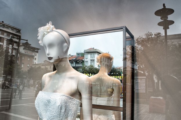
Layers are the common thread that link the mannequin series . These can be seen as layers of space or layers of light. For example in fig. 01 there is a “real” layer that includes the mannequins and the shop’s lighting, a two dimensional layer comprised of the photograph of the two models and a reflected layer which appears to be behind the photograph but is, in fact, the nearest layer to the camera. The three layers are presented as a photograph “flattened” into a single two dimensional image.
The three spacial layers often have differing intensities of light within them so there are more layers of light than of space and the relationships and interplay between the layers becomes more complex with similar levels of brightness or tone linking across the spacial layers. The reflections often appear as a backdrop as we sub-consciously decode the layers and place them in logical positions; the mannequins and the photograph are placed in front of the building.
The shop window display presents a world that we know to be an illusion but by consistently associating particular brands or styles with a specific fantasy the fashion industry adds data to, what Walter Benjamin called, our “optical unconscious”. We learn these links between brands and social categories so we know that Ralph Lauren represents the polo set, that gentleman farmers wear brown and green checked shirts, that “Twickenham man” wears a Barbour jacket. Having learnt this code we can dress to tell people how we want them to see us and we can de-code the way a stranger dresses so we know how they wish to be viewed. We don’t assume a person in a Ralph Lauren shirt plays polo with Prince William but we know they want us to see them as a person of style and taste who aspires to drink Pimms at Cowdray Park.
These photographs try to express the complex relationship between society and fashion and between reality and illusion by exploring the layers of space and light in shop windows.
- “body attitudes bespeak a visual language that is an integral part of visual merchandising”
Marsha Bentley Hale
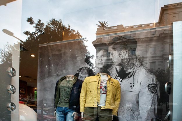
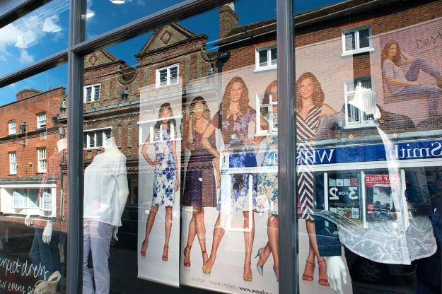
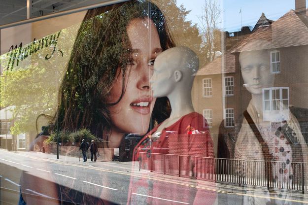
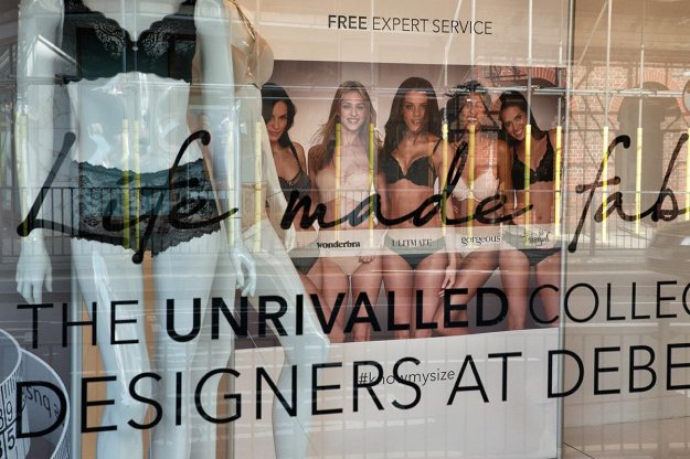
Fig. 01 Pescara – 1/125 at f/11, ISO 1,600 – Colour Accent
Headless mannequins are often combined with photographs of models to deliver the marketing message. The classic Italian architecture acts as a projection screen for the models and the yellow jacket stands out as an accent in the foreground. The models and the mannequins form a tight central group whose lack of faces allows the ethereal faces of he models to dominate. The tattoo on his right hand looks suspiciously like Margret Thatcher who would be an unlikely, but intriguing, role model for an Italian model.
- “we try to use organic fabrics and low impact dyes but we won’t do so unless we can achieve a high quality product”
Stella McCartney
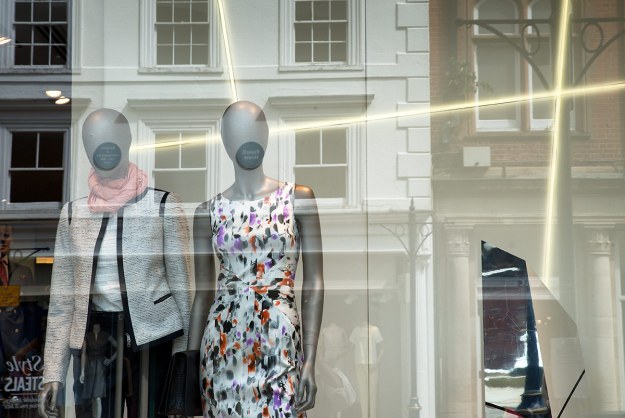
Fig 02 Guildford – 1/125 at f/11, ISO 220 – Colour Accent
The faceless mannequins and the plaques on the wall of the white shop front create wide-mouthed silent screams while the the crossed highlights suggest a more angelic interpretation. The beams of light are the accent. The seemingly broken mirror might offer a punctum. This is one example of a number of this series where I have looked for very subtle tonal variations rather than dramatic, bright colour variations.
- “the shop mannequin sees endless activity that passes for human existence”
British Film Council
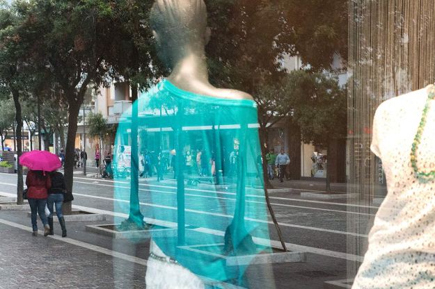
Fig. 03 Pescara – 1/125 at f/11, ISO 10,000 – Colour Accent
A summer clad mannequin watches shoppers huddled under a bright umbrella to escape the rain. The translucent turquoise blouse adds to the mysterious layers in this low light photograph. The bright shop’s lights contrast with the darkening street which is lifted by the splash of colour accent from the umbrella.
- “there is a sense of movement, a feeling that someone is there”
Tanya Ragir – Mannequin Artist
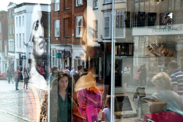
Fig 04 Guildford – 1/125 at f/11, ISO 450 – Colour Accent
All of the photographs are about mixing reality and fashion but it was difficult to capture real people in a way that worked with the shop displays. In this picture the two photographs and the young women are neatly positioned so each face looks towards the camera. The photographs provide a ghostly presence over the women. The till to the right might be a punctum.
- “at each of the six stages to make a garment the negative impacts on the environment are as numerous as they are varied”
Bangalore University
Fig.05 Godalming – 1/125 at f/13, ISO 640 – Colour Contrast
Colour contrast between the blue sky, signs and dresses with the red brick buildings on a perfect spring day, in a perfect Surrey dormitory town where the mannequins and models project the classic Surrey “yummy mummy” look onto the quaint, old, town centre shop fronts. The target market for these type of clothes are almost certainly blissfully oblivious of how cotton dresses are produced. As a photograph this is one of a few where the angles, lines and perspective create a sense of movement so we could be passing Godalming on a train. The small figure top right seems to be perched on a window sill looking down on us.
- “black is modest and arrogant at the same time, it says I don’t bother you – don’t bother me”
Yohiji Yamamoto
Fig. 06 Pescara – 1/125 at f/11, ISO 6,400 – Colour Contrast
Contrast is between the muted greys, greens and blacks with the bright strip of yellow light from the shop’s interior on a wet day in Pescara. Warm colours dominate the centre and contrast with the many cool colours and tones in the rest of the image. . The perfect mannequins dressed with elegant style in summer dresses contrast the woman wrapped up against the unseasonal spring rain. In addition to the contrasts there is a strong sense of left to right movement created by the perspective and the lines and the women’s direction of travel.
- “you know she has been touched by human hand and interpreted by human feelings”
Cyril Peck – Mannequin Artist
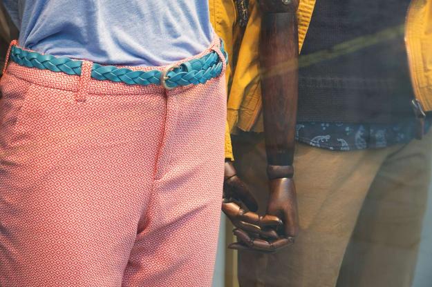
Fig. 07 Guildford – 1/125 at f/8, ISO 1,100 – Colour Contrast
One of the simplest pictures with only a hint of reflection. Blue, pick and yellows are all strongly contrasting. The psychology of window displays is complex and could be a study in its own right. There are complete mannequins, headless mannequins limbless mannequins, mannequins set in the context of photographs of models, faces with personality, featureless faces and everything in between. Most designers seem to be de-personlising their models yet every now and again there are “human” touches like these two mannequins holding each other’s stylised hands.
- “a cosmos of heavenly bodies set in a complex orbit”
Prada
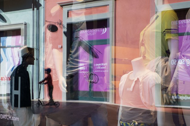
Fig . 08 Citta S’Angelo – 1/125 at f/11, ISO 560 – Colour Contrast
The very bright sunlight has helped create an ethereal scene where it is difficult to distinguish between mannequins and humans and to de-cipher the various layers. The main contrast is between blue and orange but the violet/purple is so strong it creates tension with all the other colours. I think this adds to the other-world feeling. The punctum for me is the silhouette of the boy on his scooter under the eye of the taller silhouette who might be human or mannequin.
- “only in an imaginary world can the unexpected and irrational intertwine with spontaneity and naturalness”
Dolce and Gabbana
Fig. 09 Guildford – 1/125 at f/11, ISO 800 – Complimentary Colours
The greens to the left blend into the reds on the right in a gentle way so the combination of the elderly couple, the empty road, the angle of the photographed model and the two mannequins create a relaxed, Sunday morning (it wasn’t) feel to the composition. This particular shop had large plate glass windows providing sharp reflections and I picked this one partly because of the human couple and partly because everything seems to fit so perfectly together. A “comfort food” sort of photograph.
- “avoid the masculinity problem by producing mannequins that are abstract or even completely headless”
The Mannequin Mystique
Fig. 10 Pescara – 1/125 at f/11, ISO 10,000 – Complimentary Colours
It was important to me to explore less obvious colours and this is one of a small number of my selected images that are predominantly monochrome. I was looking for tonal relationships away from yellow/blue or green/red and this shot is about these subtleties. The harmony is between the greys and brown/oranges. The composition has a lot of the features I was seeking; the bicycle, the people with umbrellas and the suited mannequin are all in stark contrast with the seemingly incongruous matching bag and shoes.
- “they must convey idealised images of ourselves, what we aspire to rather than what we are”
Fashion Institute of Technology
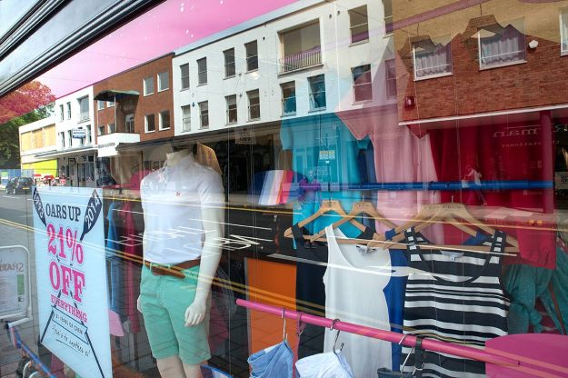
Fig. 11 Guildford – 1/125 at f/11, ISO 450 – Complimentary Colours
For many years the fashion industry has identified minority sports that few shoppers can or even want to engage in but the private school exclusivity of polo, sailing, rugby and rowing make them attractive as statements of good taste or breeding or manliness. The pale greens and pinks work well together and the interior and exterior combine to create lines of movement from the background into the foreground which seems to work especially well with the sporting theme. The punctum for me is “oars 21% off” – who wants oars and, if they did why would they buy them from a fashion boutique? why 21% not 20% ?.
- “able to claim a unique duality in its brand positioning pairing modernity and heritage”
Gucci
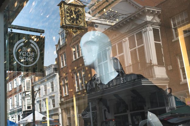
Fig. 12 Guildford – 1/125 at f/11, ISO 500 – Complimentary Colours
One of my favourites. with the Modigliani head positioned between the gold clock and the Body Shop sign staring, with no little attitude, into the far distance. The complimentary colours are the red/orange bricks and the blue sky but they are really just a background to the white model in the black dress which are equally complimentary. After all the headless mannequins and the ones with featureless faces this one is creatively sculptured. As often is the case there is also a sense of movement created by the camera angle and the receding perspective.
- “androgyny and ethnic diversity rule the creative landscape”
Rootstien – Mannequin Manufacturer
Fig. 13 Guildford – 1/125 at f/11, ISO 1,100 – Similar Colours
This photographs is in yellow to brown tones and is representative of a common window display where the monochrome and severe lines of thin mannequin are softened by the warm colours of the photographed models. The yellow tape on the scaffolding creates interesting highlights.
- “unique mix of innovative audacity and legendary Italian quailty”
Gucci
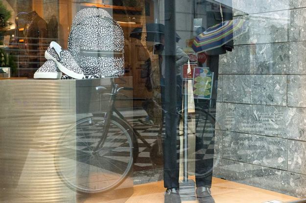
Fig. 14 Pescara – 1/125 at f/11, ISO 450 – Similar Colours
I used shop mirrors in a lot of photographs but this was the one that worked the best. The reflection of the piazza is mysterious to the right and left but with window-like clarity in the mirror which also increases our view of the mannequin. The position of the head, just on the skyline, was important to allow her lips to become a focal point. I like the way the street lamp on the right seems large enough to be a large tower. I find a lot of the interest in many of these images is the way in which the reflections can distort scale and shapes which helps my objective of asking viewers to linger and study the image.
- “available in male, female or child sizes and any skin colour”
Red Beau Mannequins
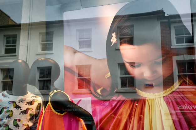
Fig. 15 Guildford – 1/125 at f/11, ISO 320 – Similar Colours
All the colours are from the quadrant of pink through to yellow and are therefore harmonious. I wanted the photo of the child to tower over the two mannequins which might have been selected to offer ethnic diversity. The old houses opposite create a neutral backdrop.
- “models are there to look like mannequins not real people”
Grace Jones
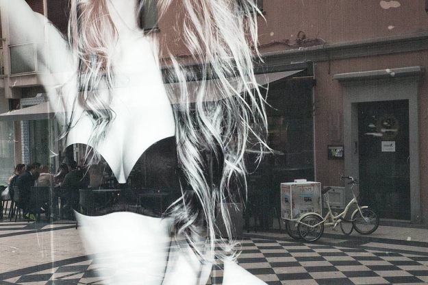
Fig. 16 Pescara – 1/125 at f/11, ISO 11,000 – Similar Colours
This nearly monochrome image works very well for me. If it is possible to have multiple punctums there could be two here with the group sitting at the street cafe to the left and the ice cream tricycle to the right and the way that both are framed by the model. I very consciously framed the model to exclude her face as I wanted to reduce her human presence to reflect the idea that a large black and white photograph is probably the cheapest mannequin you can buy so her role is as a mannequin not a woman.
Photography Notes
The subject matter and my approach posed a number of technical challenges. It was essential to use deep DoF to bring out the detail in all the available layers and typically I was photographing from a light place into a dark place through glass and reflections. On the rare occasions when there was a little more light, I under-exposed by 1/3 of a stop to help saturate the colours. The combined result was an exercise in low light photography and I was regularly using high ISOs to get the result I wanted. This doesn’t over-concern me as the images still work at 10 x 8 and whilst a few are grainy this might increase the mystery of the layers. I have post processed to maximise contrast and saturation either by using curves in Photoshop or pro-contrast in Color Efex Pro 4, but I didn’t want the images to look “over-processed” and hope my changes were within the realms of a “light touch”.
I looked at photos of reflections taken by Magnum photographers (here) and this taught me a lot about angles and on how to photograph through glass. I had no wish to include myself in any pictures so straight on (90 degrees) was usually a poor option, 45 degrees or less worked well but very few shots were successful when the “real” street as opposed to the “reflected” street came into the frame. Framing was often quite time consuming as I had to train my eyes to see all the layers at once and frame to combine the shop interiors and the exteriors effectively.
The best results were on days when it was bright enough to have a reasonable difference in the strength of light between the sunnier and shadier sides of the street. The best reflections were obviously achieved looking at the reflections of the sunny side in windows of the shady side. However, on one shoot in Italy the sun was so bright the contrast became too great and very few of the pictures worked (fig. 08 above is one of the few that I think did). Some of best layering effects came when the day was dull and the shop lights started to play a role. I undertook one shoot in an indoor shopping centre in Pescara Nord but there tended to be brighter lights in the shop windows than in the aisles and the reflections were minimal.
I have strayed some distance from the brief both in terms of not varying the subject matter, not creating movement diagrams and not using filters. In my opinion none of these ideas would have added value to what I was trying to achieve but I look forward to hearing my tutor’s views on the matter.
Links to Blog Posts for the Development of Assignment 3
Planning Assignment 3 with Tony Ray-Jones & Martin Parr
Developing Assignment 3
Evolving Assignment 3 – Mannequins
Researching Assignment 3 – Practitioners
Test Shots and More Thoughts for Assignment 3
Steal Like an Artist
Assignment 3 Contact Sheets
Sources
Photographer sources are detailed under each of the blog posts listed above. The following are a list of internet sources that I researched to provide background to the text.
Academia.edu – Fashion Industry and Media Today: The Negative Impact on Society by Ali Malik Al-Azzawi – www.academia.edu/1172572/Fashion_Industry_and_Media_Today_The_Negative_Impact_on_Society
The Daily Record – Damaging effect catwalk models are having on young women – www.dailyrecord.co.uk/lifestyle/fashion-beauty/damaging-effect-catwalk-models-having-1729385
Greenpeace International – Dirty Laundry: Unravelling the corporate connections to toxic water pollution in China – www.greenpeace.org/international/en/publications/reports/dirty-laundry/
Ecologist – Fashion’s Impact on the Earth by Safia Minney – www.theecologist.org/green_green_living/clothing/1055961/safia_minney_fashions_impact_on_the_earth.html
Mannequin Madness – The Mannequin Mystique by Emily and Per Ola dAulaire – mannequinmadness.wordpress.com/the-history-of-mannequin/
Not Just a Label – The Slow Fashion Movement: reversing environmental damage by Maureen Dickson, Carlotta Cataldi & Crystal Grover – www.notjustalabel.com/editorial/the_slow_fashion_movement
The Guardian – Britain’s rag trade revival – www.theguardian.com/fashion/2014/feb/15/britains-rag-trade-revival-marks-and-spencer
The Guardian – Britain’s fashion industry now worth nearly £21bn a year, report reveals by Imogen Fox – www.theguardian.com/lifeandstyle/2010/sep/15/british-fashion-industry-report-business
The Guardian – To Die For: Is fashion wearing out the World? by Lucy Siegle – book review – www.theguardian.com/books/2011/jun/12/to-die-for-lucy-siegle-review
Unicef – Child protection from violence, exploitation and abuse – www.unicef.org/protection/57929_55452.html


