Tag Archives: Roger Fenton

Researching and Completing Assignment 5

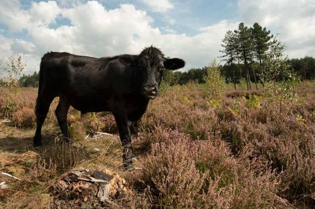
Fig. 01 Cattle on The Common - 1/60 at f/16, ISO 100

Fig. 01 Cattle on The Common – 1/60 at f/16, ISO 100

Introduction

Assignment 5 has a straight forward brief, the essence of which is to create a magazine story in the form of a picture essay and to design the cover of the magazine that will run the story. The final result should ideally incorporate both illustrative and narrative techniques.

As this assignment comes at the end of TAoP it is an opportunity to bring together elements of the whole course and it was always my intent to allocate a disproportionate amount of time to researching, planing and undertaking this assignment. TAoP naturally led me to researching a wide selection of established photographs, many of whom have very directly influenced my thinking even when their style or chosen field is not directly relevant to my own work but more than this influence they have collectively taught me a set of basic principles that I wanted to take forward into assignment 5 and beyond.

Working in a Series

The first principle, which is especially relevant to narrative, is that work is more effective when presented as part of a series. Nearly every photo book that I have studied and reviewed is greater, more powerful, than the sum of the individual photos within in. Sometimes this is because of the story line but often it is simply the effect of developing and building a conversation with the audience,  exponentially drawing the viewer deeper into a subject as each image is revealed.

See – Planning Assignment 3 with Tony Ray-Jones and Martin Parr

Quality of Research and Understanding

The second principle relates to the ethics of documentary photography. Respected photo journalists such as Stuart Freeman (1), and Phillip Jones Griffiths (2) both point out the importance of the photographer immersing themselves in their subject so that their work respects and honestly represents it. Freeman states that “storytelling in photography must be as vigorous in thought and research as it is beautiful in construction and execution” and this aide has directed my whole approach to assignment 5.

This ideal is best summarised by a quote from Tod Papageorge (13).

“If your pictures aren’t good enough, you aren’t reading enough.”

See – Philip Jones Griffiths – An Engaged Observer

Contextualisation

The third principle flows from the second. Jones Griffiths points out that documentary images must be properly contextualised. His example is that a picture of a starving child is just that, it doesn’t mean anything. The photographer must provide the context, why is this child starving? what events led to this point? who is depriving him of food? Jones Griffiths believes that this can only be done by combining photographs with text, he argues that we live in a literal society so words are an essential element of photographic story telling.

See – Captions and Other Words in Photo Narrative and Phillip Jones Griffiths and the Use of Captions, Cutlines and Other text in Vietnam Inc.

Respecting the Subject Through the Quality of the Image

For the final principle I will refer back to the second part of the Freedman quotation. Understanding the subject is not enough, we must use whatever skills we possess to bring beauty to the construction and execution of the photographs. Exhibit one to support the case for this principle can be found in the work of Josef Koudelka (4) who has championed isolated and suppressed communities for much of his career and who makes these marginalised people important, human and valuable by the art and technical excellence that he brings to every one of his pictures.

See – Josef Koudelka – Wall and The Role of Olive Trees in Koudelka’s Wall

The Concept

Choice of Subject

It was always going to be important to select a subject that I already, at least in part understood, I felt that my classmate, Adam Newsome, had been so successful with his assignment 4 on IEDs (Adam’s Assignment) (5) because he had based it on a subject with which he was already intimate. This intimacy allowed him to explore and document the subject in real depth and to offer the audience an unique viewpoint.

I chose to look at my own childhood and the village in which I grew up.

Parallel Timelines

Having looked at a wide range of narratives and photo stories I wanted to develop a story line that had multiple strands. I had connected with Julian Germain’s For Every Minute You Are Angry You lose Sixty Seconds of Happiness (3) for many reasons but I especially responded to the idea of combining his “current” photographs with the subject’s own photographic memories, this gave the audience two timelines to follow and the opportunity for juxtaposing past and present. This worked well because Germain gave both sets of pictures equal prominence and therefore equal value, there was no suggestion that because the subject’s photos were amateur ‘snaps” that they should be treated with any less respect.

To enable me to introduce multiple timelines to my narrative I decided to base part of the story on the writings of George Sturt who lived in “my” village between 1891 and his death in 1927. Sturt was not a typical man of his times, a self confessed socialist who was also a business owner and employer and who saw his employees as people and friends. A number of his books are heralded as classics but his most moving works are a trilogy of books (6), (7), (8), based on conversations with his gardener whom he calls Bettesworth. Bettesworth, or Fred Grover, was an old man when Sturt first employed him and the stories of his life in a tiny Surrey hamlet tell the story of that village from the 1840s until his death in 1905. Sturt’s other book, Change in the Village (10) and his Journals continue to map the evolution of the area until Sturt’s own death.

The concept was to trace the spirit of Fred Grover and to document his path through this landscape and to overlay that with own childhood in the same place. I hoped to find places where Fred and I could meet and ideas upon which we might have agreed or even argued. I aslo wanted to draw on any similarities that I could find between my family history as it related the the village and Grover’s.

From the outset I wanted to use a small number of photographs from Grover’s time and from my family album. This would enable me to not only juxtapose past and present but to also provide visual variety.

Text and Captions

Whilst recognising and accepting that this assignment was about photography it was also clearly set as a magazine article and for that reason alone it needed text to complement the images. My study of the early photo stories had been informative but it was also obvious that this approach is now historic, Life and its competitors have long gone and the Sunday magazines, National Geographic and specialist magazines that are image heavy such as travel magazines have a high proportion of text to image. I am sure that there are examples of pure photo stories in magazines but I would more see this to be the province of the photo book or internet slide show.

More importantly I considered whose work had influenced me the most when researching narrative and quickly concluded it was Kodelka’s WallJones Griffiths’ Vientnam Inc and Lam’s Abandoned Futures. Each of these books are heavily reliant on the written word to contextualise the photographs.

It also seemed relevant that as I would be researching the subject matter in some depth part of the story would only be told effectively by combining words with the photographs. I made the decision to format the story as if it was to be published in a magazine but to adopt a text / picture mix similar to Jones Griffiths.

Appropriation

The use of old photographs would already introduce an element of appropriation to the project but I was also keen to try and link the modern photographs with the past by using quotes from George Sturt’s books as captions. This approach also linked this assignment back to assignment 3 and my research into Anna Fox and Victor Burgin.

Other Influences

Different photographers and writers influenced different parts of the assignment.

Joachim Brohm and the Bechers influenced the way I approached a double page spread typology of cottages and other buildings that I knew as a child and that Grover would have known.

I researched a number of different views on how a photo story should be created and took forward ideas from Harold Evans’ Pictures on Page (11) regarding layouts and the relationship between pots and text although there was, of course the need, to translate the ideas from broadsheet to a smaller format. His ideas on how to build a story are invaluable an, being a newspaper man, he likes words so further justified my essay writing. Equally useful was Derek Birdsall’s Notes on Book Design (12), his ideas on how to layout a page were inspiration even though I know that I fell way short of his high standards.

My general background research is summarised in my post Narrative andI endeavoured to carry forward that research into this assignment.

Overall my strongest influences were the photo journalists such as Jones Griffiths, who I have already mentioned, Stuart Freedman, Chris Steele-Perkins, and Eugene W. Smith (for Minamata rather than his work for Life Magazine). In each case these men talk about and follow the principles I have discussed above. Quite clearly they are usually documenting subjects of world importance and I had no such subject in leafy Surrey and their technical excellence is way beyond my limited skills but their real influence on me was to set a pace for the assignment that allowed me to become absorbed in my subject and think through the photographs I wanted and how I wanted to use them.

The Process

Developing the Concept

The concept was developed in parallel with the research described in Narrative but, even before I started with OCA, I was planning a project to look at the journeys of William Cobbett or the writings of George Sturt. Partly because they were both local men and partly because they wrote about the countryside  I love and rural issues which are important to me and that always take a back seat in our urban dominated political landscape. However, I realised that the scale of the research required to deal with Cobbett was inappropriate for a single assignment and I also wanted to bring a personal element to the work and that would have been harder to achieve with Cobbett.

I felt that I already had a number of personal connections with George Sturt. My father had collected his books and as another passionate socialist shared many of Sturt’s views about the treatment of the rural poor. I had walked past his house everyday on my way to school and knew all of the places he wrote about but, more to the point, I knew these places not as a visiting student but as someone who had grown up in the lanes, fields and commons that he describes. His countryside was my countryside and it was this shared landscape that I mots wanted to explore.

Research

The first step was to re-read Sturt’s books and as I did this I formed a strong affinity with Fred Grover who had lived in a tiny cottage a few hundred yards from where I grew up, moving there around a hundred years before I was born. Sturt’s conversations with his old gardener revealed a complex life hidden behind the simple and stereotypical facade of the Surrey labourer and my copious notes centred around the important moments in Gover’s and, his wife, Lucy’s lives. His war service in the Crimea,  the enclosure of the common, the birth and death of their children, Lucy’s decline as her epilepsy worsened, the shadow of the workhouse and destitution that was the end of the road for so many of the rural poor.

Each strand opened up new avenues of research including:

  • Roger Fenton and his Crimean War photography, specifically searching on-line libraries for a photograph of the men of Grover’s regiment. I had looked at Fenton’s still life work during assignment 4 so it was interesting to look at a different aspect of his career.
  • Farnham Museum, who were most helpful with searching their photographic archives for pictures of the 19th century village, Sturt’s house, Grover’s cottage and, after much searching, a single photo of Fred Grover himself talked by George Sturt.
  • Simon Fairlie’s “A Short History of Enclosure in Britain” (15) was invaluable and provided much needed historic context and that helped explain Sturt’s thoughts on the matter.
  • I met and talked to Wendy Maddox, who co-incedentially had been taught by my Father at The Bourne School in the late 1940’s, and who is an amateur but dedicated historical researcher who has carried out extensive work on the history of the village and specifically on the old graveyard. She was part of the team who identified Fred and Lucy Grover’s unmarked graves. The results of some of this research can be found on The Bourne Conservation Society website (16)

Photography

It is not really appropriate to describe my photography trips as shoots. Over a period of nearly three months I kept visiting the village, walking through different areas, talking to the people I met and taking photographs that seemed to capture the village I remembered. My aim was to find Grover’s spirit or part of my own history so other than starting my walks from obvious landmarks such as his cottage, Sturt’s house, the houses where I had lived, the school or the pub I did not plan shoots.

Over time I began to find themes and that invested my work with a little more purpose. I began to form an idea of wanting an element of typology in the final piece and a lot of my walks were in search of cottages that had been the homes of the original squatters who inhabited the village.

A number of my walks were on, what had been the common land, and is now either part of Frensham Common which is managed by the National Trust or The Bourne Woods which are owned by the RSPB and has become quite well know for its staring role in films such as Gladiator and Robin Hood.

My photographic technique changed significantly during this time as a heavy DSLR and camera bag became too restrictive and, given I was often photographing people’s home from the lane in front of their house, it also felt too invasive. Instead I started carrying a mirror-less Fuji XT-1 and this liberated my approach and led to, what seemed, simpler and more appropriate compositions.

Sources

 Books

(3) Germain, Julian (2005) For Every Minute You Are Angry You lose Sixty Seconds of Happiness. Gottingen: Steidl MACK (Reviewed o line via a combination of Julian Germain’s web site – http://www.juliangermain.com/projects/foreveryminute.php and the MACK web site – http://www.mackbooks.co.uk/books/16-For-every-minute-you-are-angry-you-lose-sixty-seconds-of-happiness.html

(4) Koudelka, Josef. (2013) Wall: Israeli and Palestinian Landscapes 2008 – 2012. New York: Aperture

(6) Sturt, George. (1902) The Bettesworth Book: 1978 Edition, a facsimile of the second edition published in 1902. Firle: Caliban Books.

(7) Sturt, George. (1907) Memoirs of a Surrey Labourer: 1978 Edition, a facsimile of the second edition published in 1907. Firle: Caliban Books.

(8) Sturt,George (1913) Lucy Bettesworth. London: Duckworth & Co. Sturt, George (1907) Memoirs of a Surrey Labourer. 1978 facsimile of the 1st Edition. Firle, Sussex: Caliban Books

(9) Sturt, George (1912) Change in the Village. 1955 edition. London: Gerald Duckworth & Co.

(10) Sturt, George (1923) The Wheelwright’s Shop. First paperback edition 1963. Cambridge: Cambridge University Press.

(11) Evans, Harold. (1979) Pictures on a Page: Photo-journalism, Graphics and Picture Editing. London: Book Club Associates.

(12) Birdsall, Derek. (2004) Notes on Book Design. New Haven and London: Yale University Press.

Internet

(1) Freedman, Stuart. (2010) Ethics and Photojournalism – http://www.epuk.org/The-Curve/952/ethics-and-photojournalism

(2)  Photo Histories (August 2014) – Philip Jones Griffiths – http://www.photohistories.com/interviews/23/philip-jones-griffiths

(5) Newsome, Adam. (2014) IEDs – https://adamnewsome.wordpress.com/2014/08/31/level-1-art-of-photography-assignment-4/

(13) Foto8. Mark Durden Interview with Tod Papageorge – http://www.foto8.com/live/tod-papageorge-interview/

(14) Smith, W. Eugene and Smith, Aileen M (1971) Minamata vs. Chisso Corporation – Magnum Photography site – http://www.magnumphotos.com/C.aspx?VP3=SearchResult&ALID=2TYRYDDWZXTR

(15) Fairlie, Simon (2009) A Short History of Enclosure in Britain. First Published in The Land Magazine – http://www.thelandmagazine.org.uk/articles/short-history-enclosure-britain

(16) The Bourne Conservation Society – http://www.bourneconservation.org.uk/index.htm

Exercise 42 Illustration by Symbols

White Vanitas - Colour - 1/60 at f/14 , ISO 100

White Vanitas – Colour – 1/60 at f/14 , ISO 100

Symbolism has been used throughout the history of both commercial and art photography. In art many symbols have been carried forward from religious painting, especially from the vanitas movement which flourished in the Netherlands in the early 17th century. During my research for assignment 4 I looked at the types of symbolism used by these Dutch painters and how photographers such as William Henry Fox Talbot and Roger Fenton brought that tradition into photography with it later becoming the basis for a lot of Irving Penn’s work and how vanitas symbols are regularly found in the work of contemporary still life photographers including conceptual artists such as Mat Collishaw. Many of the symbols used by contemporary artists have their roots in traditional religious, and especially Christian, art for the simple reason that they are readily understood by both religious and non religious audiences or because they have become so universal they have transcended their original religious meaning and become a common secular symbol so, for example, the Archangel Michael who was historically depicted holding scales as the warrior-guardian of righteousness and justice becomes Lady Justice on the top of the Old Bailey.

Advertising, and therefore commercial photography, is hugely dependent upon symbolism either by using commonly recognised symbols such as the sun to suggest health, vigour or goodness when advertising orange juice or breakfast cereals, shields, gates and castles for insurance and for security services or roses for valentine day products. All these uses of visual symbols rely on the concept of semiotics, which in simple terms is a sign that stands for something else *(1). The idea of semiotics was first described by Ferdinand de Saussure, a Swiss linguist, who explained that it involves a sign, word or object, the signifier and a concept, idea or thought that is to be communicated, the signified. Semiotics is a broad and complex subject that will no doubt be a subject for in-depth study at a later date but at its heart our ability to communicate an idea through the use of a symbol relies upon either, an obvious association between that thought and the symbol, or a common acceptance of the meaning of the signifier. There are many symbols that have instantly recognised meanings in Western society, a dove or an olive branch for peace, a red cross for medical care or a dollar sign for money or wealth (even in countries that use the pound or the euro). However, these symbols can be interpreted differently by different societies and cultures so a red cross might evoke a negative response in the Middle East where it is associated with the crusades.

In effect we all carry a mental register of codes that allow us to interpret these signs to understand their intended meaning, and although these codes might vary between cultures, we are often sophisticated enough to combine the code with its context to identify alternate meanings. These codes are constantly evolving, partly because the advertising industry sets out to design and introduce new signifier / signified relationships through the use of symbols in the shape of logos or by the repeated use of specific images in close association with a product.

Through this process we not only decode MacDonalds and everything it stands for from a large yellow “M” we come to associate meerkats with a consumer choice portal or, for those of a certain age, tigers with petrol. Once such strong brand identities are established the most sophisticated advertising can move beyond advertising a dull and unexciting product such as home insurance and provide short entertaining mini-dramas that become an end in themselves but subtly  promote the product by making the audience feel connected or just good about the family story in a series of gravy adverts, the students obsessed with the speed of their internet connection or the lives of Russian meerkats.

At a more sophisticated level charities are especially prone to leverage preconceptions and, arguably, prejudices, to attract our donations. A black child with a fly on their face is code for suffering, illness and deprivation even though many healthy children all over the world will have a fly land on their face in the course of a day, try visiting the Australian bush in summer, and using dogs and cats in an advert for an animal charity at Christmas is more effective that the same advert used in mid-summer because it is coded as “a dog is not just for Christmas”, “people are acting badly during the season of goodwill”.

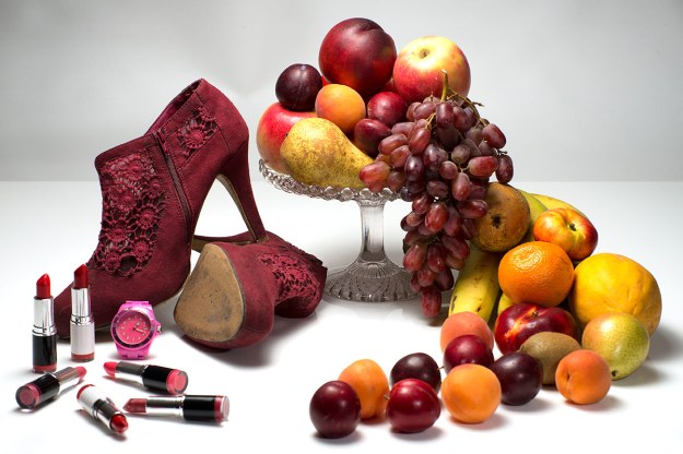
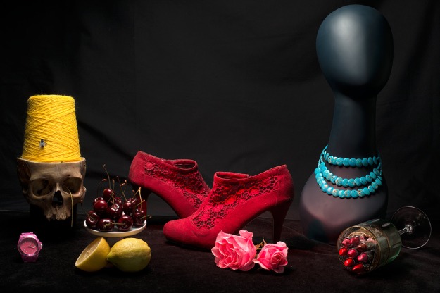
Photographers can draw on all these sources and code their images to communicate a message by appropriating established signifiers or inventing new ones that leverage established ideas. In some of my test pieces for assignment 4 I tried to use contemporary items as modern day vanitas symbols. This led me to use lipstick and stiletto heals to signify the vanity of the fashion industry but I mixed in traditional vanitas symbols such as plentiful fruit and watches in an attempt to suggest to the audience that all of the items in a still life needed to be interpreted in the context of vanitas.

This exercise suggests that we avoid clichés but the de-coding system we carry in our heads is reliant on our ability to instantly recognise and interpret symbolism in art or advertising. As a result there is a very thin line between a symbol being able to communicate the idea intended and it becoming a cliché. In practise a cliché is just a matter of timing, so the 1914 Lord Kitchener “Wants You” recruitment poster or “Keep Calm and Carry On” only became clichéd when they became over copied.

Growth

Avoiding plants, charts, upward pointing arrows and other common ideas:

  • I might try to photograph the wall in a house where parents have marked off their children’s height over time. The more dilapidated the wall the better, indicating that it has been left undecorated as a family treasure. This could provide a underlying message of love and nurture and sense of time passing.
  • On a similar theme a heap of, obviously discarded shoes of varying sizes might work.

Excess

  • Without wishing to appear obsessed with the subject all the traditional vanitas symbols work here, over-laden tables and so forth but, if I was planning to work on this subject again I would build on Mat Collishaw‘s ideas with his studies of American junk food. The concept of over sized portions and what we throw away offers powerful imagery.
  • Skips behind supermarkets and, a subject dear to my heart, all the food we dump in land fills that used to be fed to pigs because we have allowed government to over legislate to stop pork products being fed to pigs and cow products being fed to cows. As ever, we introduce new, sweeping, ill thought through laws instead of policing existing and sensible regulations.

Crime

  • I would look to go beyond symbols of crime and look for images of social situations that inevitably nurture crime. Disproportionate unemployment in areas with large populations of  ethnic minorities could provide interesting subjects.
  • The other angle might be crime waiting to happen such as open windows, keys in locks or visible purses in handbags.

Silence

  • A wealth of religious symbolism comes to mind and although this might verge on being clichéd it would rely on the image being strong enough to lift itself above the cliché. A lone monk walking towards an abbey or a simple altar in an empty church, someone praying alone in a church. Something with an Eleanor Rigby feel from Yellow Submarine might work so that loneliness was linked to silence. Note the use of a Beatles’ film as a source of symbolism.
  • Nearly any rural landscape with a pond if it is photographed with a long exposure so the surface is misty and perfectly smooth. Even a fisherman by a river might work.

Poverty

  • Probably a cliché but my first instinct would be to look for a juxtaposition of unnecessary wealth and extreme poverty. I spent many years in Asia and the images that still leap into my mind are slums next to Chinese graveyards where the dead were “living” in marble mausoleums and the living languished in huts made from flattened oil cans and packing cases.
  • If, it was to be a project, I would probably focus on rural poverty which is over-shadowed by the more obvious urban equivalent. The regular car boot sale in Aldershot would provide plenty of opportunities.

Sources

Internet

(1) Moriarty, Sandra. An Interpretive Study of Visual Cues in Advertising. http://spot.colorado.edu/~moriarts/viscueing.html

Chandler, David. Semiotics for Beginners. http://visual-memory.co.uk/daniel/Documents/S4B/sem01.html

Developing Assignment 4

Over the last several weeks I have been researching, planning and shooting test photos for assignment 4, Applying Lighting Techniques. Originally I wanted to carry forward ideas about the vanity of fashion, which had featured strongly in assignment 3 combining this with the symbolism of vanitas to create faux 17th century still life. As ever with these assignments some ideas work, some do not, new ideas arise, new inspiration is discovered and the end result is quite different from the images imagined at the start. To that end it is helpful to record the development process.

This post looks at the evolution of the idea and at some of the technical challenges that were encountered along the way. In each phase of this course my work has been influenced by three things:

  • “text” book and other informed opinions about the genres of photography that are relevant to the exercises and assignments in that part of the course;
  • the photographers, both contemporary and more historic whose work appears relevant;
  • and, my previous experience and knowledge of relevant techniques.

For assignment 4 my previous experience of photographic lighting was limited to trying to develop better daylight flash techniques in an attempt to capture a Martin Parr look and feel for outdoor documentary photography and extensive experimentation with food photography which I regularly undertake as part of my role in the family business.

This food photography is effectively the starting point for assignment 4. Partly because it means I own 3 flash guns, a remote infra-red flash trigger, three cold-shoe soft boxes and various other bits and pieces such as grids, reflectors, LED lights, stands and backdrops. But, it was only by beginning to think about assignment 4 that it became clear that it is also a starting point because food photography, along with some fashion and product advertising, is one of the most commonly viewed forms of still life in books, magazines and on-line.

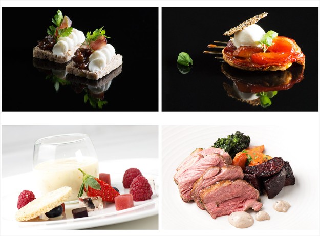
It is interesting to note that Irving Penn and David Bailey both worked as commercial fashion photographers yet also produced still lifes as part of personal projects that are generally highly respected. The dividing line between commercially driven and artistically driven still life is blurred with photographers such as Peter Lippmann *(4) producing compelling personal studies alongside similar commercial projects. As someone who sees many high quality cookery books as part of my work I would argue that there is much to be learnt about still life from the food photographers working for the most celebrated chefs. Dominic Davies *(5) is an excellent example of a food photographer producing creative and exciting food still lifes for Heston Blumenthal. In the last six months I have learnt that it is dangerous to pigeon hole contemporary photographers without trying to explore the breadth of their work. I found Peter Lippmann when looking at a Christian Louboutin advertising campaign but his personal still life work is, in many ways, even more exciting as is his unusual approach to intimate landscape in Paradise Parking. Dominic Davies is no doubt a highly sought after food photographer having worked for Blumenthal but before putting him into that pigeon hole it is worth looking at his other still lifes and his Mapping London project which is a William Eggleston like view of the details of London.

Fig. 1 Food Photography

Fig. 1 Food Photography

Food photography was quite alien to me until the last few years and whilst it has been a steep learning curve and a journey that is far from complete it has provided me with a basic understanding of working with small lights in restricted spaces. There is little or no room for big lighting systems in a commercial kitchen.

Initially, for assignment 4, I wanted to work with natural light and to photograph still life or human subjects within the landscape as I felt that this would take me into new areas and would keep me away from using the type of equipment I used for food photography. However, whilst I felt inspired by the work of Edward Weston * (1) and would have liked to try something along the lines of his beach nudes I quickly realised that the logistical challenges were significant and to meet the requirements of the assignment with a human model outdoors was unrealistic at this stage. Despite this early change of direction I did find inspiration from Weston’s 1927 Shells, and his studies of vegetables a few years later. Pepper No. 30, (1930), Pepper (1929), Eggplant (1929) and Cabbage Leaf (1931) are classic studies of form.* (2)

My first tests, with Weston’s work in mind, were with small groups of fruit to allow me to experiment with lighting for colour, form and texture.

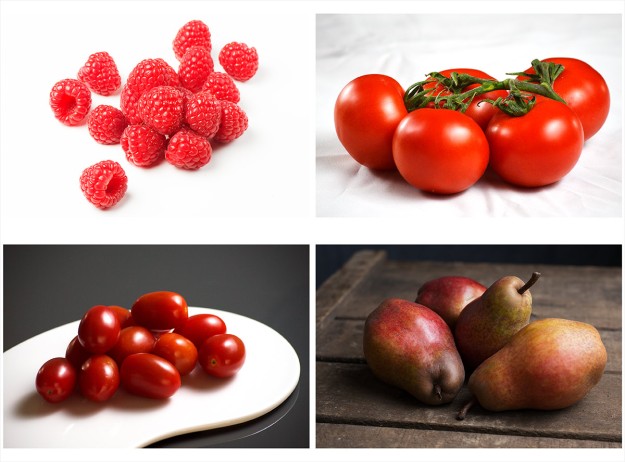
Fig. 1 Contact Sheet of Fruit Test Shots

Fig. 2 Contact Sheet of Fruit Test Shots

This experiment highlighted some of the challenges that would arise time and again in this assignment. My instinct is to light for a combination of colour, form and texture (at least where the subject makes all three relevant) and I found it difficult to think in terms of isolating one attribute of a subject to the exclusion of all others.  In the context of Weston’s work the plum tomatoes bottom left and the pears bottom right come nearest to the effect I was trying to achieve where form was the main study but the raspberries and the vine tomatoes have a sense of both depth and colour. I knew that this type of subject could be carried forward into the assignment and that a series based on any of these groups could be lit in the four required, different ways. The fat Duck series on the Dominic Davies *(5) web site shows how food can be lit for colour, texture and form, for obvious reasons silhouettes are less common but a few examples in this series come very close.

I was also looking at the work of Irving Penn and a number of contemporary still life photographers and to stick with Weston style fruit and vegetables would be very limiting and too close to food photography.

As mentioned previously I was interested in the origins and history of still life photography and that research trail inevitably leads to Fox-Talbot, Roger Fenton and through them back to the vanitas painters of the 17th century. The symbolism of the vanitas style appealed in a very direct way and immediately spoke to my original agenda of weaving in the modern vanities of the fashion industry.

Fig. 03 A Small Study in Grey - 1/60 at f/13, ISO 100

Fig. 03 A Small Study in Grey – 1/60 at f/13, ISO 100

My first shoot was a very simple set-up. I spray painted a number of common household objects, set them up on a white acrylic sheet, added a pink rose for colour and took a few test shots. The vanitas elements were limited to the rose, symbolising the fragility of beauty and the fly to symbolise decay. This was primarily a light test using two cold-shoe soft boxes, one left and one right, both at about 45 degrees. The lighting worked to a point but I was uncomfortable with the fade to grey in the upper part of the background and noted that I either had to increase the intensity of the lights or find a way to fill the background. As an idea it was very limited and not something that could be taken forward into the assignment. I also felt that it was difficult to achieve the intensity of colour that I wanted using a white background.

By this point I had looked at the work of a lot of photographers and was identifying ideas that could come with me into the assignment. When looking at any photographers for inspiration there is an element of thinking about their subject matter, their overriding style and their technical approach but for studio based still life the technical approach in terms of backgrounds and lighting become a major consideration. It is clear that there are a lot of different ways to set-up and light a still life and I wanted to experiment with some of the options.

Fig 2 Still Life Inspration

Fig 04 Still Life Inspration

Fig. 04 shows the various photographers that were researched in some detail. A write up on these photographers is included here. This research led to a series of still life experiments where I looked at using different set-ups and techniques. One of the first experiments was inspired by Simon Norfolk whose archaeological study of objects found on the battlefield of the Tigris valley interested me at a number of levels. This is stripped down, simplified approach to still life that focusses total attention on a single object. Norfolk has photographed a series of small items excavated from a modern dessert battlefield so, unlike excavating  the site of the Battle of Hastings where the best one might hope for is a piece of broken and decayed metal, he has found tattered identity cards, pieces of clothing and personal photographs amongst the spent bullets and shell casings. This is a very human form of still life, exploring the memory of people through their lost possessions. I was keen to test out this idea quickly with objects that I already had to hand but with the intent to take this idea into the field and photograph found objects in a single location at some later point.

Fig. 05 My Dad's Stuff

Fig. 05 My Dad’s Stuff

Fig. 05 is the result of that experiment. My father was born in 1919 and died nearly 20 years ago. When I was thinking about subjects that might work as small items for simple, one object, white background still life I realised how few of his possessions I still own. His father’s silver watch, his scout knife, a bronze age axe he excavated, a few war time souvenirs and some tools.

At a personal level each object has a story which reminds me of my father, some objects are still being used by me, some are just beginning to be looked at and understood by my grandchildren and, when I have time I would like to repeat the exercise for other deceased relatives as a way of documenting an aspect of their lives. The items were photographed individually and then collected into a single image in Photoshop.

From a technical perspective it was a useful exercise as I was able to test different lighting in response to the material being photographed in a controlled environment. Some worked better than others.

Fig. 01 Bronze Age Axe , from a series My Dad's Stuff - 1/160 at f/11. ISO 100

Fig. 06 Bronze Age Axe , from a series My Dad’s Stuff – 1/160 at f/11. ISO 100

For fig.06, the bronze age axe, I arranged the main light back of 90 degrees to the right, 3/4 lighting, and a fill light at a similar position to the left. This seems to have provided a sense of depth to the subject and the texture of the surfaces has been explored to some degree.

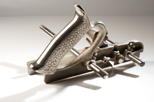
I have tried to use shadow as as way of exploring the form of the old fashioned router plane in fig. 07 as an alternative way of looking at the form of the object.

These test shots worked reasonably well but showed that 3/4 lighting is not the easiest to use if you still want to see the face nearest to the camera.

In fig. 07 the problem of backgrounds is also highlighted. In this instance I was using a flat acrylic sheet so the meeting point between the base and the background is very obvious.

I was also using a 105mm lens and working very close to the subjects so needed a deep depth of field to have the whole piece in focus. I have found depth of field challenging in food photography, occasionally it is interesting to only have part of a set in focus but generally it is desirable for the whole subject to be sharply focussed. This appears equally true for still life and  forces the use of small apertures.

Fig. 01 Router Plane,  from a series My Dad's Stuff - 1/160 at f/16, less 1/3 stop, ISO 100

Fig. 07 Router Plane, from a series My Dad’s Stuff – 1/160 at f/16, less 1/3 stop, ISO 100

For my next series of test shots I wanted to create more complex vanitas still lifes bringing together classic motifs with modern objects.

ContactSheet-003a

Fig. 08 White Vanitas

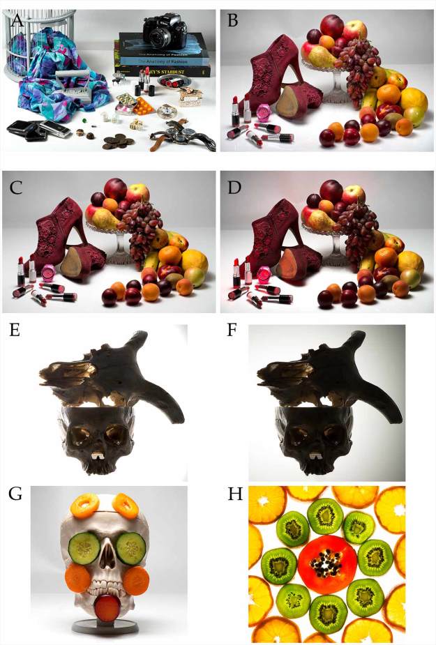
For these shots I was still using a white background and, for all but “A” and “H”, I used the same acrylic sheet and a white background. A photography backdrop curved from background to base was used for “A”  whilst “H”, which is really just a bit of fun, was taken using a light box and a small amount of overhead light.

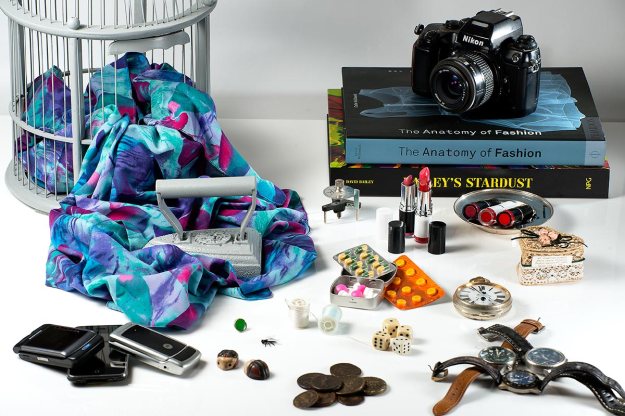
Fig.  Blue Vanitas - 1/60 at f/16, ISO 100

Fig. 09 Blue Vanitas – 1/60 at f/16, ISO 100

“A”, the blue themed still life, was over complicated and didn’t work and was only useful as a learning experience for how not to set up a still life. However, I was pleased by the lighting in fig. 09 which is very even, brings out the various colours and avoids distracting reflections from the watch glasses and old mobile phones. In retrospect there could be a little more light to the left of the camera and on the coins at the front.

“B”, “C” and “D” were more successful, and worked when exploring colour but were much less successful when the same setup was used for texture, form and shape. I chose the red shoes specifically because they had both colour and texture but there was very little difference in the end result when I set up for colour and when I set up for texture.

“E” and “F” were taken as test shots for shape and “G” is my take on Irving Penn’s Vegetable Face.

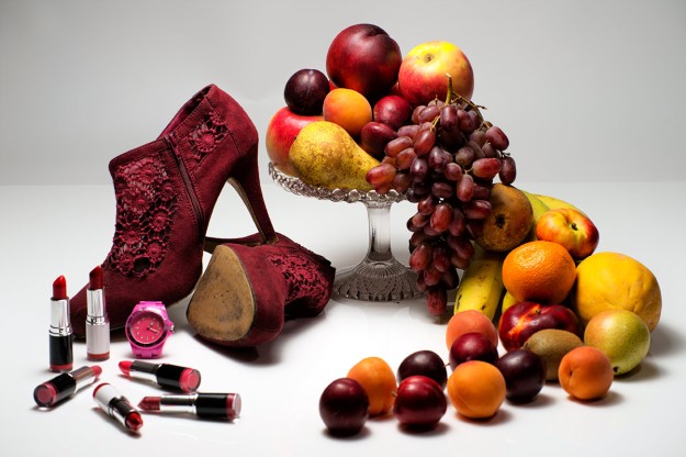
Fig.09 White Fruit Vanitas 1 - 1/60 at f/14, ISO100

Fig.10 White Fruit Vanitas 1 (colour) – 1/60 at f/14, ISO100

Fig. 10 is a shot that is on the short list for my final submission as It meets many of my original objectives. It has obvious and less obvious vanitas elements, it brings fashion and classic still life together in a single shot and, I believe, works as an exploration of colour. The white background is difficult to work with, there is a 1 stop loss of exposure for every metre the backdrop is placed behind the subject so without extra lights to direct onto the backdrop it is always, at best, going to be grey. In this shot is just about acceptable but not ideal.


Fig. 10 Skulls - 1/125 at f/16, ISO 100

Fig. 11 Skulls (edges) – 1/125 at f/16, ISO 100

Fig. 11 Skulls (Edges) - 1/125 at F/16, ISO 100

Fig. 12 Skulls (Edges) – 1/125 at F/16, ISO 100

Fig. 11 is also on the short list as an example of lighting for edges. It could, and has been (fig. 12), processed as a full silhouette but it is not as interesting as a photograph.

In fact this picture sums up my frustrations with this assignment.

I can light or process this just to focus on the outer edges and perhaps that approach best meets the assignment criteria but equally by over exposing a little I can also bring out the texture of the skulls and explore their form.

This is a far more appealing image than fig. 12. so I might submit fig. 11 and hear my tutor’s thoughts.

After “White Vanitas” I wanted to carry out some test shoots using black backgrounds. When researching contemporary still life I saw that whenever black backdrops were used the colours of the still life became far more intense. Mat Collishaw and Paulette Tavormina use black backdrops in very different styles of still lifes but I think both are doing so to emphasise colour.

Fig. 12 Black Fruit

Fig. 13 Black Vanitas and Fruit

“A” through “E” continue to use vanitas motifs and are a natural progression from the White Vanitas shoot. “G” and “H” are straight forward colour studies. There is no doubt that using a black base and black background brings out the colours in the subject. If the aim was just to emphasise colour this is the set-up I would use.

Fig. 13 Black Vanitas (colour) - 1/160 at f/16, ISO 100

Fig. 14 Black Vanitas (colour) – 1/160 at f/16, ISO 100

Fig.14 is on my short list as part of the submission. It is “B” in the contact sheet at fig. 13. “A” would be an alternative but without the honeycomb grid and red gel used to emphasise the red shoes. The strength of these two photos are firstly that they are an evolution of my original idea so have some heritage in the project and secondly that they are strong studies in colour. The black background is much more interesting than the white with the subjects fading into or growing out of the black set, appearing suspended in space. In some ways the black set is easier to work with but it does suck up the light so the flashguns had to be run much nearer full power.

Fig. 14 Melon and Citrus - 1/125 at f/16, ISO 100

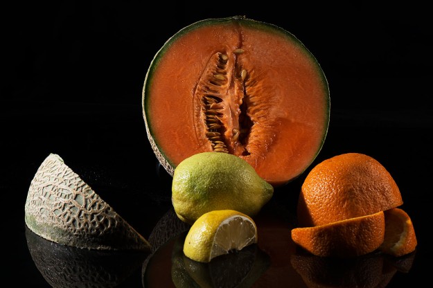
Fig. 15 Melon and Citrus (texture) – 1/125 at f/16, ISO 100

Fig. 15 is also short listed as a submission for texture. This was lit with hard light angled to maximise the different textures in the fruits. At this stage in the process I had a few images that had worked for colour, texture, form and shape but they were from different set-ups so I wanted to conduct a final shoot where the four attributes were represented by four different lighting techniques and photos from the same set.

The criticism might be levelled that, as this was the assignment brief, I should have gone straight to this point in the first place and this is a totally valid point. However, I wanted to explore the four attributes with different set-ups and for each shoot I did light the subjects in, at least, four different ways and took four different sets of photos but with all the above set-ups one or two, and very occasionally three attributes would come through strongly but never all four. I believe that this is because the way I worked through the process of looking at different techniques and using different subjects created environments that empathised one or two attributes above the others. Clearly I could back light the Black Vanitas and photograph a silhouette but it was a dull picture and I don’t see the point in trying to take dull pictures, I take enough by mistake already.

The process also allowed me to explore different photographers’ work and try some of their techniques and work towards a style of still life that was representative of me and that was an evolution of the style I have developed for food photography over recent years. I think I found my greatest inspiration in the work of David C. Halliday and Krista van der Niet. This is a move away from classic vanitas still life but they use light and simple sets to create atmospheric still life that explores form, texture and colour, often simultaneously.

Fig. 15 Green Backdrop Shoot

Fig. 16 Green Backdrop Shoot

Fig. 16 is a contact sheet from my final two shoots where all the ideas finally came together. I am disappointed that “G” which is the colour shot from the very final shoot is weak, the colours seem desaturated and what seemed right in the “studio” did not process as effectively as I had expected. I may be fooling myself but I suspect the the choice of fruit in “A” through “D” lent itself to colour better that the subjects in “E” through “H”.

Fig. 16 Green Backdrop (colour) - 1/60 at f/18 (-1/3 stop), ISO 100

Fig. 17 Green Backdrop (colour) – 1/60 at f/18 (-1/3 stop), ISO 100

This is a shame as fig. 17, “G” from the contact sheet, is very close to the effect I wanted to achieve, the lighting seems very soft and natural, (I believe that Halliday works with natural light) and without having any vanitas motifs it has a 17th century oil painting feel. I have just failed to bring out the colours as strongly as I wanted.

This has been a very frustrating assignment at times and I still questions whether setting such a simple question is pushing a student to explore lighting in real depth. It is too easy to take one object with a bit of colour and texture and setup:

  • Colour – lights above and in front
  • Form – 3/4 lighting
  • Texture – hard light at acute angles
  • Shape – backlight

I set out to learn about still life as a genre and to explore lighting for effect. I have enjoyed the research and test shoots immensely and believe that I have learnt a considerable amount about, not just lighting, but how to introduce a mood into simple still lifes.

Sources

Books

(1) Weston, Edward. (1999) Edward Weston. Cologne: Benedikt Taschen Verlag GmbH

Internet

(2) Weston, Edward. EdwardWeston.com – http://www.edward-weston.com/edward_weston_natural_1.htm

(3) Norfolk, Simon. SimonNorfolk.com  http://www.simonnorfolk.com/pop.html

(4) Lippmann, Peter. Peter Lippman Official Site  http://www.peterlippmann.com/lippmann3/menu.html

(5) Davies, Dominic. Dominic Davies Official Site. http://www.dominicdavies.com/fat-duck/


Contemporary Still Life

Fig.  01 Pincers and American Grips (war souvenir) from a series My Dad's Stuff - 1/60 at f/16, ISO 100

Fig. 01 Pincers and American Grips (war souvenir) from a series My Dad’s Stuff – 1/60 at f/16, ISO 100

Having looked at the origins in painting of still life  and specifically at vanitas painting and before focussing in more closely on Irving Penn I wanted to look at a cross section of the still life work of contemporary photographs. The research trail has led me to a number of interesting photographers, some commonly working with still life, and some who have, seemingly, only used the genre occasionally. Some are obviously taking inspiration from the 17th century painters and some are working from a different starting point. The only connection is that each of these photographers has something in their style or approach that might feed into my assignment 4.

Contemporary Still Life 

The Tate Guide to Art Terms has no clear definition of “contemporary” offering a number of options ranging from the last ten years to the last sixty seven so I generally use my own life time as a period that is contemporary to me, not quite the Institute of Contemporary Arts’ 1947 until until today but not far off. However, this arbitrary moment in time needs to be stretched a little further to include Edward Weston whose shells and vegetables were original in their own day and a high watermark for simple, uncluttered, even austere, still life images that focus on light and form to the exclusion of all else.

Contemporary still life is a house with many rooms, and I know that I have only visited a small proportion of them but I see five clear groups of work.

There are many artists who are using the old masters as a template to create modern interpretations of the fruit, flowers and skulls of the 17th century. These would include Sharon Core who wants to recreate the time it took the masters to paint a still life by cultivating the rare fruits and plants that star in her productions;  Ori Gerscht who creates “classic” still lifes that are often directly modelled on paintings but then exploded whilst shooting frames at 1/6000th of a second to freeze the action; Laura Letinsky uses the framework of the Dutch and Flemish masters but moves away from their subject matter by bringing a strong sense of narrative to still life. Her photographs of the remains of meals look at what is “after the fact, at what lingers and by inference, at what is gone.” *(2) I have focussed in on photographers from this group that are more directly using the abundant styling of vanitas such as Lynne Collins and Paulette Tavormina and at Peter Lippmann who flamboyantly uses the vintage styling as props for shoe advertisements. Associated with this group but not quite part of it is Mat Collishaw who uses the look and the language of vanitas to express his concerns, however his subject matter and style are far removed from fruit and flowers.

Irving Penn, who like Lippmann, worked in the fashion industry has a simpler, crisp, clean, razor sharp style which has no obvious link to the Dutch and Flemish painters until you note the tiny details that echo vanitas motifs and thereby challenging the viewer to de-code his meanings. Other photographers have taken a further step towards minimalism in still life and I particularly like the work of Simon Norfolk, who is better know as a war photographer and whose series on found items in the Tigris valley inspired me to build series of simple still lifes of dead peoples’ possessions.

Penn used advertising and fashion as his vehicle for developing a collection of remarkable still life pictures but he was not alone. Paul Wolff and Alfred Tritschler founded Germany’s first photo agency and their archives show an eclectic mix of commercial work *(5) but it is their Short Collars photographed as advertisements in the 1930s  that provide another excellent example of the blurred line that divides commercial advertising work from art. Paul Martineau, in his paper The Still Life in Photography *(4), describes these images as cubist and points out that they are closely related to Paul Outerbridge’s work for vanity Fair from the previous decade. Outerbridge, who in his career worked for all the major fashion magazine titles of the age brought a highly tuned talent for arrangement to his commercial work which included a number of cubist still lifes. *(6)

Another group who have attracted my attention are artists who have fused vanitas influences, modern food photography and artistic interpretation to create photographs that, like Weston, are about light and form but use colour, thoughtful lighting and inventive sets to make the subject, which is often raw food ingredients, the hero of the piece. I will look more closely at two such artists in David C. Halliday and Krista van der Niet both as potential inspiration for my work and partly because I have a professional interest in food photography.

Finally there are conceptual artists working with mundane everyday objects that are made extraordinary by being photographed but, unlike the historical painter’s idea that the ordinary is made extraordinary by the technical skill of the artist many of these photographers present photographs that, at first glance, might appear casual and lacking in high technique. The Peter Fischli and David Weiss’ series Quiet Afternoon presents everyday objects built into unlikely structures. Charlotte Cotton, in The Photograph as Contemporary Art *(1), believes that this series played an important part in moving photography towards more playful and conceptual territories. Cotton explains that this approach to asks the viewer to identify the significance of the subject, knowing that there must be one, because the artist has made it significant by photographing it.

Although it is clear that there are different schools of artists using still life it is also interesting that, as a genre, it was very popular in the 18th century and rather faded in the first half of the 20th century. Since the war there have been a few notable photographers in this field but not enough to make it a main stream genre to compare with the popularity of landscape or portraiture. Of course throughout this period and up to the present day commercial photographers have been creating fashion, food and product advertising that is, in effect, still life and many of those, such as Penn and Lippmann have become well know outside their original world.

However, since the millennium there appears to been a resurgence as more artists take to still life as their favoured medium of expression. This may be because it is the genre that is closest to the classic visual arts where every aspect of the image is in the direct control of the artist. The artist collects the subject, arranges the set and deals with the technical challenges of lighting and exposure and post production and publishing.

In my next post I will look more closely at some of the specific artists mentioned here.

Sources

Books

(1) Cotton, Charlotte. (2009) The Photograph as Contemporary Art: Second Edition. London: Tames and Hudson Ltd.

(2) Higgins, Jackie. (2013) Why It Does Not Have To Be In Focus: Modern Photography Explained. London: Thames and Hudson.

Internet

(4) Martineau, Paul (2011) The Still Life in Photography http://www.theasc.com/blog/2011/03/28/paul-martineau-the-“still-life”-in-photography/

(5)  Dr. Paul Wolff and Alfred Tritschler – http://itaibachar2.blogspot.co.uk/2012/02/dr-paul-wolff-tritschler-alfred.html

(6) The J Paul Getty Museum  (2009) Paul Outerbridge: Command Performance – http://www.getty.edu/art/exhibitions/outerbridge/

Still Life, Symbolism and Vanitas

Fig. 01 Watch from the series My Dad's Stuff - 1/60 at f/11, ISO 100

Fig. 01 Fob Watch from a series My Dad’s Stuff – 1/60 at f/11, ISO 100

Assignment 4 “Applying Lighting Techniques” initially appeared to offer a wide choice of subject and approach and I was considering the merits of building a series of photographs in the landscape, this led me to Edward Weston. However, my tutor had also suggested that II looked at Iriving Penn and this began to pull me further from Weston’s nudes in the landscape and towards Weston and Penn’s still lifes.

The more I looked at the photographs in Penn’s book Still Life *(11) the more I became interested in still life as a genre and, given Penn’s background in the fashion industry and his still life style, there is a natural progression from assignment 3 to 4 and this in itself is appealing.

Still life, as a photographic genre, makes its entrance nearly simultaneously with the “invention” of the medium. Liz Wells tells us, in Photography A Critical Introduction *(1), that Henry Fox Talbot and Louis Jacques Mandé Daguerre both announced the process for making and fixing a photographic image in 1839 and it is notable that many of those earliest photographs are forms of still life. In 1839 Daguerre photographed Shells and Fossils *(2) and Fox Talbot sent a “Table Set for Tea” to his friend, the Italian naturalist, Antonio Bertoloni *(3).

There are no doubt many reasons for the genre’s early entry onto the stage, not least of which was the restrictions of the new technology calling for long exposures and still subjects, but it is also relevant that Henry Fox Talbot was a frustrated artist who referred to his invention as the “art of photogenic drawing” and who named the first photographically illustrated book “The Pencil of Nature”. According to Graham Clarke *(4) The Pencil of Nature “both predicted and set the terms of reference for the way photography was to viewed for much of the nineteenth century”. Fox Talbot saw photography in the context of painting, describing his techniques using the language of the existing visual arts and thought as a painter. From the outset Fox Talbot was in no doubt that photography was an art and that he was drawing “without any aid whatsoever from the artist’s pencil”.

So, from the outset, the new artists were thinking in the language of painters and as well as assuming the most obvious techniques such as compositional rules and lighting they started to use the same types of subjects and, perhaps most importantly, the same symbolism. In “The Open Door” 1844 Fox Talbot carefully constructs a scene containing positioned objects, even the “set” is manipulated to provide the effect he was seeking, the half open door, the backlit window, the twigs symmetrically crossed in the bottom corner. The photograph is as constructed as a painting, it is far from casual, far from capturing a chance moment.

Many of the early photographers were painters and many had enjoyed a formal education that would have included gaining an understanding of the great painters so it is not surprising that when they took up photography they came to the medium heavily laden with the baggage of fine art. Roger Fenton, who had studied painting before qualifying as a lawyer, made his name photographing great places and great people before turning to still life in the late 1850s. Still Life with Ivory Tankard and Fruit (1860) *(5) is one of his most famous works and as well as displaying his mastery of both technique and composition it reveals his roots as a fine artist by borrowing symbolism from the much earlier work of the Dutch artists. He includes the religious symbols of a chalice and bread, but the chalice is on its side suggesting consumption, there are grapes in the background suggesting Bacchanalian pleasures, over-ripe fruits suggesting that life is fleeting and the two ripe peaches have been associated with buttocks and the pleasures of the flesh.

This type of symbolism could be traced directly to the Dutch painters of the 17th century *(9) who used still life to communicate a religious, moral message in a style of painting known as “vanitas” from the quotation in the book of Ecclesiastes “Vanity of vanities, all is vanity”. The message of these paintings is not complex; live a better life, spurn the pleasures of the flesh in this life and focus your attention on the next. Their audience was offered repetitive symbols in paintings that, on face value, celebrated the wealth of a trading nation that was punching well above its weight in the 17th century with compositions built around an abundance of fruit, flowers, wine, imported goods and the fruits of the sea but often included snuffed candles, timepieces, books, musical instruments and human skulls.

The symbolism would have been understood by the wealthy residents of Amsterdam and Rotterdam in the the 1600s. Over-ripe fruit spoke of the brevity of life and if mixed with citrus suggested the sweet and sour nature of existence. Flowers symbolised the fragility of life, everything beautiful is short lived, beauty is transient, it decays. Skulls, more obviously, signified impending death whilst clocks and snuffed candles said “time flies”. Oysters, thought to be an aphrodisiac, represented sexual pleasures, an idea that could be underlined by the careful positioning of a knife. Books and musical instruments, expensive luxuries at the time, symbolised worldly pursuits. (A more comprehensive list of symbols can be found here)

The overall message was saying we are living in a rich and successful country with the fruits of the earth coming to our door but don’t get carried away as life is short, all these earthly pleasures are short-lived, focus your attention on the hereafter. The Gospel of Matthew 6:18-21 was at the heart of their thinking: “Do not store up for yourselves treasures on earth, where moth and rust destroy, and where thieves break in and steal. But store up for yourselves treasures in heaven, where moth and rust do not destroy, and where thieves do not break in and steal. For where your treasure is, there your heart will be also.” The obvious irony being that only the very rich could afford to commission such works of art.

The work of the vanitas painters, their predecessors and those that were influenced by them, can be viewed at another level all together *(10). In their day these were highly sought after pieces of art attracting the wealthiest patrons and some of the most accomplished artists of the time worked extensively in this field. The still lifes that have been preserved represent the work of highly skilled master technicians who were creating objects of great beauty. The Dutch prized flowers and wanted accurate and skilful renditions to brighten up dark winter evenings, the aristocrats wanted paintings that expressed the wealth of their country estates, the merchants wanted to show off their ability to import the rarest plants, fruits and objects from across the world. Many still lifes have no hidden message other than the artists’ delight in form, colour and texture and, more prosaically, market forces.

Photographers not only adopted the genre they often adopted the symbolism and we can see the same symbols repeated by Roger Fenton in the 1860s, Edward Weston in the 1920s and 30s, Irving Penn in the 50s and 60s right up to Ori Gersht in recent years. This lineage is intriguing and we can see a clear connection between Caravaggio’s “A Basket of Fruit” *(6) painted around 1599 and Ori Gersht’s Pomegranate *(7) in 2006, despite there being over 400 years between the two.

This connection is exciting and continues to be exploited by contemporary photographers but we are not restricted to the symbolism of the 16th and 17th centuries or the interpretations of the 19th century. Mat Collinshaw, a British photographer born in Nottingham in 1966, whose work spans many genres published a small set of still life images in 1994 entitled “Natura Morte” *(8) which are feasts of American junk food and speak simultaneously of wealth and waste, gluttony and over-abundance. Collinshaw communicates a strong message using the broad style of the Dutch Vanitas painters but using his own set of symbols. We readily understand his message because we recognise the Macdonald’s fries and the chicken nuggets and this in itself makes it easier to understand how effectively the 17th and 18th century artists communicated their message using symbols that were as quickly recognised and read by their audience.

Sources

Books

(1) Wells, Liz. (2009) Photography: A Critical Introduction. Abingdon: Routledge.

(4) Clarke, Graham. (1997) The Photograph. Oxford: Oxford University Press.

(5) McCabe, Eamonn. (2008) The Making of Great Photographs: Approaches and Techniques of the Masters. Cincinnati: David and Charles.

(11) Penn, Irving. (2001) Still Life. Boston: Bulfinch Press.

Internet

(2) The Metropolitan Museum of Art – A Table Set for Tea –  http://www.metmuseum.org/toah/works-of-art/36.37.36

(3) The Metropolitan Museum of Art – William Henry Fox Talbot (1800–1877) and the Invention of Photography – http://www.metmuseum.org/toah/hd/tlbt/hd_tlbt.htm

(6) The Bridgeman Art Library – Michelangelo Merisi da Caravaggio “A Basket of Fruit” – http://www.bridgemanimages.com/en-GB/asset/737485/caravaggio-michelangelo-merisi-da-1571-1610/basket-of-fruit-by-michelangelo-merisi-da-caravaggio-oil-on-canvas-1594-1598?context=%25searchContext%25

(7) Museum of Fine Arts Boston – Ori Gersht Exhibition – http://www.mfa.org/exhibitions/ori-gersht

(8) Collinshaw Mat (1994) Natura Morte – http://www.matcollishaw.com/art/archive/natura-morte/

(9) Metropolitan Museum – Still Life Painting in Northern Europe, 1600 – 1800 – http://www.metmuseum.org/toah/hd/nstl/hd_nstl.htm

(10) The National gallery of Art – Still Life Painting – https://www.nga.gov/kids/DTP6stillife.pdf

Rodriguez, Levin. The Berkemeyer Project – http://levinrodriguez.blogspot.co.uk/2012/02/symbolic-meaning-of-objects-used-in.html

Phelps, D G. the Art of D.G.Phelps – http://www.easy-oil-painting-techniques.org/still-life-symbolism.html