Category Archives: Part 1 Assignment Preparation, Feedback and Reflection (Contrasts)

Assignment 1 – Tutor Feedback and My Reflection

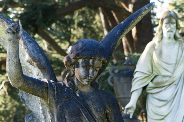
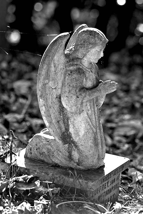
Fig 1 - The Dark Angel - 1/100 at f/9, ISO 100, 105mm prime lens

Fig 1 – The Dark Angel – 1/100 at f/9, ISO 100, 105mm prime lens

It was good to receive feedback on assignment 1 from my tutor. The feedback was generally positive, which is a relief, and has given me some excellent pointers to help with moving forward. I will combine extracts from the comments with my reactions and thoughts.

“This was an excellent first submission Steve, which was very enjoyable to look through and feedback on.”

“It was excellent to receive actual prints for a change, but I would suggest in order for you to cut your own costs, you needn’t do this for each submission.”

I have extracted this second point because I found it difficult to find out from the forums and from other students submissions whether prints were required or not. However, it was clear that the further one proceeds with the degree course the more important printing becomes. I spent a lot of time considering how to approach this because the Epson 2100 I had successfully used for many years had finally given up the ghost four years ago and I had switched to preparing my work for iPad. After some deliberation I decided to invest in a new printer for two main reasons:

a) I have always found the technology of printers and printer / screen calibration frustrating but I came to the conclusion that I was using the iPad approach as a way of avoiding confronting this challenge.

b) Even if I rise to new levels of image capture and post production my journey is incomplete if I outsource the printing and make no effort to build my skills in that area. I will not say that photographers who don’t print are in anyway lesser photographers. Ai Wei Wei appears to outsource nearly all his works of art* so it is not necessarily a valid measure of creativity. However, for me, it is the third key skill that I wish to master.

I have purchased an Epson R3000 which, despite the extortionate price for the ink, is a very satisfactory machine and is far more compatible with my iMac than the 2100 ever was with my old G5.

“What it does show me in advance though, is your clear ability to be able to professionally present your work, with very close attention to detail in a manner that not only looks very impressive, but gives a clear indication about how seriously you take your work.  This is very important, because if you don’t take it seriously, others will find it difficult to!”

This was probably the most pleasing statement from the feedback. Embarking on a degree course at my age when my life is already full and quite satisfyingly complex was a major decision and one that I did not take lightly. A lot of my thought processes were about having my work taken seriously. After 40 plus years of taking photos for no particular reason I had a strong desire to understand how to capture better images and, perhaps more importantly, to have a clear reason for taking them. That reason is not to complete the many tasks and assignments, those are just steps on the path, it is about finding a way to take photographs that reflect the way I see the world and, like anyone else, I want my view of the world to be taken seriously. OCA talk about students finding their voice and that would be a highly satisfactory outcome.

“As mentioned above Steve, in my opinion this was a very impressive first submission in terms of both your appreciation of theory and practice.  You have certainly set your stall out for future assignments to come now!”

Obviously I am delighted to receive some praise and take much heart from it but I also recognise that I need to maintain the standard of presentation but, most importantly, to improve my creative ability and technical skills and to show a developing appreciation of theory and practice as I move forward with the course.

“All the imagery looked well worked out and shot for purpose.”

I am glad that my tutor valued this. Distance learning is a funny thing, especially for someone who was never very good at non-distance learning. It requires a blend of discipline, motivation and management that can only come from one source. There is little point in cutting corners as   I am only answerable to myself. I wanted to treat each exercise and assignment as an opportunity to explore what interests me through the medium of photography and this means taking on board the objectives, researching where necessary, learning and applying new skills where possible and creating something that is new to me and better than before.

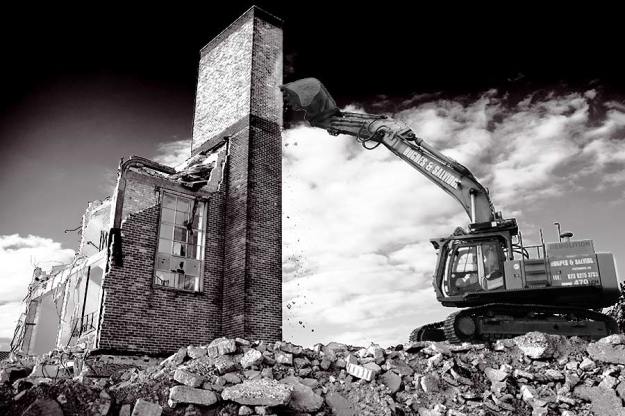
Fig 2 and 3 High and Low as Originally Submitted

Fig 2 and 3 High and Low as Originally Submitted

“Some of these contrasting sets worked really well in my opinion – I particularly liked the ‘High & Low’ pairing which was a clever interpretation.  I will always remain unconvinced about the monochrome / colour isolation used here though (or anywhere for that matter !), as I don’t really understand what purpose it has.  These two images are strong enough without applying any fancy footwork or gimics … my advice will always be to keep things as simple as possible”

Totally fair comment. Over processed and gimmicky. I was definitely trying to be “creative” rather than letting the images speak for themselves.

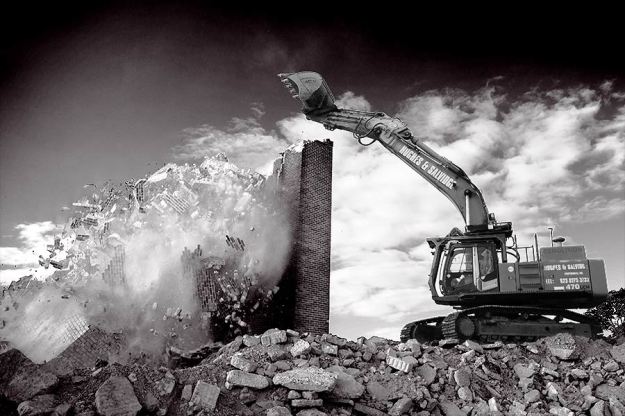
Fig 4. High (Re-worked) - 1/100 at f/3.2, ISO 100, 24 to 70mm zoom lens at 24mm

Fig 4. High (Re-worked) – 1/100 at f/3.2, ISO 100, 24 to 70mm zoom lens at 24mm

Fig 5. Low (Re-worked) - 1/100 at f/3.2, ISO 100, 24 to 70mm zoom lens at 24mm

Fig 5. Low (Re-worked) – 1/100 at f/3.2, ISO 100, 24 to 70mm zoom lens at 24mm

Figures 4 and 5 above are re-works of High and Low following my tutors suggestion that combining colour and black and white had not added anything to the originals. They certainly have not become weaker images through a quick re-work and there is now an argument that the digger has become a leading line into the demolition and is thereby adding to the image without being a dominant and inappropriate distraction.

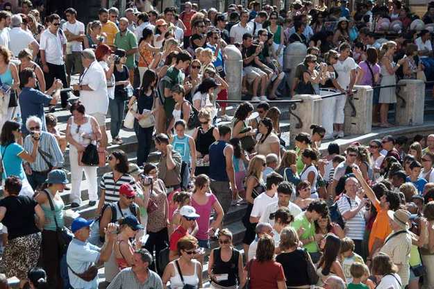
Fig 6 and 7 many and Few as Originally Submitted

Fig 6 and 7 many and Few as Originally Submitted

“The other pairings I thought that worked well would be ‘Many & Few’, which was a very literal representation that simply defined the requirement. (I might have cropped in tighter with the ‘many’ shot though in order to have removed the wall in the bottom right corner.)”

Not being literal was my biggest challenge, I know that I am a literal sort of person and it will be difficult to break that mould. It was a challenge to come up with imaginative interpretations of the pairings without copying other people’s ideas so, in many cases, I settled for literal. It is interesting that my tutor homed in on the wall, I thought about taking it out but felt that there was more of a crowd with it in and it added some context.

Many - 1/200 at f/5.6, ISO 100, 24 - 70mm zoom lens at 65mm

Fig 8 Many (Re-Worked) – 1/200 at f/5.6, ISO 100, 24 – 70mm zoom lens at 65mm

Fig. 8 is a cropped, re-worked version of many. I know that the real answer was to have captured more people and less architecture with the camera so this is just about cropping. Even when I was re-working this I was thinking the tutor is entitled to his opinion but I prefer the original. Once I saw the crop I can see he was right – too much irrelevant architecture adding nothing to the image either in the context of the assignment or even just as an image. Which neatly leads to his comments about composition that I will come back to later.

Much and Little as Originally Submitted

Fig 9 and 10 Much and Little as Originally Submitted

“Also, the ‘Much & Little’ worked well for the same reason really.  It can also often be a good idea to try and keep the format of the images identical if at all possible.”

Good point. “Much” could have been a portrait frame and probably wouldn’t have lost its impact. There was not enough clean wall to the left and right of “Little” to have been a landscape frame and the scale was wrong as a landscape crop.

Light - 1/80 at f/14, ISO 6400, 16 to 35mm lens at 16mm

Fig 11 Light – 1/80 at f/14, ISO 6400, 16 to 35mm lens at 16mm

“I also really liked the ‘Light’ shot which was really nicely lit … looks like a great place to hang out !”

It is, I wish I could get there more often. One of the great aspects of modern DSLRs is their ability to deal with low light. On film or with an early DSLR I would not have had sufficient skill to get this shot. I love mixing natural light and artificial light and have used it extensively when photographing my grandchildren.

“Lastly, another additional positive point to make about your work is that in general, most of the images show very little ‘dead space’, which is so often found in the early stages of photographic practice – prior to any theoretical compositional considerations being either learnt or absorbed.  Remember that effective photography equals Technique + Composition.  Good or acceptable technique is arguably the first prerequisite for ‘good’ photography, but this alone will not make a ‘good’ image.  Image making must be complimented by composition, not just technique as mentioned before. We all use very similar technical equipment to make images, so composition is often one of the best ways in which a photographer can express their individuality and personal feeling in communicating their thoughts and ideas.”

“The term ‘composition’ has been mentioned in your feedback and I cannot emphasise its importance enough at this level of study and in particular at this stage of the programme.  In order to help and support you making appropriate compositional decisions [IE: what you choose to include and exclude from the frame, prior to taking the image] you must closely study the work of other practitioners.” (for follow up work see here)

Obviously the positive is pleasing, I usually crop quite tight and don’t like dead space in an image. I recognise that this sometimes means that I don’t use negative space to best effect. However, I want to take the tutor’s comments about composition on board and think more deeply about this. Looking at the submission images there is already the specific remark about “many” to consider in this context and looking back over the whole set I can see that I need to consider more carefully what should and should not be included in the frame. I’m of a generation that remembers the famous Bill Shankly quote about the off-side rule “If a player is not interfering with play or seeking to gain an advantage, then he should be.” I will take my tutor’s advice and more rigorously consider whether all the content of the frame is gaining an advantage for the composition. Study of the great masters is an advised and valid route to help me develop this skill. My tutor has pointed me towards Josef Koudelka as an additional inspirational source in this regard.

I was pleased that I received positive comments about this blog, I am not reproducing them here as they are not related to photography.

Overall my tutor thought that assignment 1 was an “impressive first submission in terms of both (my) appreciation of theory and practice” and that is just the motivation I need to try and maintain the standard and improve both generally and specifically in the next phase. All the criticism was highly constructive with clear guidance on what I need to work on and I will endeavour to carry that forward into assignment 2.

Sources

*Klayman, Alison. (2013) Ai WeiWei: Never Sorry, United Expression Media.

Assignment 1 – Self Assessment

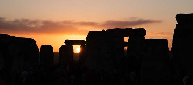
Light at Stonehendge - 1/200 at f/7.1, ISO100, 24-70mm lens at 24mm

Light at Stonehendge – 1/200 at f/7.1, ISO100, 24-70mm lens at 24mm

Demonstration of Technical & Visual Skills

There are a few different techniques used to capture images using flash and other off-camera lights and in the case of rough and smooth the lighting has been used to create the image.

There are, perhaps, a disproportionate number of images that have relied on the ability of my cameras to work with very high ISO but this is an effect that I like and I believe works especially well with light and much. 

I would have liked to have included some landscape and portraits in the set but the opportunity did not arise and, as many of my existing images are landscape, I think I was sub-conciously keeping away from that genre. Overall there is a studio image, some street photography, some abstract and some action images so I feel there is a reasonable spread of techniques in use.

I think that straight and many show the ability to spot a potential subject which is not immediately obvious and I feel that overall the set shows some visual awareness.

In terms of composition, I have tried to improve my initial compositions as I have worked through the exercises and this assignment. I am consciously using two prime lenses (150mm and 50mm) to help me think about composition more and whilst no 50mm images made the cut there are several taken with the 150mm. Each image has been actively composed to create the image I wanted and I am happy with the results in that regard.

Quality of Outcome

This is a very difficult area to self judge. I am far from knowing everything I need to know to capture good images but I do feel that I have applied some of what I do know to this assignment and have consciously tried to build on the initial exercises. I am endeavouring to creatively think about depth of field, shutter speed, composition and framing and to produce technically strong images. I am not satisfied with the final processing of high and low but pushed myself to include black and white work as this is a specific area that I know needs improvement.

I believe that the assignment, both in the blog and in the pack I am sending to my tutor, is coherently presented and that I have expressed my ideas clearly.

Demonstration of Creativity

These are not imaginative images and I know that this is an area that I need to take to another level. I have set myself targets to seek out more inspiration from great photographers and to use that inspiration to fuel my own imagination.

On the other hand I have experimented with techniques that I have rarely used in the past such as the processing of high and low, the lighting in rough and smooth and the indoor shots in light and dark.

I am a long way from developing a personal voice but see that as the overall objective of this course. I do believe that I am beginning to see personal projects that interest me about subjects about which I feel strongly. This is something I did not have six weeks ago so perhaps I am taking the first step towards a voice.

Context

I am comfortable researching subjects and see this is as a potential weakness as I did get bogged down in this assignment (see Assignment 1 Reflections). The challenge is that there is too much information available on the internet and I am going to more effectively focus my research in the next part of the course.

I am self critical by nature but the ability to critique a photograph is a skill that needs developing.

Assignment 1 – Reflection and Objectives Going Forward

I found Assignment 1 to be challenging partly because I am quite literal by nature and nurture, forty years in IT has to have some effect.

To try and overcome this limitation I spent a lot of time thinking about and planning this project. I found that slowly leafing through the work of several photographs helped. I have mentioned Camilo José Vergara as a specific inspiration for my pair of graffiti images and, although I did not use the images as part of the assignment, I took several photographs in Aldershot that were influenced by his work.

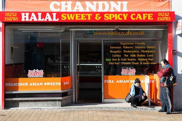
Sweet Shop - 1/100 at f/8, ISO 125, 24 - 70mm zoom lens at 56mm

Sweet Shop – 1/100 at f/8, ISO 125, 24 – 70mm zoom lens at 56mm

Sweet shop is one of those photographs and shows two Nepalis outside an Asian fast food shop in Aldershot.

One of my earliest ideas was to base many of the images around an industrial theme. This led me to seek out artists who had used this theme extensively and this took me to Lewis W. Hine. I found a copy of  “Women at Work” second hand but I’m still looking for an affordable copy of “Men at Work”.

Hine’s work is remarkable, in his introduction to Women at Work, Jonathan L. Doherty points out that Hine saw the American Worker as a heroic figure.  Many of his photographs focus on the skill and application of his female subjects even though he is known to have held strong views on poverty and exploitation. As a result his images are very positive, I do not believe that he intends us to feel sorry for the workers, he wants us to see them as people with ability and strength, to celebrate and admire them.

I sought out Hine to see how he photographed machines but came away more influenced by the way he portrayed people in a positive light even if their circumstances were clearly unsatisfactory. An example of this is “Italian Immigrant, East Side, New York City 1910” which is of a women in a run-down district, carrying a heavy load but instead of this being a depressing image it emphasises her strength and purpose. His ability to emphasise the positives has made me think more deeply about street photography and how important it is not to fall into the trap of type casting people by the way you photograph them.

Overall I spent a lot of time looking at black and white photos from great photographers but lacked the confidence to bring much black and white to the assignment. My trip to the military cemetery in Aldershot was to look for many and few or large and small contrasts. I thought the gravestones and the memorials might offer these comparisons. But, I also thought that the older sections would provide strong gothic images that would work well in black and white so I could include this technique in my final set.

I think I captured several images that fitted those criteria but in every case I preferred the colour version.

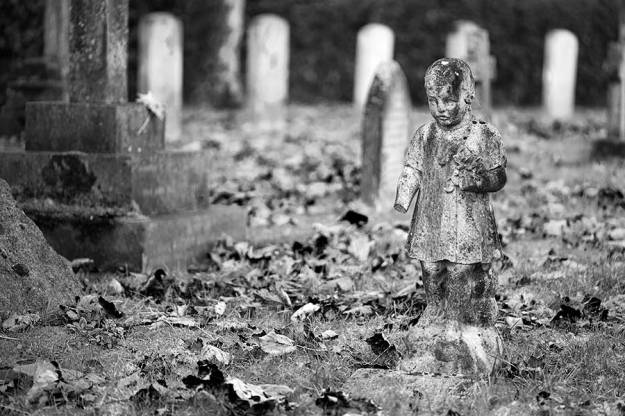
Grave of a Small Child - 1/100 at f/3.2, 105mm prime lens

Grave of a Small Child – 1/100 at f/3.2, 105mm prime lens

Grave of a Small Child - 1/100 at f/3.2, 105mm prime lens

Grave of a Small Child – 1/100 at f/3.2, 105mm prime lens

Little Angel - 1/100 at f/4.5, ISO 100, 105mm prime lens

Little Angel – 1/100 at f/4.5, ISO 100, 105mm prime lens

Little Angel - 1/100 at f/4.5, ISO 100, 105mm prime lens

Little Angel – 1/100 at f/4.5, ISO 100, 105mm prime lens

I found Michael Freeman’s Black and White Photography Field Guide immensely helpful and looking at the work of Henri Cartier Bresson, Lewis W. Hine and Ansel Adams is also a great help but I have to make major step up in terms of technique to produce even average results in black and white.

As a result only high and low had a monochrome element and I feel those images have several processing flaws. I have asked myself why I included them if I knew they were flawed but I like them as images and believe a “good” print is hidden in there but that I don’t have the black and white processing skills to extract it. It is therefore helpful to post them as a marker that I can look back on to measure whether I am improving these skills.

My first objective moving forward is to improve my ability to capture and print work in black and white so that I am confident to present it in an assignment.

I am very conscious that I lost momentum in the course of completing this assignment. I knew that my instinct would be to produce very literal representations of the contrasts and therefore spent a lot of time looking at the potential meanings of the words, brainstorming ideas, planning locations, taking and analysing test shots and selecting images. This all sounds very positive and it would be easy to spin it as a diligent and efficient process but it wasn’t.

I actually used very few of the dozens and dozens of ideas I had on my mind maps. I spent a second day at Milestones Museum to get one usable image and know that most of the unplanned “test” shots were better than the planned versions. In reality the process was flawed and it took at least three weeks of elapsed time before I changed tack. I was far more effective when I picked locations that might offer opportunity and just went out and took photographs or by just having my camera with me when I had to be in places for other reasons. Italy, MC Motors, Salisbury and The South Bank were all places I went to for work or social reasons; the three locations I used in Aldershot were more planned and the trampoline photos in our back garden were staged.

Overall I feel that I have been working on this assignment for far too long, I was defiantly bogged down and have my daughter, who teaches photography, to thank for getting me out of a lot of blind alleys and onto a clearer path. It is hard to define exactly what I need to do to address this going forward but I do not want to move steadily through the exercises and then stall when I reach the assignments.

My current thoughts are that I need to carefully manage the time spent planning and the amount of process and get out there with a camera more quickly. I feel that my best work was when I put myself in a good location, with the assignment objectives in my mind, and just took photographs that felt right. By doing this I took some photos that I liked but that didn’t fit the assignment but also found photos that did both.

The desk work that really did help was looking at top photographer’s work. Looking at the thousands of images that Google can find only helped to confuse the issue. I need to focus my attention on gaining inspiration from great photographers and to strive to learn from their skills. Although it didn’t directly impact the assignment I felt that reviewing Vergara’s work on a Saturday led to me taking better photos on Sunday morning.

My second objective is to focus my research on gaining inspiration as a creative fuel and to use this fuel by moving quickly to capturing images.

Sources:

Hine, Lewis H. (1981) Women at Work. New York, Dover Publications

Exercise 13 – Finding Contrasts

Look Many - 1/250 f2 ISO 100

Look Many – 1/250 f2 ISO 100

In exercise 13 we are asked to look back through our existing photographs and identify pairs that represent contrasting subjects.

Pair 1 – Still and Moving

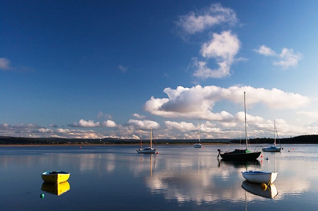
Fig. 1 - Still Waters - 1/160 at f/5.6 ISO 125

Fig. 1 – Still Waters Findhorn Scotland – 1/160 at f/5.6 ISO 125

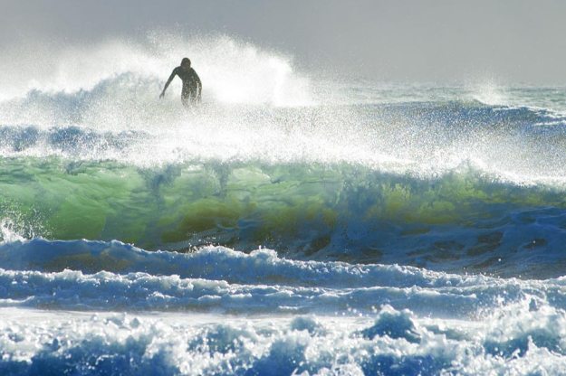
Fig. 2 - Crashing Waves - 1/500 at f/8 ISO 125

Fig. 2 – Crashing Waves Queensland Australia – 1/500 at f/8 ISO 125

These two images exhibit, both of the sea, are strongly contrasting in many ways. Still as in calm versus wind blown, moving, crashing, surf. There is also a good contrast in light, a summer’s evening in  the north east of Britain and the backlit very early morning  light behind the waves and the surfer in Queensland Australia.
Pair 2 – Spring and Winter

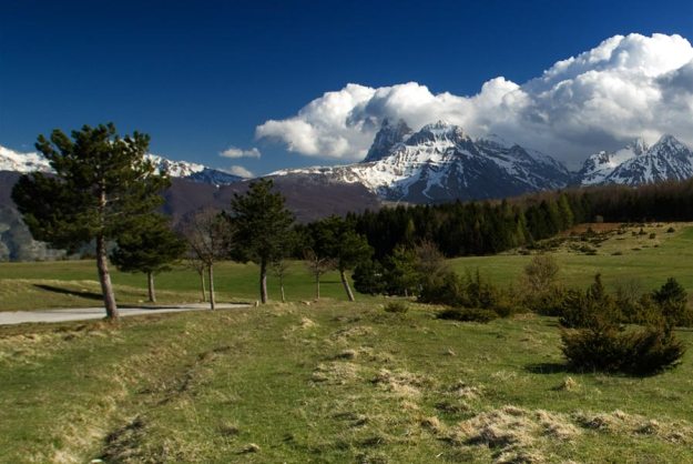
Fig. 3 - Spring in Monti della Laga - 1/200 f/4.5 ISO 100

Fig. 3 – Spring in Monti della Laga – 1/200 f/4.5 ISO 100

Mountains-winter

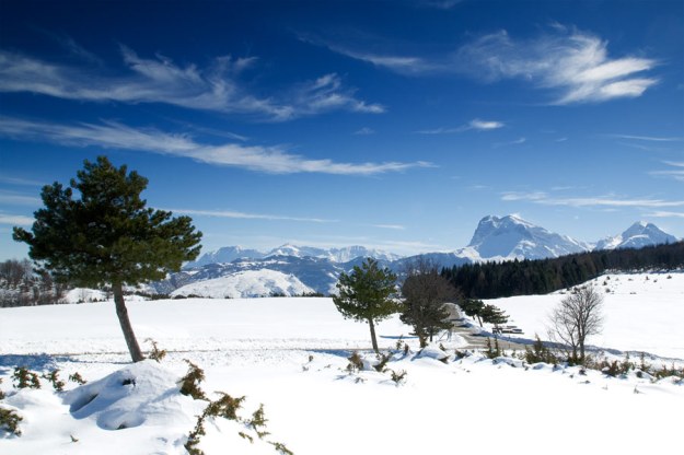
Fig. 4 – Winter in Monti della Laga – 1/125 f/12 ISO 100

The contrast in fig. 3 and 4 is simply Spring and Winter at the same place in Abruzzo Italy. The large mountain in the background, Corno Grande, is crowned with fluffy white clouds on an otherwise clear spring day but stark against a cold winter sky in the second photograph.

Pair 3 Fake and Real

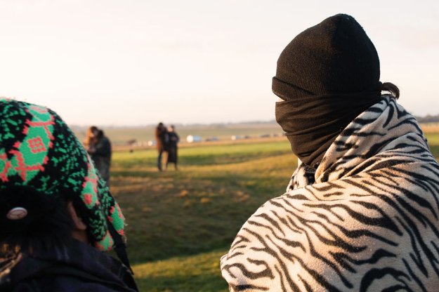
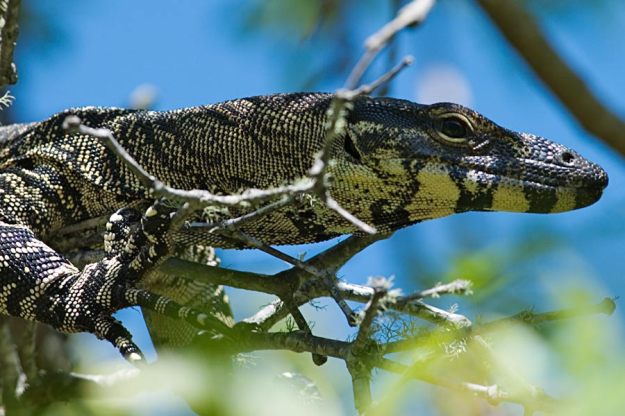
Fig. 5 - Fake Black & White Skin - 1/200 at f/2.8 ISO 110

Fig. 5 – Fake Black & White Skin – 1/200 at f/2.8 ISO 110

Fig. 6 - Real Black and White Skin - 1/180 at f/6.7 ISO 125

Fig. 6 – Real Black and White Skin – 1/180 at f/6.7 ISO 125

A contrast of real skin against fake animal print skin. The mysterious man in fig.5 is watching the dawn on the winter solstice at Stonehenge. The monitor lizard is waiting out the hot afternoon in a tree at Noosa in New South Wales.

Pair 4 – In and Out of Season

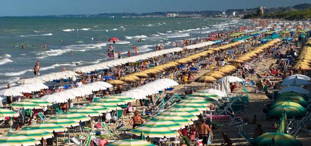
Fig. 7 - August in Pineto - 1/180 at f/8 ISO 125

Fig. 7 – August in Pineto – 1/180 at f/8 ISO 125

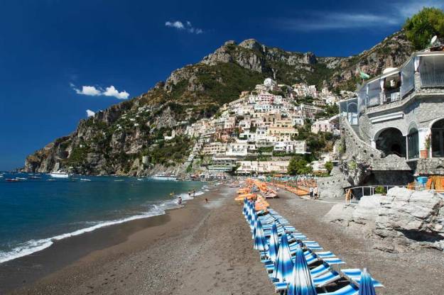
Fig. 8 - September in Positano - 1/15 at f18 ISO 100

Fig. 8 – September in Positano – 1/15 at f18 ISO 100

I am intrigued how the summer holiday season in Italy is defined primarily by the calendar. In August the beaches are packed with people, sun loungers and umbrellas. On the 1st of September, regardless of the weather, they are handed back to foreign tourists and dog walkers. In Positano it is still early enough in September for the umbrellas and sun loungers to be optimistically set out on the beach every morning and packed away, unused, at the end of the day.

Researching Assignment 1 – Remembrance Sunday

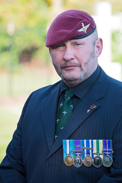
Fig. 1 - 1/100 at f/5 ISO 125

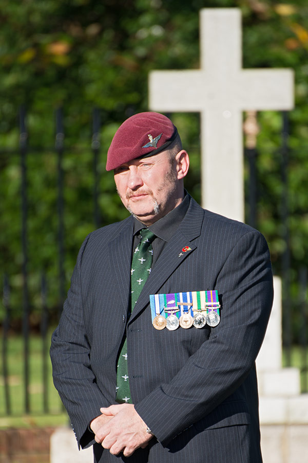
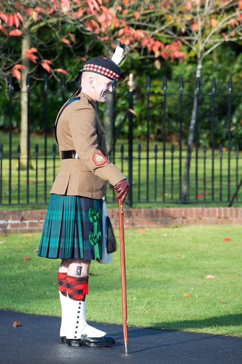
Fig. 1 – Proud Para – 1/100 at f/5 ISO 125

Continuing the process of researching and undertaking TAoP Assignment 1, Contrasts. Over the last few weeks I have slowly collected images for the contrasting pairs. My process has mostly been to map out ideas and then to identify locations that might work for those ideas.

When thinking about straight & curved I had thought of soldiers as a possibility for straight and with Remembrance Sunday falling last weekend I wanted to attend the service in Aldershot to further explore that idea.
Aldershot is a location that I see myself regularly returning to during this course, in reality it is already becoming more of a personal project. Aldershot is famous for a very small number of things.  First and foremost it is the Home of The British Army which is one of life’s great ironies as successive governments have reduced the military presence in the town as they have consolidated the Army in other places such as Colchester. Most of the army has left home.
The opening lines of Rudyard Kipling’s poem Gunga Din* immortalises the town:

You may talk o’ gin and beer, When you’re quartered safe out ‘ere, And you’re sent to penny fights an’ Aldershot it;

Penny fights was Victorian army slag for training battles and Aldershot was where they happened.

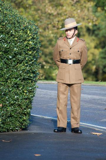
Fig. 2 Gurkha - 1/100 at f/5.6 ISO 100

Fig. 2 – Gurkha – 1/100 at f/5.6 ISO 100

It’s second claim to fame is more recent. Joanna Lumley, the daughter of a Gurkha officer, was the public face of a campaign to secure the right of ex-Gurhkas, the Nepalese mercenries who have been part of the British Army since the days of the Raj, to retire in Britain along with their families if they had served in the regiment for more than 4 years. This led to a influx of Nepalese to the UK and many settled in Aldershot which was the nearest town to their old barracks at Church Crookham. By 2011, 1 in 10 residents of Aldershot was Nepalese putting a significant strain on the infrastructure and creating much tension in the community. The so called “Battle of Aldershot” had begun and is still a topic of hot debate today.

I am interested in Aldershot at many levels. The Nepalese story is compelling, the tensions it has created, the strain on social services and infrastructure against the work ethic of the immigrants and the boost they have given to the local economy by creating successful businesses that might help regenerate the town.

At another level I am drawn to the history of a place that started as a tented training camp, around a small village, and grew into a town with no other purpose than to house and support the Army – a modern day vicus** and, I suspect, potentially quite unique in that regard in modern Britain. But a town that has nearly lost its reason for existing as the army has withdrawn and is trying to reinvent itself.

The rapid growth of the army in the Aldershot area led to the construction of barracks, stables, churches and a wide array of military buildings whilst civic and commercial buildings sprang up in the town centre. Sadly many of these buildings were demolished and their sites redeveloped in the 60s, an era of wanton vandalism by town planners, and, of course, many of those developments are now abandoned or already pulled down. However, dotted around the military town there still architectural gems that have survived and that deserve preservation.

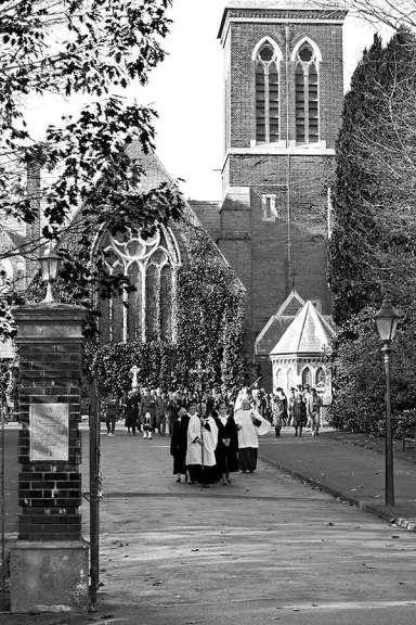
Fig. Garrison Church Aldershot - 1/100 at f/5.6 ISO 100

Fig. 3 – Garrison Church Aldershot – 1/100 at f/5.6 ISO 100

So, on Sunday, I travelled to Aldershot and specifically to the Garrison Church on the edge of the military town.

In planning I thought that there was potentially a pair of images to represent straight and curved. I knew that the war memorial was likely to have straight lines, that there would be lines of wreaths on the memorial and soldiers at attention. There was also the connotation of straight for an upright uncool citizen such as a soldier (or am I showing my age?).

For curved there would be wreaths of poppies and musical instruments.

I was highly conscious that this was a subject that must be treated with respect. Aldershot is a town that has lost thousands of serving soldiers from it’s regiments since it was founded in 1854. Since the Crimean war soldiers have left Aldershot to serve in every conflict Britain has been involved in.

Some research told me that Civil and military dignitaries would first join each other at a remembrance service in the Garrison Church followed by wreath laying and a march past.

Arriving early I had the opportunity to meet and photograph some of the veterans that were gathering for the parade including the ex-paratroper, or “para” as they are known locally, in fig. 1. Breaking from any tradition of candid street photography I asked his permission to photograph him and he rewarded me by striking the marvellous pose shown in fig 1 and fig. 4.

Fig. 4 - Proud Para - 1/100 at f/5.6 ISO 100

Fig. 4 – Proud Para – 1/100 at f/5.6 ISO 100

I am especially pleased with fig. 4 as it includes the memorial in the background. This could be my “straight” image but I feel that this would not be respectful.

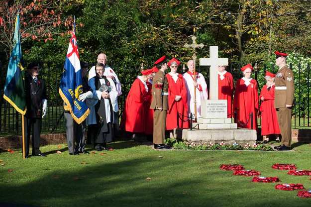
After a short while military policemen or “red caps” arrived with an officer or NCO from a Scottish regiment and began to arrange the wreaths ready for the official laying. This provided interesting images that I had not expected.

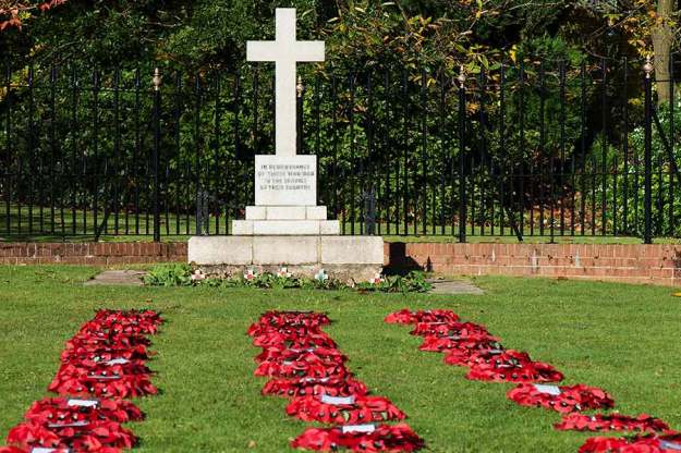
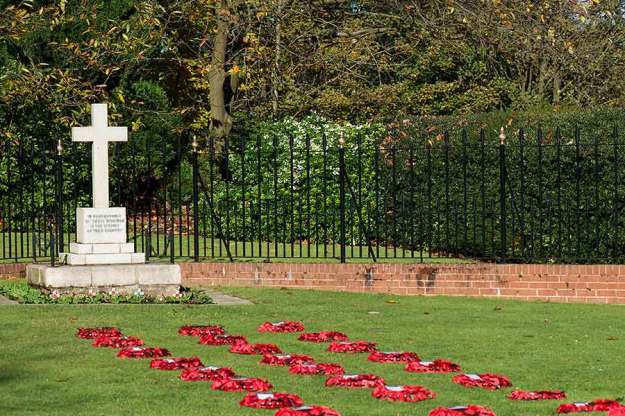
Fig. 5 - Memorial & Poppies - 1/160 at f/10 ISO 100

Fig. 5 – Memorial & Poppies – 1/160 at f/10 ISO 100

Fig. 6 - Memorial & Poppies - 1/320 at f/7.1 ISO 100

Fig. 6 – Memorial & Poppies – 1/320 at f/7.1 ISO 100

My expectation had been to capture the wreaths in lines after they had been laid but the MPs placed them in the long straight lines in fig. 5 and fig 6. ready to be picked up and placed on the memorial. I initially though that one of these would be my “straight” image but eventually choose a slight variation on this theme.

And, apparently in charge, or was he just in the best uniform ? The gentleman from Scotland, a Regimental Sergeant Major perhaps.

Fig 7 - Scottish RSM - 1/100 at f/8 ISO 180

Fig 7 – Scottish RSM – 1/100 at f/8 ISO 180

It was an interesting learning experience, I do not recall photographing anything quite like this before. In some ways it is similar to photographing the winter solstice last year. I felt a bit lost, not quite sure where to be at any given time and not certain what was acceptable and what was intrusive or disrespectful.

It was helpful that a local press photographer was there and happy to explain the programme. However, watching where he went was the real education as he was always one step ahead of the action. I would imagine he has covered this event many times and knew exactly where to stand for each phase of the ceremony. If I go again next year I will get into better positions and that might lead to better images.

The summary of the lesson is that research about an event can only get you so far, being there is the only way to know what to do next time. Hopefully, if I go to enough events, my senses will become better tuned to spotting the right place to be.

Fig 8. - 1/1250 at f/7.1 ISO 100

Fig 8. – Ready for the Ceremony – 1/1250 at f/7.1 ISO 100

Sources:

*Kipling, Rudyard, (1990) The Complete Verse. Folkestone, Invicta

** A “vicus” was the civilian settlement that grew up outside the walls of a Roman Legionary camp or fort. Initially populated by camp followers many of these disorganised camps developed in towns and eclipsed the original military camp. See Salway, Peter, (1993) The Oxford Illustrated History of Roman Britain. Oxford University Press. Page 404

Researching Assignment 1 – A Visit to the Museum

1/100 at f/4 ISO 3200 with ring flash

1/100 at f/4 ISO 3200 with ring flash

Assignment 1, contrasts is based on an exercise created in the 1920s by Johanne Itten who ran the basic course at the Bauhaus School of art and design. Itten’s theory of composition was built on the concept of contrasts and as an early part of his teaching he asked his students to identify and illustrate contrasts selected from a list.

Michael Freeman, in The Photographers Eye (2007), says that Itten’s intent was to “awaken a vital feeling for the subject through observation”. He goes on to explain that the exercise involved three steps; firstly to gain a feeling for each contrast, then to list the ways of expressing this feeling and finally to make an image. Assignment 1 calls for these same three steps and my approach has been to try and follow a process towards each pair of images.

My first thought was to develop a theme through all 17 photographs as well as having a relationship, and a contrast, across the pairs. However, as I moved further into exploring ideas for the images the harder it became to stay within a single theme as it quickly became too restrictive, limiting subject matter, technique and creativity.

The challenge in this assignment has been to avoid the obvious and the cliché. Aaron Siskind said “We look at the world and see what we have learned to believe is there. We have been conditioned to expect… but, as photographers, we must learn to relax our beliefs.” This appeared to be an apt thought to remember on embarking upon this assignment.

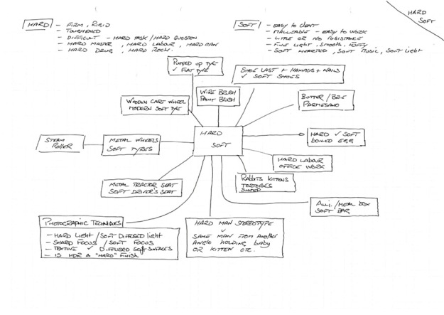
My process began by creating a series of mind maps for most of the contrast pairs. This included using the Oxford Concise English Dictionary, not so much for definitions, but for the usage examples that it gives. For example “hard” offers dozens of linked words including hard problem, hard to suffer, hard life, hard frost, hard data, hard labour and so on. This helped to see the many nuances of a simple word, in fact I tended to find that the simpler the word the more widely it was used.

wrimg014The scanned page shown above is the mind map representing hard/soft. This has been a useful process and although I won’t be using most of the ideas it has helped spot potential images.

Having created these mind maps I began to home in on some potential pairs. I created an initial list of matched pairs and then began exploring locations that might provide images that fitted in with my ideas. I began to visualise some images and set out to search them out and in other cases I felt that a particular location or situation might work for certain pairs. Of course many of the visualised images were disappointing and some locations were fruitless but the process of planning, then seeking an image sometimes allowed me to develop a potentially better idea.

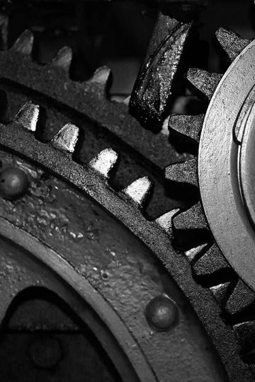
One useful visit was to an industrial museum where I hoped to find machinery that offered the opportunity to capture shapes that might work for example with rounded/diagonal, curved/straight, strong/weak and heavy/light. I expected that the most obvious contrasts available would be the physical ones such as size, texture and shape.

1/100 at f/1.8 ISO 2800

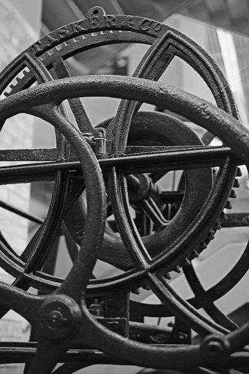
Fig. 2 – 1/100 at f/1.8 ISO 2800

As the museum was indoors with very limited natural light it was challenging to manage the light but this helped to focus on shapes. I captured a series of images that were processed and assesses. This gave me half a dozen ideas that might work which I printed as rough drafts, and noting ideas about angles, lighting and compositions.

For example in fig. 2, which might have worked for rounded, the wheels needed more light bottom left, perhaps a reflector, to bring the first wheel out of such deep shadow.

The wheels are old and highly textured so light across the surface will bring that out. It also needs enough depth of field to have all the layers of wheels in focus but not so much that the very angular background comes into focus.

1/100 at f/1.8 ISO 1000

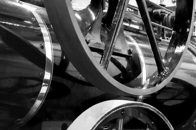
Fig 3 – 1/100 at f/1.8 ISO 1000

Another idea for rounded was to find as many rounded objects as possible interacting with each other. Fig. 3 is one example of many. By getting in close I am trying to take the viewer away from seeing an old steam engine and just to see the shapes. I have noted to try this again with a more acute angle to see if it possible to show the rounded boiler more clearly.

Fig. 4 - 1/125 at f/2.8 ISO 8063

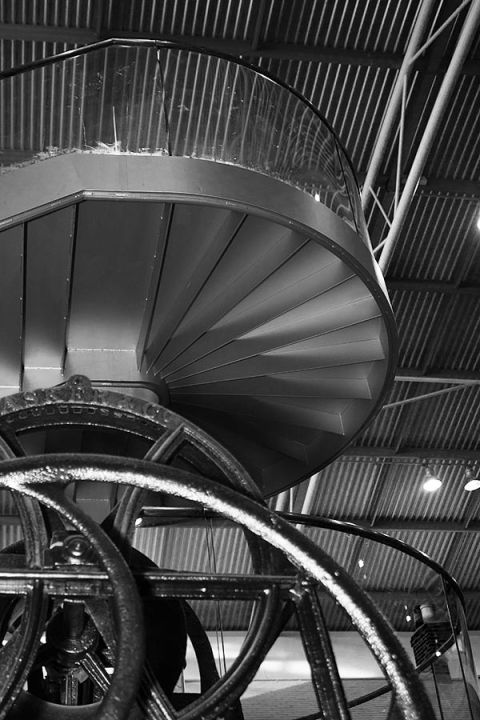
Fig. 4 – 1/125 at f/2.8 ISO 8063

Fig 4. is a different idea for rounded taken in the same location.

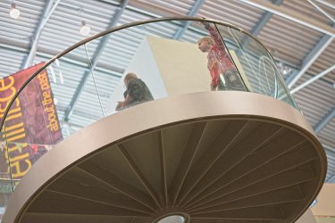
I took several shots of these very distinctively shaped stairs that sweep round about the exhibits. I liked the idea of the people rounding the corner as well as the rounded structure of the stair case. The light was difficult with a skylight above and the dark underneath of the stairs which I felt was essential to the image . I have used the HDR Toning function in Photoshop to balance out the shadows and highlights to show the structure of the staircase. This nearly works for me it is insipid.

I tried this technique after reading Michael Freemen’s blog post “HDR Revisted”  where he makes the point that HDR does not have to be extreme and is a way of dealing with the often impossible light conditions inside buildings where outside facing windows are essential to the composition. Obviously fig. 4 is not true HDR as it is based on a single image but it was interesting to try to balance of the light this way.

Fig. 5 – 1/125 at f/2.8 ISO 900

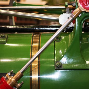
There was no shortage of diagonals on the old engines. Fig. 5 is one example, I liked the strong diagonal bottom left to top right and the lesser ones at the top.

I used a an on-camera flash hence the flash reflection to the right. My notes for this were to look for a framing that included the red junctions at top and bottom and to try working with natural light or a reflector. This and a number of other images also made me think about using off camera flash to bring light in from different angles.

Fig. 6 - 1/100 at f/5.6 ISO 18,000

Fig. 6 – 1/100 at f/5.6 ISO 18,000

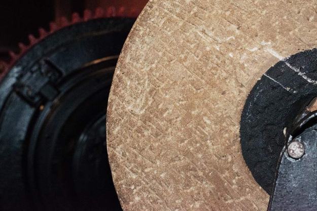
One of the strongest images on that first visit was of a stone grinding wheel. I felt the key to a photograph of this wheel would be angled light to bring out the texture. It could work as an image for rough.

A second visit to the museum allowed me to test a focussed number of ideas.

Fig. 7 - 1/100 at f/5.6 ISO 400 with diffused off camera flash

Fig. 7 – 1/100 at f/5.6 ISO 400 with diffused off camera flash

Fig. 7 was a development of the ideas of the stairs and the iron wheels. Starting out as “rounded” it became “curved” with the inclusion of the stairs. At one level I like this image, the curves work well being on two planes, vertical and horizontal but there is also a lot of straight lines and I am still unhappy with the lighting. I used an off-camera flash gun with a small diffuser and tried it in a variety of positions but the very black surface of the wheel was a magnet for blown out highlights and this is distracting. The light did not bring out the texture of the iron. It did not make the cut and I have subsequently moved onto a different idea for both curved and rounded but I have learnt something about using flash on this sort of subject.

Fig. 8 - 1/60 at f/5.6 ISO 100 diffused off-camera flash

Fig. 8 – 1/60 at f/5.6 ISO 100 diffused off-camera flash

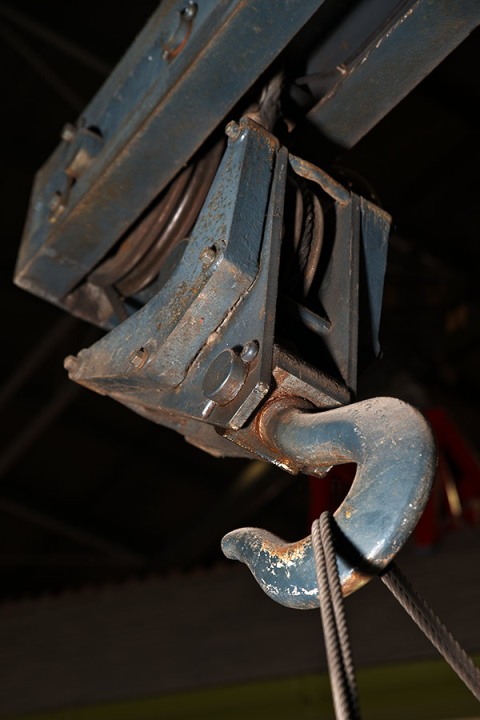
Fig. 8 is another image that went to the reject pile but that I enjoyed planning and working on. I had seen the hook with the tensioned cable on my first visit. It is about 3 metres off the ground and has the lights of the museum roof above it. The built in flash gun I used on my first visit has not allowed me to isolate the hook from the background so I wanted to try again with a much stronger light from the side and below. I think there is some merit in the result, the tension on the cable and the strong diagonal line through the whole subject was intended to give me “strong”. However, like most of the museum photos it is a too obvious interpretation.

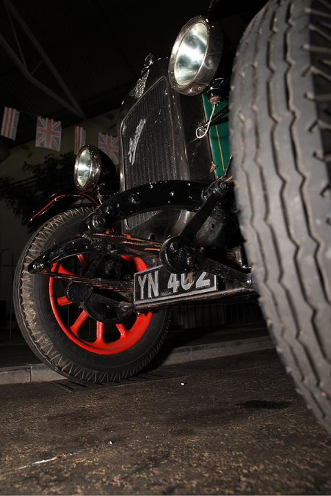
Other ideas that seemed good on paper but week in practice include my hard and soft combination where I wanted the contrast of hard and soft wheels, or seats or suspension. I tried a variety of shots of steam rollers, vintage cars and iron clad cart wheels but have not found angles that offer anything beyond a photo of a wheel.

Fig 9. - 1/60 at f/5.6 ISO 100 off-camera flash

Fig 9. – 1/60 at f/5.6 ISO 100 off-camera flash

Fig. 9 is one of the better examples where I was trying to get tyres and suspension into the same composition. Unfortunately all of the shots says things like “vintage car” or “old” and not hard or soft.

The two trips to the museum have achieved a lot. I use off-camera flash, in a soft box, to bring out the texture when I photograph food and taking this technique on-the-road was a useful learning experience. I have one shot which I am planning to include in my final pieces that is all about texture and came as a direct result of planning, taking test shots and returning to the same location with a planned image in mind. The fact that most of the other ideas fell short of my expectations was also helpful as it showed the gap between the idea and its execution. On balance  by selection this location I saw too many unimaginative and limited interpretations of the word pairs.

My next phase would be to look at quite different subjects.

Sources

Michael Freemen’s blog post “HDR Revisted

Aaron Siskind quotation – http://photography.about.com