Category Archives: Part 5 – Narrative & Illustration

Exercise 43 Illustration by Juxtaposition

Fig. 1 the Wheelwright's Shop Front Cover

Fig. 1 the Wheelwright’s Shop Front Cover

This exercise offer two options, either to design a book cover using a still life or to juxtapose a person with the result of their labour. As can be seen in fig. 1 my choice is the book cover.

The Book

The Wheelwright’s Shop (1) is linked, although not central, to my research for assignment 5 which is partly based on the writings of George Sturt. Sturt lived in the village where I grew up and was writing in the late 19th and early 20th century about life in rural Surrey at a time of great and rapid change. He had inherited The Wheelwright’s Shop from his father but his real love was writing and he handed over the business in 1891 to his foreman, whom he made a partner, and retired to his cottage in Lower Bourne to write a series of books and journals and to contribute to magazines such as Country Life.

The Wheelwright’s Shop, which he wrote in the period between 1884 and 1891 is widely regarded as his finest and most important work describing, in great detail, the complex processes involved in building wheels, carts, wagons and carriages. Sturt’s importance as a historical documentarian lies in his respect and admiration for the tradesmen employed in his business whom he describes as his friends. This elevates this book beyond being a technical journal through his descriptions of attitudes and life styles that bring the reader into close contact with the working man of the late 19th century.

The Cover

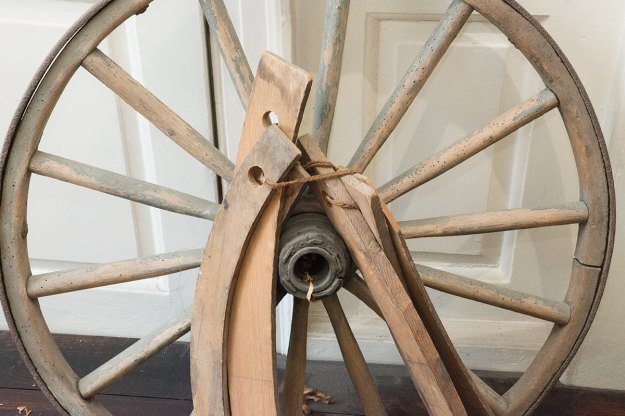
For my subject I chose two exhibits from Farnham Museum, the first is one of Sturt’s wheels and the other is from the collection of his tools that are currently on display. I wanted to design a cover that created an impression of a wheel being manufactured, creating a sense of past-times and suggestive of a craftsman’s bench. The juxtaposition is the completed wheel on one hand and the tools that might have made it on the other with the wood shavings acting as a link between the two.

The Process

Fig. 2 The Wheel - Original Photograph - 1/60 at f/20 with flash

Fig. 2 The Wheel – Original Photograph – 1/60 at f/20 with flash

Fig. 3 The Tools - Original Photograph - 1/60 at f/20 with flash

Fig. 3 The Tools – Original Photograph – 1/60 at f/20 with flash

  1. I started with two images, the wheel (fig. 2) and the tools (fig.3)
  2. They were both taken with the same exposure settings and a small on-camera flash gun, I used the same 24 to 70mm lens using my distance from the subject to achieve the difference in scale.
  3. I introduced the two photographs into photoshop as separate layers.
  4. My initial idea was to have the tools on top at about 80% opacity so that the wheel shoed through the tools but the result lacked any real punch.
  5. I then removed all the background from the wheel photo to give me a clean cut out and laid that over the tools.
  6. I adjusted the size of the wheel and moved the layer to create a compositional relationship between the tool handles and the wheel rim.
  7. Because it was a book cover the whole canvas had to be orientated vertically.
  8. For the text I wanted to use a font that reflected the time of the original book’s publication in 1923 and although Times New Roman, my final choice, wasn’t invented until 1932 it felt right.
  9. I added the text and created a mild 3D effect by copying the text layers, expanding the copies by 5% and changing the text colour to black. This gives a fine black line around the original white text which helps the text stand out without using any too modern techniques.

Sources

Books

(1) Sturt, George (1923) The Wheelwright’s Shop, 1963 edition. Cambridge: Cambridge University Press.

Exercise 42 Illustration by Symbols

White Vanitas - Colour - 1/60 at f/14 , ISO 100

White Vanitas – Colour – 1/60 at f/14 , ISO 100

Symbolism has been used throughout the history of both commercial and art photography. In art many symbols have been carried forward from religious painting, especially from the vanitas movement which flourished in the Netherlands in the early 17th century. During my research for assignment 4 I looked at the types of symbolism used by these Dutch painters and how photographers such as William Henry Fox Talbot and Roger Fenton brought that tradition into photography with it later becoming the basis for a lot of Irving Penn’s work and how vanitas symbols are regularly found in the work of contemporary still life photographers including conceptual artists such as Mat Collishaw. Many of the symbols used by contemporary artists have their roots in traditional religious, and especially Christian, art for the simple reason that they are readily understood by both religious and non religious audiences or because they have become so universal they have transcended their original religious meaning and become a common secular symbol so, for example, the Archangel Michael who was historically depicted holding scales as the warrior-guardian of righteousness and justice becomes Lady Justice on the top of the Old Bailey.

Advertising, and therefore commercial photography, is hugely dependent upon symbolism either by using commonly recognised symbols such as the sun to suggest health, vigour or goodness when advertising orange juice or breakfast cereals, shields, gates and castles for insurance and for security services or roses for valentine day products. All these uses of visual symbols rely on the concept of semiotics, which in simple terms is a sign that stands for something else *(1). The idea of semiotics was first described by Ferdinand de Saussure, a Swiss linguist, who explained that it involves a sign, word or object, the signifier and a concept, idea or thought that is to be communicated, the signified. Semiotics is a broad and complex subject that will no doubt be a subject for in-depth study at a later date but at its heart our ability to communicate an idea through the use of a symbol relies upon either, an obvious association between that thought and the symbol, or a common acceptance of the meaning of the signifier. There are many symbols that have instantly recognised meanings in Western society, a dove or an olive branch for peace, a red cross for medical care or a dollar sign for money or wealth (even in countries that use the pound or the euro). However, these symbols can be interpreted differently by different societies and cultures so a red cross might evoke a negative response in the Middle East where it is associated with the crusades.

In effect we all carry a mental register of codes that allow us to interpret these signs to understand their intended meaning, and although these codes might vary between cultures, we are often sophisticated enough to combine the code with its context to identify alternate meanings. These codes are constantly evolving, partly because the advertising industry sets out to design and introduce new signifier / signified relationships through the use of symbols in the shape of logos or by the repeated use of specific images in close association with a product.

Through this process we not only decode MacDonalds and everything it stands for from a large yellow “M” we come to associate meerkats with a consumer choice portal or, for those of a certain age, tigers with petrol. Once such strong brand identities are established the most sophisticated advertising can move beyond advertising a dull and unexciting product such as home insurance and provide short entertaining mini-dramas that become an end in themselves but subtly  promote the product by making the audience feel connected or just good about the family story in a series of gravy adverts, the students obsessed with the speed of their internet connection or the lives of Russian meerkats.

At a more sophisticated level charities are especially prone to leverage preconceptions and, arguably, prejudices, to attract our donations. A black child with a fly on their face is code for suffering, illness and deprivation even though many healthy children all over the world will have a fly land on their face in the course of a day, try visiting the Australian bush in summer, and using dogs and cats in an advert for an animal charity at Christmas is more effective that the same advert used in mid-summer because it is coded as “a dog is not just for Christmas”, “people are acting badly during the season of goodwill”.

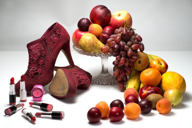
Photographers can draw on all these sources and code their images to communicate a message by appropriating established signifiers or inventing new ones that leverage established ideas. In some of my test pieces for assignment 4 I tried to use contemporary items as modern day vanitas symbols. This led me to use lipstick and stiletto heals to signify the vanity of the fashion industry but I mixed in traditional vanitas symbols such as plentiful fruit and watches in an attempt to suggest to the audience that all of the items in a still life needed to be interpreted in the context of vanitas.

This exercise suggests that we avoid clichés but the de-coding system we carry in our heads is reliant on our ability to instantly recognise and interpret symbolism in art or advertising. As a result there is a very thin line between a symbol being able to communicate the idea intended and it becoming a cliché. In practise a cliché is just a matter of timing, so the 1914 Lord Kitchener “Wants You” recruitment poster or “Keep Calm and Carry On” only became clichéd when they became over copied.

Growth

Avoiding plants, charts, upward pointing arrows and other common ideas:

  • I might try to photograph the wall in a house where parents have marked off their children’s height over time. The more dilapidated the wall the better, indicating that it has been left undecorated as a family treasure. This could provide a underlying message of love and nurture and sense of time passing.
  • On a similar theme a heap of, obviously discarded shoes of varying sizes might work.

Excess

  • Without wishing to appear obsessed with the subject all the traditional vanitas symbols work here, over-laden tables and so forth but, if I was planning to work on this subject again I would build on Mat Collishaw‘s ideas with his studies of American junk food. The concept of over sized portions and what we throw away offers powerful imagery.
  • Skips behind supermarkets and, a subject dear to my heart, all the food we dump in land fills that used to be fed to pigs because we have allowed government to over legislate to stop pork products being fed to pigs and cow products being fed to cows. As ever, we introduce new, sweeping, ill thought through laws instead of policing existing and sensible regulations.

Crime

  • I would look to go beyond symbols of crime and look for images of social situations that inevitably nurture crime. Disproportionate unemployment in areas with large populations of  ethnic minorities could provide interesting subjects.
  • The other angle might be crime waiting to happen such as open windows, keys in locks or visible purses in handbags.

Silence

  • A wealth of religious symbolism comes to mind and although this might verge on being clichéd it would rely on the image being strong enough to lift itself above the cliché. A lone monk walking towards an abbey or a simple altar in an empty church, someone praying alone in a church. Something with an Eleanor Rigby feel from Yellow Submarine might work so that loneliness was linked to silence. Note the use of a Beatles’ film as a source of symbolism.
  • Nearly any rural landscape with a pond if it is photographed with a long exposure so the surface is misty and perfectly smooth. Even a fisherman by a river might work.

Poverty

  • Probably a cliché but my first instinct would be to look for a juxtaposition of unnecessary wealth and extreme poverty. I spent many years in Asia and the images that still leap into my mind are slums next to Chinese graveyards where the dead were “living” in marble mausoleums and the living languished in huts made from flattened oil cans and packing cases.
  • If, it was to be a project, I would probably focus on rural poverty which is over-shadowed by the more obvious urban equivalent. The regular car boot sale in Aldershot would provide plenty of opportunities.

Sources

Internet

(1) Moriarty, Sandra. An Interpretive Study of Visual Cues in Advertising. http://spot.colorado.edu/~moriarts/viscueing.html

Chandler, David. Semiotics for Beginners. http://visual-memory.co.uk/daniel/Documents/S4B/sem01.html

Exercise 40 – A Narrative Picture Essay

Fig. 01 The Full Loxwood Joust Five Page Spread

Fig. 01 The Full Loxwood Joust Five Page Spread

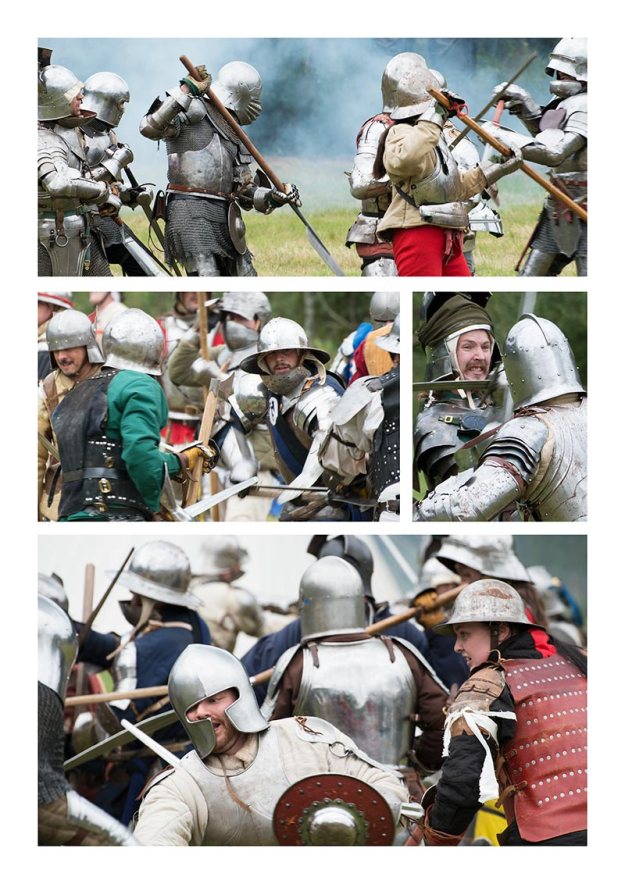
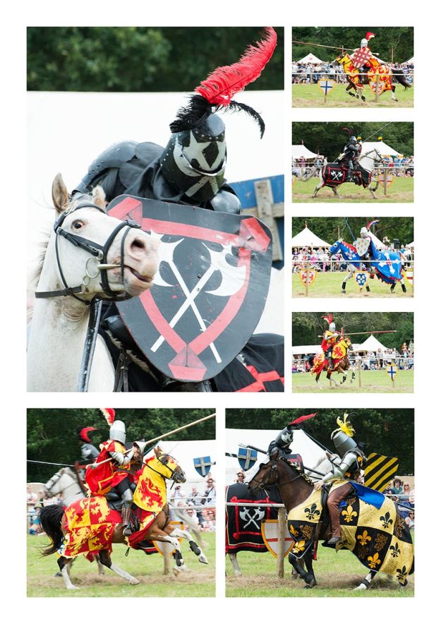
Exercise 40 calls for a picture essay of an event. I chose to cover the Loxwood Joust, a battle reenactment, medieval fair and joust held in the village of Loxwood, Sussex in August 2014. This event offered a variety of subjects but, for the photo essay, I concentrated on the first of two re-enactments and the joust as these offered the most colour and action. It would have been possible to add another page of store holders and perhaps a page of spectators but I decided to keep to an opening page and two double page spreads.

Fig 1 shows the layout of the spreads as if displayed in a magazine. I have not added any text other than the opening title which is arguably an unrealistic presentation but I was more concerned with practicing editing, selecting and displaying a story in a disciplined manner that writing about the event.

I am still researching the subject of narrative but, even at this early stage I am struck by the plethora of different terms used by various writers and the variety of interpretations of those terms. Harold Evans, in Pictures on a Page *(1), notes that the phrase photo story and photo essay are “used interchangeably in newspapers and magazines” but that an “essay [is] preferred by photographers who want to give themselves artistic airs”. He offers the following definitions:

The Picture Story: is essentially narrative, the record of a single event or aspect of it, or a simple chronology. It may imply a comment but it is descriptive rather than declarative.

The Picture Essay: is not confined by time or event. The essay will argue and analyse rather than narrate: it will make points.

Michael Freeman, in The Photographer’s Story *(2), says that the photo essay was a term coined by Life Magazine in 1937 to promote the “photographic story as an advanced form that went beyond a collection of pictures”. His definitions, which seem to conflict, at least in part, with Evans, are:

The Picture Story: photographs can be harvested from many sources.

The Picture Essay: implies a single vision and the work of one photographer shooting in a consistent style.

Putting this confusion to one side for later discussion it is perhaps more important to focus on the word narrative which seems to be more universally understood to mean the telling of a story. David Campbell, in his talk on narrative *(3), is very clear that “narrative is an account of connected events” so whether we wish to give ourselves “airs” and call this an essay or settle for it being a story is neither here nor there.

Loxwood Joust is the story of a day in a rather pretty corner of the Sussex countryside, it is not the whole day because all narrative is about inclusion and exclusion; Ian Fleming might have been less successful if each of Bond’s love scenes was preambled by a detailed description of the bedroom wallpaper and the exact dimensions of the bed. I have selected the best bits of the story that could be fitted into five pages. The twenty four photos are not necessarily the best I took on the day but they appear to tell the story; however, as Evans points out the photographer is potentially the least qualified person to make the selection. He refers to Michael Rand who was once the Art Director at The Sunday Times Magazine who believed that photographer’s do not know their best pictures, “they get too involved with them. They try and tell you what the picture is saying…. if I can’t see it I don’t want it explained.”

So, Loxwood Joust is my selection of photographs laid out in picture story style but without text or context. They attempt to tell a story by:

  • Introducing the cast and thereby giving the story a face;
  • showing two mock conflicts for the sake of dramatic effect.
  • suggesting a chronological sequence that closes with the participants leaving the field.

Technique and Thoughts for the Future

Most of the portraits were taken with daylight flash, a technique I have been practicing ever since reviewing Martin Parr’s Last Resort. This technique is tricky, the flash gun needs to be constantly adjusted to increase and decrease its power as the light and the distance form the subject changes. However. it gives me more control when working against the clock, at an event like the Joust most of the characters are happy to be photographed but there is still limited opportunity for stage management to move people into the right light so being able to get fairly predictable and quick results regardless of the position of the sun is a real bonus. I also like the slightly 3D effect that the flash gun sometimes imparts.

The long range shots were taken with a 70 to 300mm lens. I sacrificed depth of field for speed but the left the ISO on auto so the camera was selecting exposures based on 100 ISO whenever it could. I now realise that I would have been better to set the ISO at 400 and gain a extra couple of stops of aperture and thereby have more often captured the nearest and furthest horse in focus. I was side on which was not ideal and a 45 degree angle would have probably reduced the need for depth of field and captured the moments of impact more effectively.

I researched the event as much as was possible but a site visit would have been useful and, in hindsight, I should have tried to get some sort of accreditation that would have allowed me better access to the arenas. For the battle I was able to get a prime spot but I was late arriving at the Joust arena and most of the ideal spots were taken.

This was only the second re-enactment I have been to and it is worth remembering that the participants are only too happy to be photographed. If you are willing to dress in medieval armour and fight a mock battle you are happy to have your picture taken. I enjoyed the close-up studies more than the battles and enjoyed the interaction with some colourful characters.

The Spreads
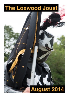
Fig. 02 The Opener

Fig. 02 The Opener

Fig. 03 Introducing the Cast and the Battle of Loxwood
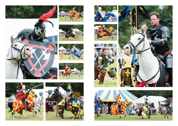
Fig. 03 Introducing the Cast and the Battle of Loxwood

Fig. 04 The Joust Through to Close

Fig. 04 The Joust Through to Close

The Individual Pages

Fig. 02 The Opener

Fig. 05 The Opener

Fig. 05 Some of the Cast

Fig. 06 Some of the Cast

Fig. 06 The Battle of Loxwood

Fig. 07 The Battle of Loxwood

Fig. 08 The Joust
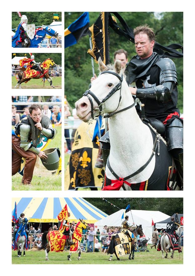
Fig. 08 The Joust

Fig. 09 Close

Fig. 09 Close

Sources

(1) Evans, Harold. (1979) Pictures on a Page: Photo-journalism, Graphics and Picture Editing. London: Book Club Associates.

(2) Freeman, (2012) The Photographer’s Story: The Art of Visual Narrative (Kindle Edition). Lewes: Ilex Press.

Internet

(3) Campbell, David. (2010) Photography and narrative: What is involved in telling a story? – http://www.david-campbell.org/2010/11/18/photography-and-narrative/

Campbell, David. Official Website – http://www.david-campbell.org

(3) Soundcloud, recorded by Matt Johnston. David Campbell – Narrative, Power and Responsibility – https://soundcloud.com/mattjohnston/david-campbell