Over the last several weeks I have been researching, planning and shooting test photos for assignment 4, Applying Lighting Techniques. Originally I wanted to carry forward ideas about the vanity of fashion, which had featured strongly in assignment 3 combining this with the symbolism of vanitas to create faux 17th century still life. As ever with these assignments some ideas work, some do not, new ideas arise, new inspiration is discovered and the end result is quite different from the images imagined at the start. To that end it is helpful to record the development process.
This post looks at the evolution of the idea and at some of the technical challenges that were encountered along the way. In each phase of this course my work has been influenced by three things:
- “text” book and other informed opinions about the genres of photography that are relevant to the exercises and assignments in that part of the course;
- the photographers, both contemporary and more historic whose work appears relevant;
- and, my previous experience and knowledge of relevant techniques.
For assignment 4 my previous experience of photographic lighting was limited to trying to develop better daylight flash techniques in an attempt to capture a Martin Parr look and feel for outdoor documentary photography and extensive experimentation with food photography which I regularly undertake as part of my role in the family business.
This food photography is effectively the starting point for assignment 4. Partly because it means I own 3 flash guns, a remote infra-red flash trigger, three cold-shoe soft boxes and various other bits and pieces such as grids, reflectors, LED lights, stands and backdrops. But, it was only by beginning to think about assignment 4 that it became clear that it is also a starting point because food photography, along with some fashion and product advertising, is one of the most commonly viewed forms of still life in books, magazines and on-line.
It is interesting to note that Irving Penn and David Bailey both worked as commercial fashion photographers yet also produced still lifes as part of personal projects that are generally highly respected. The dividing line between commercially driven and artistically driven still life is blurred with photographers such as Peter Lippmann *(4) producing compelling personal studies alongside similar commercial projects. As someone who sees many high quality cookery books as part of my work I would argue that there is much to be learnt about still life from the food photographers working for the most celebrated chefs. Dominic Davies *(5) is an excellent example of a food photographer producing creative and exciting food still lifes for Heston Blumenthal. In the last six months I have learnt that it is dangerous to pigeon hole contemporary photographers without trying to explore the breadth of their work. I found Peter Lippmann when looking at a Christian Louboutin advertising campaign but his personal still life work is, in many ways, even more exciting as is his unusual approach to intimate landscape in Paradise Parking. Dominic Davies is no doubt a highly sought after food photographer having worked for Blumenthal but before putting him into that pigeon hole it is worth looking at his other still lifes and his Mapping London project which is a William Eggleston like view of the details of London.
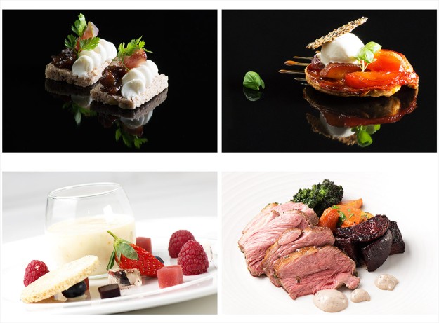
Fig. 1 Food Photography
Food photography was quite alien to me until the last few years and whilst it has been a steep learning curve and a journey that is far from complete it has provided me with a basic understanding of working with small lights in restricted spaces. There is little or no room for big lighting systems in a commercial kitchen.
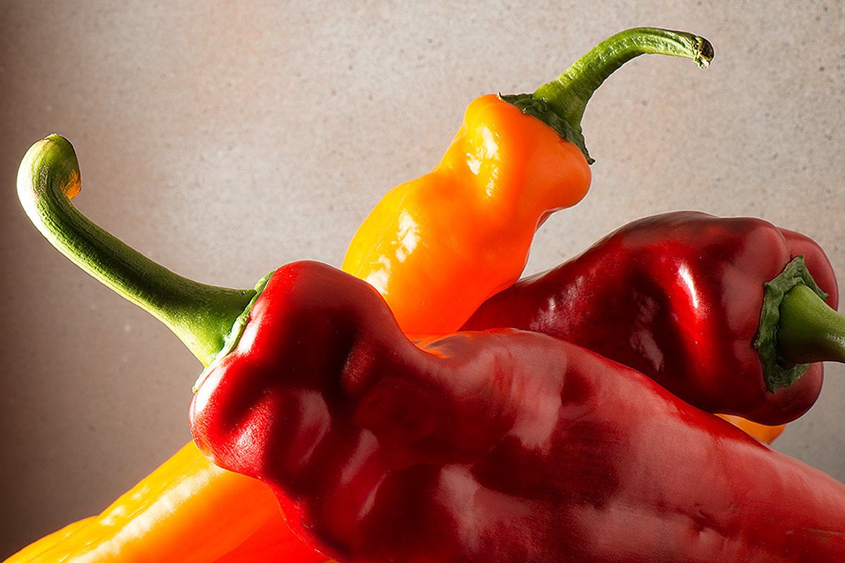
Initially, for assignment 4, I wanted to work with natural light and to photograph still life or human subjects within the landscape as I felt that this would take me into new areas and would keep me away from using the type of equipment I used for food photography. However, whilst I felt inspired by the work of Edward Weston * (1) and would have liked to try something along the lines of his beach nudes I quickly realised that the logistical challenges were significant and to meet the requirements of the assignment with a human model outdoors was unrealistic at this stage. Despite this early change of direction I did find inspiration from Weston’s 1927 Shells, and his studies of vegetables a few years later. Pepper No. 30, (1930), Pepper (1929), Eggplant (1929) and Cabbage Leaf (1931) are classic studies of form.* (2)
My first tests, with Weston’s work in mind, were with small groups of fruit to allow me to experiment with lighting for colour, form and texture.
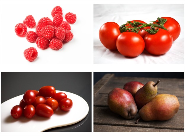
Fig. 2 Contact Sheet of Fruit Test Shots
This experiment highlighted some of the challenges that would arise time and again in this assignment. My instinct is to light for a combination of colour, form and texture (at least where the subject makes all three relevant) and I found it difficult to think in terms of isolating one attribute of a subject to the exclusion of all others. In the context of Weston’s work the plum tomatoes bottom left and the pears bottom right come nearest to the effect I was trying to achieve where form was the main study but the raspberries and the vine tomatoes have a sense of both depth and colour. I knew that this type of subject could be carried forward into the assignment and that a series based on any of these groups could be lit in the four required, different ways. The fat Duck series on the Dominic Davies *(5) web site shows how food can be lit for colour, texture and form, for obvious reasons silhouettes are less common but a few examples in this series come very close.
I was also looking at the work of Irving Penn and a number of contemporary still life photographers and to stick with Weston style fruit and vegetables would be very limiting and too close to food photography.
As mentioned previously I was interested in the origins and history of still life photography and that research trail inevitably leads to Fox-Talbot, Roger Fenton and through them back to the vanitas painters of the 17th century. The symbolism of the vanitas style appealed in a very direct way and immediately spoke to my original agenda of weaving in the modern vanities of the fashion industry.

Fig. 03 A Small Study in Grey – 1/60 at f/13, ISO 100
My first shoot was a very simple set-up. I spray painted a number of common household objects, set them up on a white acrylic sheet, added a pink rose for colour and took a few test shots. The vanitas elements were limited to the rose, symbolising the fragility of beauty and the fly to symbolise decay. This was primarily a light test using two cold-shoe soft boxes, one left and one right, both at about 45 degrees. The lighting worked to a point but I was uncomfortable with the fade to grey in the upper part of the background and noted that I either had to increase the intensity of the lights or find a way to fill the background. As an idea it was very limited and not something that could be taken forward into the assignment. I also felt that it was difficult to achieve the intensity of colour that I wanted using a white background.
By this point I had looked at the work of a lot of photographers and was identifying ideas that could come with me into the assignment. When looking at any photographers for inspiration there is an element of thinking about their subject matter, their overriding style and their technical approach but for studio based still life the technical approach in terms of backgrounds and lighting become a major consideration. It is clear that there are a lot of different ways to set-up and light a still life and I wanted to experiment with some of the options.

Fig 04 Still Life Inspration
Fig. 04 shows the various photographers that were researched in some detail. A write up on these photographers is included here. This research led to a series of still life experiments where I looked at using different set-ups and techniques. One of the first experiments was inspired by Simon Norfolk whose archaeological study of objects found on the battlefield of the Tigris valley interested me at a number of levels. This is stripped down, simplified approach to still life that focusses total attention on a single object. Norfolk has photographed a series of small items excavated from a modern dessert battlefield so, unlike excavating the site of the Battle of Hastings where the best one might hope for is a piece of broken and decayed metal, he has found tattered identity cards, pieces of clothing and personal photographs amongst the spent bullets and shell casings. This is a very human form of still life, exploring the memory of people through their lost possessions. I was keen to test out this idea quickly with objects that I already had to hand but with the intent to take this idea into the field and photograph found objects in a single location at some later point.

Fig. 05 My Dad’s Stuff
Fig. 05 is the result of that experiment. My father was born in 1919 and died nearly 20 years ago. When I was thinking about subjects that might work as small items for simple, one object, white background still life I realised how few of his possessions I still own. His father’s silver watch, his scout knife, a bronze age axe he excavated, a few war time souvenirs and some tools.
At a personal level each object has a story which reminds me of my father, some objects are still being used by me, some are just beginning to be looked at and understood by my grandchildren and, when I have time I would like to repeat the exercise for other deceased relatives as a way of documenting an aspect of their lives. The items were photographed individually and then collected into a single image in Photoshop.
From a technical perspective it was a useful exercise as I was able to test different lighting in response to the material being photographed in a controlled environment. Some worked better than others.

Fig. 06 Bronze Age Axe , from a series My Dad’s Stuff – 1/160 at f/11. ISO 100
For fig.06, the bronze age axe, I arranged the main light back of 90 degrees to the right, 3/4 lighting, and a fill light at a similar position to the left. This seems to have provided a sense of depth to the subject and the texture of the surfaces has been explored to some degree.
I have tried to use shadow as as way of exploring the form of the old fashioned router plane in fig. 07 as an alternative way of looking at the form of the object.
These test shots worked reasonably well but showed that 3/4 lighting is not the easiest to use if you still want to see the face nearest to the camera.
In fig. 07 the problem of backgrounds is also highlighted. In this instance I was using a flat acrylic sheet so the meeting point between the base and the background is very obvious.
I was also using a 105mm lens and working very close to the subjects so needed a deep depth of field to have the whole piece in focus. I have found depth of field challenging in food photography, occasionally it is interesting to only have part of a set in focus but generally it is desirable for the whole subject to be sharply focussed. This appears equally true for still life and forces the use of small apertures.
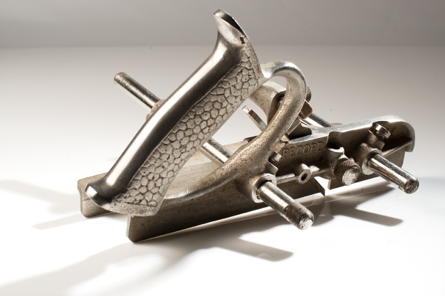
Fig. 07 Router Plane, from a series My Dad’s Stuff – 1/160 at f/16, less 1/3 stop, ISO 100
For my next series of test shots I wanted to create more complex vanitas still lifes bringing together classic motifs with modern objects.
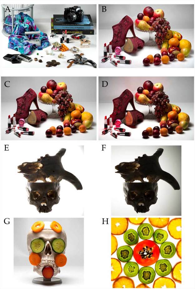
Fig. 08 White Vanitas
For these shots I was still using a white background and, for all but “A” and “H”, I used the same acrylic sheet and a white background. A photography backdrop curved from background to base was used for “A” whilst “H”, which is really just a bit of fun, was taken using a light box and a small amount of overhead light.
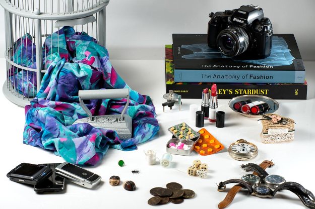
Fig. 09 Blue Vanitas – 1/60 at f/16, ISO 100
“A”, the blue themed still life, was over complicated and didn’t work and was only useful as a learning experience for how not to set up a still life. However, I was pleased by the lighting in fig. 09 which is very even, brings out the various colours and avoids distracting reflections from the watch glasses and old mobile phones. In retrospect there could be a little more light to the left of the camera and on the coins at the front.
“B”, “C” and “D” were more successful, and worked when exploring colour but were much less successful when the same setup was used for texture, form and shape. I chose the red shoes specifically because they had both colour and texture but there was very little difference in the end result when I set up for colour and when I set up for texture.
“E” and “F” were taken as test shots for shape and “G” is my take on Irving Penn’s Vegetable Face.
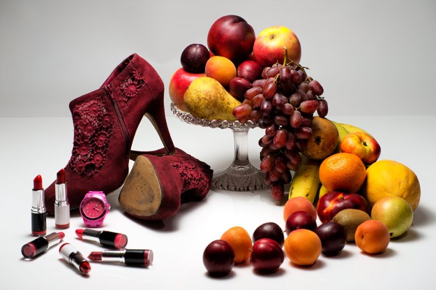
Fig.10 White Fruit Vanitas 1 (colour) – 1/60 at f/14, ISO100
Fig. 10 is a shot that is on the short list for my final submission as It meets many of my original objectives. It has obvious and less obvious vanitas elements, it brings fashion and classic still life together in a single shot and, I believe, works as an exploration of colour. The white background is difficult to work with, there is a 1 stop loss of exposure for every metre the backdrop is placed behind the subject so without extra lights to direct onto the backdrop it is always, at best, going to be grey. In this shot is just about acceptable but not ideal.

Fig. 11 Skulls (edges) – 1/125 at f/16, ISO 100

Fig. 12 Skulls (Edges) – 1/125 at F/16, ISO 100
Fig. 11 is also on the short list as an example of lighting for edges. It could, and has been (fig. 12), processed as a full silhouette but it is not as interesting as a photograph.
In fact this picture sums up my frustrations with this assignment.
I can light or process this just to focus on the outer edges and perhaps that approach best meets the assignment criteria but equally by over exposing a little I can also bring out the texture of the skulls and explore their form.
This is a far more appealing image than fig. 12. so I might submit fig. 11 and hear my tutor’s thoughts.
After “White Vanitas” I wanted to carry out some test shoots using black backgrounds. When researching contemporary still life I saw that whenever black backdrops were used the colours of the still life became far more intense. Mat Collishaw and Paulette Tavormina use black backdrops in very different styles of still lifes but I think both are doing so to emphasise colour.

Fig. 13 Black Vanitas and Fruit
“A” through “E” continue to use vanitas motifs and are a natural progression from the White Vanitas shoot. “G” and “H” are straight forward colour studies. There is no doubt that using a black base and black background brings out the colours in the subject. If the aim was just to emphasise colour this is the set-up I would use.
Fig. 14 Black Vanitas (colour) – 1/160 at f/16, ISO 100
Fig.14 is on my short list as part of the submission. It is “B” in the contact sheet at fig. 13. “A” would be an alternative but without the honeycomb grid and red gel used to emphasise the red shoes. The strength of these two photos are firstly that they are an evolution of my original idea so have some heritage in the project and secondly that they are strong studies in colour. The black background is much more interesting than the white with the subjects fading into or growing out of the black set, appearing suspended in space. In some ways the black set is easier to work with but it does suck up the light so the flashguns had to be run much nearer full power.
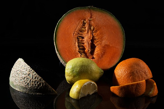
Fig. 15 Melon and Citrus (texture) – 1/125 at f/16, ISO 100
Fig. 15 is also short listed as a submission for texture. This was lit with hard light angled to maximise the different textures in the fruits. At this stage in the process I had a few images that had worked for colour, texture, form and shape but they were from different set-ups so I wanted to conduct a final shoot where the four attributes were represented by four different lighting techniques and photos from the same set.
The criticism might be levelled that, as this was the assignment brief, I should have gone straight to this point in the first place and this is a totally valid point. However, I wanted to explore the four attributes with different set-ups and for each shoot I did light the subjects in, at least, four different ways and took four different sets of photos but with all the above set-ups one or two, and very occasionally three attributes would come through strongly but never all four. I believe that this is because the way I worked through the process of looking at different techniques and using different subjects created environments that empathised one or two attributes above the others. Clearly I could back light the Black Vanitas and photograph a silhouette but it was a dull picture and I don’t see the point in trying to take dull pictures, I take enough by mistake already.
The process also allowed me to explore different photographers’ work and try some of their techniques and work towards a style of still life that was representative of me and that was an evolution of the style I have developed for food photography over recent years. I think I found my greatest inspiration in the work of David C. Halliday and Krista van der Niet. This is a move away from classic vanitas still life but they use light and simple sets to create atmospheric still life that explores form, texture and colour, often simultaneously.

Fig. 16 Green Backdrop Shoot
Fig. 16 is a contact sheet from my final two shoots where all the ideas finally came together. I am disappointed that “G” which is the colour shot from the very final shoot is weak, the colours seem desaturated and what seemed right in the “studio” did not process as effectively as I had expected. I may be fooling myself but I suspect the the choice of fruit in “A” through “D” lent itself to colour better that the subjects in “E” through “H”.

Fig. 17 Green Backdrop (colour) – 1/60 at f/18 (-1/3 stop), ISO 100
This is a shame as fig. 17, “G” from the contact sheet, is very close to the effect I wanted to achieve, the lighting seems very soft and natural, (I believe that Halliday works with natural light) and without having any vanitas motifs it has a 17th century oil painting feel. I have just failed to bring out the colours as strongly as I wanted.
This has been a very frustrating assignment at times and I still questions whether setting such a simple question is pushing a student to explore lighting in real depth. It is too easy to take one object with a bit of colour and texture and setup:
- Colour – lights above and in front
- Form – 3/4 lighting
- Texture – hard light at acute angles
- Shape – backlight
I set out to learn about still life as a genre and to explore lighting for effect. I have enjoyed the research and test shoots immensely and believe that I have learnt a considerable amount about, not just lighting, but how to introduce a mood into simple still lifes.
Sources
Books
(1) Weston, Edward. (1999) Edward Weston. Cologne: Benedikt Taschen Verlag GmbH
Internet
(2) Weston, Edward. EdwardWeston.com – http://www.edward-weston.com/edward_weston_natural_1.htm
(3) Norfolk, Simon. SimonNorfolk.com http://www.simonnorfolk.com/pop.html
(4) Lippmann, Peter. Peter Lippman Official Site http://www.peterlippmann.com/lippmann3/menu.html
(5) Davies, Dominic. Dominic Davies Official Site. http://www.dominicdavies.com/fat-duck/