I set myself the objective at the end of assignment 1 to improve my black and white processing skills. Whilst in Turks and Caicos I endeavoured to “see” in black and white which, as might be expected, is challenging in a place where colours are typically strong. There are a few obvious characteristics of a landscape that impact whether a black and white shot will work, the most obvious being the sky. A single coloured flat sky is even less dramatic, if dramatic is the aim, in black and white than in colour, this is even more true of pale skies. My single Ansel Adams reference book is a collection of his portfolios *(1) that I purchased in the Philippines over twenty years ago and has moved around with me ever since. It is noticeable that most of his skies are either deep blue, rendered as nearly black, or, when cloudy, often rendered in more subtle tones of grey.
The second characteristic is that the shot needs strong contrasts to work. I have found that I can’t force this contrast. It is either there and can be used to good effect or it isn’t and I achieve a flat looking image. I am not suggesting that this is rule for black and white photography just that I do not achieve a result that is satisfactory to my eyes unless I start with a contrasting scene. Using Adams as a benchmark tends to push me towards seeking a high contrast result and I think it is fair to say that Koudelka’s *(2) and Cartier-Bresson’s *(4) images, whilst very different in subject matter, also lean towards high contrast. I also find Koudelka’s images dark in tone (and content) and so far I have not been brave enough to process towards such dark tones but this may change if I start to shoot grittier subjects.
On my trip to Turks and Caicos I took very few books but one that did travel was Michael Freeman’s Black and White Photography Field Guide *(3) which I referred to frequently when trying to think in black and white. I have generally found this little book helpful as it is a very practical guide and quite appropriate reading for a beginner.
I had considered using a small number of black and white prints as part of assignment 2 but having asked about mixing media on the OCA forum the advice was to not mix black and white and colour in the same assignment. In the same vein I have been advised by both my tutor and some answers on the same forum to avoid mixing vertical and horizontal frames. I understand and accept the reasoning but this leaves me slightly disappointed as I feel I have made some progress in black and white processing and using some in an assignment would have given me the chance to hear my tutors views. I did consider submitting a complete black and white assignment but I felt that, whilst this might help me focus on the elements of design, it would be a perverse decision when attempting to document a place with so much colour.
This post is therefore an opportunity to record that progress and the thought processes I have gone through so I can refer back here when I next attempt a collection of monochrome images.
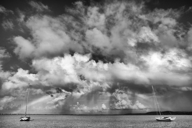
Fig 1 Stormy Sky at Chalk Sound – 1/125 at F/11, ISO 100
Fig 1 was taken on a perfect day when there were rain clouds blowing across the islands at some speed. I have an emotional attachment to this view as it is a familiar sight for any sailor sailing in bright sunshine whilst watching squalls only a short distance away. I have processed to maximise the contrast between the white boat on the right and the dark landmass in the distance. It was important to leave some sense of the rainbow in the image as this is an important curve linking the two boats. The sky is the real subject so I have framed it to dominate the composition.
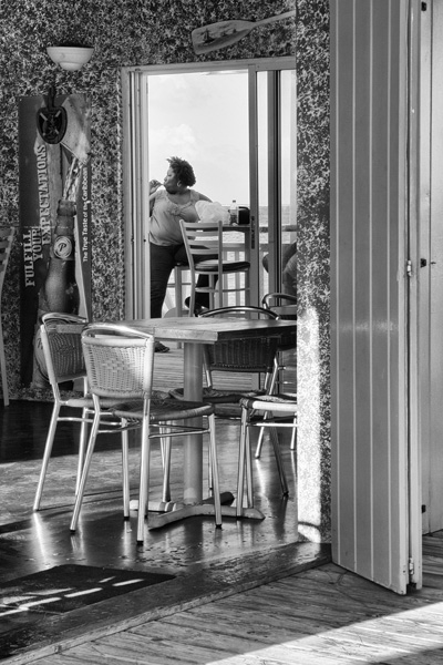
Fig 2 Beach Bar – 1/125 at f/16, ISO 100
In complete contrast to fig. 1 The Beach Bar in fig. 2 is an interior to exterior shot and as such quite challenging to process. I have used HDR Toning in photoshop to get detail into the shadows and to preserve the definition of the woman on the veranda. I am pleased with this shot which was taken in a locals’ bar well away from the tourist areas. The women was very interested in something that was happening out of my view and I was taken by her pose and the fact that she continued to eat whilst looking out of shot. The old-fashoned wall paper and the advertising on the drinks cooler seem at odds with one another and add some tension to the scene.
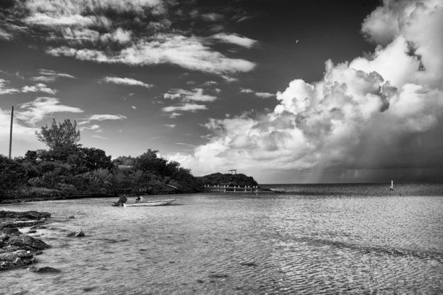
Fig 3 Sapodilla Bay – 1/125 at f/11, ISO 100.

Fig 4 Sapodilla Bay – 1/125 at f/16, ISO 160

Fig 5 Sapodilla Bay – 1/250 at f/8, ISO 100
With the three images of Sapodilla Bay I wanted to test whether I could create strong images from sea, sky and beach scenes. Before starting TAoP I would not have looked for a black and white answer to the question of how to make a beach scene more interesting but I reached a point that I was comfortable with after quite a lot of experimentation with the multitude of variables offered by Silver Efex Pro 2, which I purchased after reading about its possibilities in Michael Freeman’s Black and White Field Guide *(3). It appears to offer more creative control that the black and white layer in Photoshop but it is tempting to go too far and drift towards a HDR look which is not what I wanted.
It was quite hard to find a benchmark for this type of shot, I wanted to make the sky the dominant feature because it is the shape of the clouds and the varied tones within them that lift the image beyond “yet another” beach photo. I looked at the sky in Ansel Adams’ “Pinnacles”, Alabama Hills, Owens valley, California 1945 and the sea in “Dunes”, Oceano California and used his processing as a loose guide. I recognise that he would have looked for greater contrast between the foreground objects and the sky and I might have made more of the beaches in Fig. 4 and 5.

Fig 6 Old Timber Taylor Bay – 1/125 at f/16, ISO 160
Fig 7 Broken Screen Taylor Bay – 1/125 at f/16, ISO 720

fig 8 Post and Rope – 1/125 at f/f11, ISO 100

Fig 9 Old Timber Taylor Bay – 1/125 at f/16, ISO 100
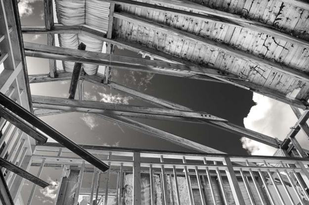
Fig 10 Ruined Roof Emerald Point – 1/500 at f/8, ISO 100
The last images, figs. 6 to 10 are all part of a study of decay. Turks and Caicos is in the hurricane zone and even when the weather is more peaceful it is still an environment of harsh sunlight, frequent rain and strong winds. Ruined houses, weathered timbers, washed up wreckage and a few sunken boats were evidence of nature’s fight-back.
Fig 6 and fig 9 are the remains of a washed-up door and frame from something large, I am not sure whether it is from a ship or something like a barn door. It was weathered and sea rolled before ending up at the back of the beach at Taylor Bay.
Fig 7 and fig 8 are details from a large, abandoned house overlooking an idyllic beach. It appeared to have been deserted quite recently as the main fabric of the building was still sound but I was intrigued by the weathering on the details such as the fly screen and the posts that lined the path to the beach. These might be the first signs of the eventual demise of the whole structure.
Fig 10 is more dramatic showing the sky through the roof of another large abandoned house at the other end of the island. I think this was probably first damaged in a hurricane and is now well on the way to collapse so, in some ways is a natural progression from 7 & 8.
Overall I have found these exercises in black and white useful. I feel that I have learnt a little about what works in black and white and I am more confident in using this medium. My tutor suggested that I needed to have a position on the black and white versus colour debate but I am not ready in my own mind to take a position. I have enjoyed my forays into black and white processing and am very interested in the work of the many masters of the art, I see it as a valid medium in the 21st century and would respect anyone who chose to work entirely in this way. If I had to choose I would stay with colour but I would prefer not to choose and to use both. I am increasingly finding situations where I find black and white works best but the majority of the time I want to capture the colour of both the natural and the man-made world.
Sources
Books
* (1) Adams, Ansel, with an Introduction by John Szarkowski. (1981) The Portfolios of Ansel Adams, New York, New York Graphic Society, Little, Brown and Company.
* (4) Cartier-Bresson, Henri (1999), The Mind’s Eye, Writings on Photography and Photographers. Aperture Foundation, New York
* (3) Freeman, Michael. (2013) Black and White Photography Field Guide, The art of creating digital monochrome, Lewes, The Ilex Press Limited.
* (2) Koudelka, Josef. (2007) Josef Koudelka: Thames & Hudson Photofile with an introduction by Bernard Cuau. London: Thanks and Hudson.
* (5) Eggleston, William, (1976) The Guide with an introduction by John Szarkowski, New York, The Museum of Modern Art


